Join us Dec. 1-3 in Nashville for the Digiday Programmatic Marketing Summit

The Web is a noisy place. At a time when legacy publishers like The New York Times and spunky upstarts like Upworthy are on the same playing field, publishers are doing all they can to ensure that they get noticed.
One seemingly small question with big consequences they’re facing: What’s the right size and placement for a logo? Consider Mic, (formerly PolicyMic), which redesigned its site with a “sticky” navigation bar that follows readers as they scroll down the page. The feature’s goal, according to Mic lead designer Liran Okanon, is to keep the Mic brand front and center no matter where a reader is on a page.
“We want new audiences to remember our great editorial content,” he said. “The sticky nav allows us to keep the brand visible at all times.”
It’s an tactic that Mic shares with publishers like Bloomberg Businessweek and Pando, which also use variations on the sticky navigation bar. The approach makes sense: In a crowded publishing ecosystem, in which readers bounce promiscuously from site to site, publishers are eager for ways to leave strong impressions and convert new readers into regular ones. Making a bigger logo is one way to do that.
Other publishers share this thinking. When The New Yorker revealed its new redesign this week, it bucked current design trends by keeping its logo front and center and sizing it at 601 by 70 pixels. Other legacy publishers, including The New York Times (379 by 64 px), Washington Post (420 by 68px) and LA Times (660 by 100px), have done the same, largely in an attempt to make their websites evoke the same look and feel of their print publication (and emphasize the esteem of the brand).
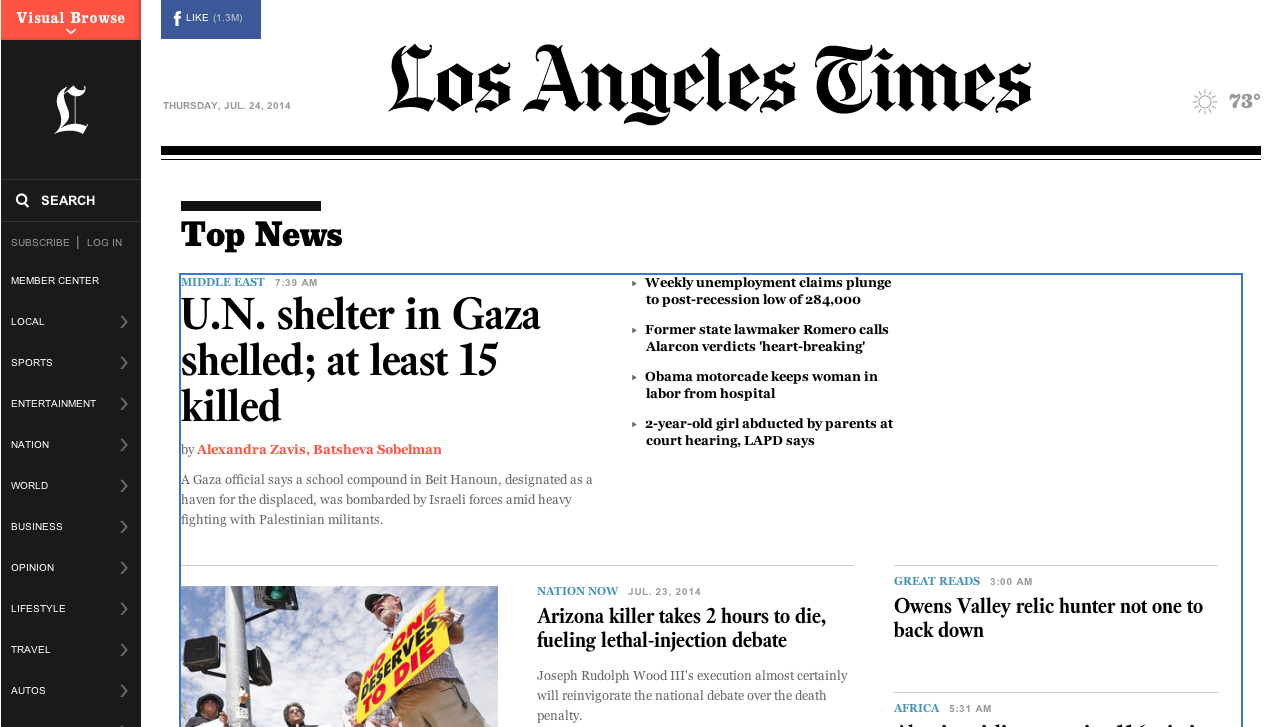
A problem with the logo-first approach is that readers don’t care about logos as much as publishers do. “Oftentimes brands get full of themselves,” said Dan Maccarone, CEO of design firm Charming Robot.”When a publisher makes its logo bigger, it’s letting a small part of its brand do the work for it rather than its content.”
“The thing that people are going to gravitate to or remember you by is what they’ve read and how impactful it was for them. If the content works, they’re going to want to know who they got it from,” he added.
So while some publishers are making their branding larger and more persistent, many are moving toward smaller logos, not larger ones. A look at Quartz, BuzzFeed, The Daily Dot and Vice shows that most publishers are minimizing their logos while maximizing other parts of their pages. Mobile is a big part of this as well: Smaller screens mean that publishers are forced to make the limited real estate of smartphone screens go further.
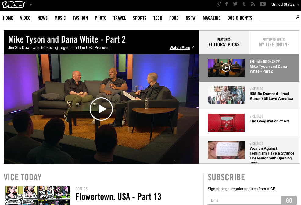
Which is smart. A big problem with the logo-first approach to branding is that it conflates logos with brands, which are two different things. A logo is a small part of a much larger brand identity, which for publishers usually includes things like editorial voice, font and the experience of reading their magazine or website. “It’s hard to tell a story with just a logo,” said Austin Smith, managing partner at Alley Interactive. “Your logo is not your brand.”


More in Media
Creators say it’s difficult to make money from news — with platform rules and brand guidelines
With more people getting news from creators than traditional media, those creators are still trying to build sustainable businesses.

Why CNN International is building for agentic ad market that barely exists yet
CNN International is still chasing its first agent-sold dollar by Q1.
Media Briefing: The transatlantic push to rein in stealth bots is gathering pace
U.S. and U.K. publishers are pushing for laws to crack down on stealth AI crawlers as bot scraping surges and demands for transparency grow.