for the Digiday Programmatic Marketing Summit, May 6-8 in Palm Springs.
Serif fonts, holdovers from the days of print, are on the chopping block in the age of mobile.
Google’s recent shift to a simpler, more colorful sans-serif logo earlier this month was as much a practical decision as it was an aesthetic one. Google said that its previous logo, based on the serif typeface Catull, was too large and cumbersome, making it hard to display on smaller screens, particularly those with slow Internet connections.
Google isn’t alone. For publishers, type choice is one of the many previously considerations that have moved from matters of taste and sensibility to the optimization side of the ledger. Performance is top of mind on mobile, where speedy connections are rarely guaranteed and users will give up quickly when faced with a slow load. Publishers, tormented by the specter of ad blocking, are eager to do as much as they can to speed up their pages and reach performance parity with the big platforms. Doing so means making sacrifices, including doing away with serif fonts, print-era vestiges that often feel out of place on the modern Web. (Fonts named such because of the small lines attached each to each stroke of their letters, which improve readability on the printed page.)
“So many sites now are looking to add these large photos, so the performance savings are going to have to come from somewhere,” said Chris Pace, chief creative officer at design firm Charming Robot “Typefaces are definitely going to take a hit. You have to optimize when you can.”
For many sites, this means doing away with serif fonts, which are more complex and hence larger than their sans-serif counterparts. The typical serif font can be as heavy as 400 kilobytes across its various font family members. Sans-serif fonts, on the other hand, are often a fifth of that, said Pace. For publishers such as The Washington Post and GQ trying to squeeze out tiny optimizations from their images and other page elements, these small changes add up.
Publishers don’t always nail the font performance balance. Vox.com, which uses the sans-serif font Balto for its articles and the stylized serif Harriet Display for its headlines, is particularly bogged down by its fonts. Over 20 percent of its page weight on first load is taken up by them, the third-largest element after its javascript code and images. Wired.com is also particularly heavy on font load. 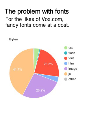
From the tech-company perspective, sans-serif is the way to go on mobile. Google opted for the sans-serif Roboto as its Android default and Apple chose Helvetica Neue for iOS (though it’s switching to its custom “San Francisco” with iOS 9), both training mobile users to expect sans-serif across all their devices.
“On the mobile side, everyone is definitely distancing themselves from serif fonts,” said John Newman, creative director at digital agency Imulus. “There was a debate around it for a while, but we seem to agree that in the digital environment, sans-serif is is generally better for reading.”
Beyond performance and readability concerns, the font a publisher chooses says a lot about its brand. Fonts have their own personalities. Vox (Balto), BuzzFeed (Proxima Nova), and Vice (Arial), for example, have all opted for clean sans-serif fonts in an effort to appear more modern. Sites such as The New York Times, Washington Post (and even Digiday), meanwhile, have opted for classic serif fonts such as Georgia and Baskerville that are meant to evoke the aesthetics of print.
Charming Robot’s Pace said this is why publishers have to balance the need optimize their sites’ performance with the less quantifiable effects that fonts have on their brands.
“Once you scroll down a site and no longer see its logo or photos, you’re just looking at the text on the page. There’s a lot of personality and character that even that can bring, and sites don’t want to lose that,” he said.


More in Media

The rise of deepfakes poses a new trust challenge for publishers
As AI deepfakes surge and become harder to detect, publishers are under pressure to fact-check content and safeguard credibility.
Adobe relies on Firefly to win over creators
Adobe wants Firefly to do for AI-native creators what Photoshop did for a generation of ad creatives – become the tool they can’t work without.
News UK turns The Times’ first-party data into synthetic audiences for advertisers
News UK is turning The Times’ first-party data into a synthetic audience planning tool for advertisers.