Connect with execs from Axios, The New York Times, Paramount and more.
Google is looking younger as it gets older.
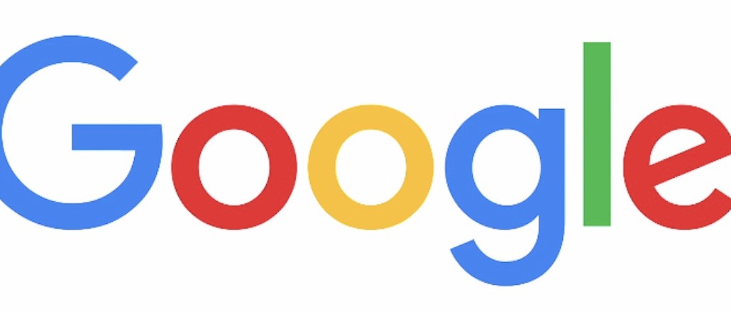
The search giant unexpectedly rolled out a new logo today, complete with a simpler sans-serif typeface while maintaining its signature parade of colors, albeit more muted. Perhaps not surprising is that the new logo evokes the company’s new parent company, Alphabet, thus providing a unified appearance across the two brands.
As Google does, the new logo was announced in a Google Doodle on its homepage showing a hand wiping away the old logo with the fresh identity.
Keeping with the “simple, friendly and approachable style” of its former logo, Google explained that the new version combined “the mathematical purity of geometric forms with childlike simplicity of a schoolbook letter printing.” TL;DR: It looks updated.
The custom font is called “Product Sans” and was designed in-house. The red, blue, yellow and green colors were edited to add “vibrancy” and “to maintain saturation and pop.” Google explained the surprisingly lengthy design process on its company blog.
With the cleaner and flatter font, akin to Facebook’s recent logo redesign, the new logo is made for mobile, noted Susan Cantor, the president of Red Peak Branding.
“The type is simpler, flatter and almost juvenile,” Cantor told Digiday. “I assume they’ve done this so that the brand retains its youthful, approachable feel in an era when things are becoming more impersonal and distant. ”
All of Google’s new products will soon be using the new logo, with Search being the first.


More in Marketing

To manage 300,000 creators, Unilever automates everything but the relationship
Unilever is using AI to vet creators and automate workflows as it scales a 300,000-creator network without handing over creative decisions.

Nike versus Adidas: Who’s spending more in race to claim the World Cup crown?
With the World Cup at the midway point, ad spend estimates show the apparel rivals taking opposite tacks in their media approaches.
Platforms’ AI dilemma: scale without sameness
Using AI to create content risks a lot of it looking the same. But the platforms agree creativity will always come from humans.