How The Economist uses its 12-person data journalism team to drive subscriptions

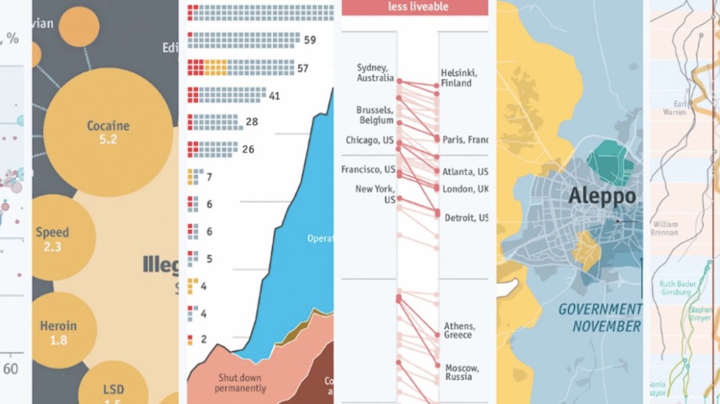
The Economist knows charts and data visualizations play a number of key roles, like reaching new audiences to drive back to its site and helping to bolster its credence.
Articles like The Economist’s glass-ceiling index and a chart on the most dangerous cities in the world are among its most popular by pageviews and dwell time, according to the publisher. A reader survey in January showed readers were interested in more charts, and half of the respondents were not in the data journalism industry, but interested in how the publisher uses data to tell a story, said Alex Selby-Boothroyd, The Economist’s head of data journalism.
“Data journalism is important to us, and it’s getting more prevalent in general, driven by better and quicker access to data,” he said. “More people who don’t work in data journalism are using the tools.”
The publisher has created charts for some 22 years online and 90 years in print, but only since the end of last year has it focused on getting them out to a wider audience on social media by hiring a dedicated data journalist, Marie Segger, to join Selby-Boothroyd’s team of 12 data journalists.
The Economist posts animated GIFs and videos, mostly on Twitter and Facebook. Typically, the publisher uses these to drive people back to the site, where users have to register or subscribe. Each day, The Economist publishes a chart, accompanied by a 300-word explanation of it, to the site’s chart of the day section. After the birth of Britain’s Prince Louis last week, the team created a chart showing that it was more expensive to have a baby in the U.S. than in the Lindo Wing, an exclusive maternity ward at St Mary’s Hospital in London.
The team creates up to seven longer stories a week that contain several charts, each published online, and up to five longer stories for the print paper. For instance, a recent chart detailing the rise of profane language on the forum Mumsnet was created in two hours and printed in the paper after news broke that advertisers had pulled ads.
“Data journalists say they spend 90 percent of their time cleaning data and 10 percent complaining about cleaning data,” said Selby-Boothroyd, adding that while the total output of charts since November — when Segger joined — has remained roughly the same, the team has been working on longer-term projects.
Creating charts for social requires tweaking. Around 20 percent of the charts The Economist creates in print or online require a longer dwell time of up to a minute to understand. On social, that kind of dwell time is impossible, so the team works to strip each chart down to make just one clear point so readers get the sense from scrolling through.
Equally, The Economist has to design charts and interactive graphs with mobile screens in mind. The Big Mac index, the publisher’s barometer of a country’s wealth by the cost of a McDonald’s Big Mac, has been published twice a year for the last 30 years. The team is redesigning the interactive chart to suit mobile screens, which will be ready in July when the next set of statistics are released. The team has collected responses from 1,000 readers, recorded screens and used heat maps to gauge the types of features people like.
The publisher is also making a more concerted effort to get readers and data journalist fans involved. During an independently run makeover challenge, the publisher asked people to redesign one of its charts about the prevalence of hurricanes in the U.S., and 60 people submitted different ways of presenting the data, said Selby-Boothroyd.

For the upcoming Big Mac index, readers will be able to download the raw data. Segger is also more proactive about the charts’ dedicated Twitter account, chatting with people in the industry and explaining The Economist’s methodology. As with most things in data, giving it a more human voice makes the work more accessible.
“Readers associate numbers, statistics and charts with proof, as long as they are clear and provide sources,” she said.
Image: The Economist via Medium
More in Media

Amazon bets creator video podcasts can be the next TV network – if it can fix measurement
Amazon’s Upfront presentation leaned into its podcast offerings, which the company believes are the next generation of TV networks.

Media Briefing: BuzzFeed’s $120M sale marks another step in the repricing of digital media scale
Byron Allen’s $120 million BuzzFeed deals marks another turning point in the collapse of the platform-era media business model.

Mail Metro Media shifts ad strategy toward PMPs and fewer ads as it unifies stack
Mail Metro Media wants to drive 300% PMP growth over the next three years as part of plans to turn a high-volume digital direct business into an outcomes shop.


