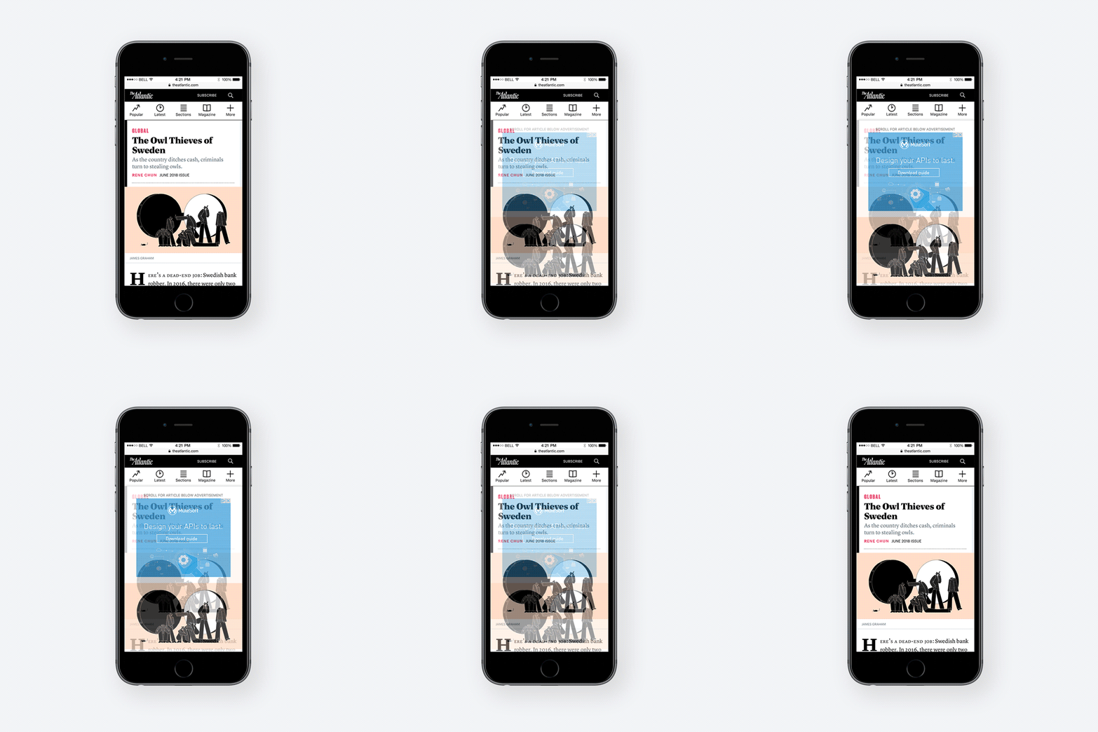
When The Atlantic magazine began working on its first article page redesign in three years, it had a lot more to think about than when it last overhauled the format.
In the interim, mobile audience and ad viewability standards had become a lot more important. The Atlantic also had to think about its new membership program, as well as a customer-centric mindset that involves closer collaboration across different parts of the publisher’s organization. Where the preceding redesign had involved input from the site editor, design and product teams, the most recent one also included contributions from ad ops, marketing and consumer marketing.
The end result, a faster article page format, officially launched Wednesday.
“Everything is 50 times more complex than it was three years ago,” said Kim Lau, The Atlantic’s evp of strategy and operations. “[This redesign] had the largest group of stakeholders, the most statistical analysis done on it of any redesign we’d done. The big new focus is on keeping the customer in the center of our view.”
The Atlantic added a dedicated promotional unit that plugs various Atlantic products to readers, based on what the site could discern about its visitors. A first-time reader might get an invitation to subscribe to its main newsletter, while a regular reader might get an offer to join the Masthead, its membership program. In other cases, the offerings will reflect the kinds of content a reader’s consumed on the Atlantic’s site in the past. It has seven different newsletters and three different podcasts it plans to promote this way.
Though the Atlantic has a few audience segments carved out for this already, the publisher will be building out further segments over time, and use DoubleClick for Publishers to store them and deliver the right kinds of offers through the new unit.
Rather than occupying a static piece of real estate on the pages, the promotional unit is inserted dynamically, typically within the first three paragraphs of an article, Lau said. The publisher’s team expects to tinker with where that unit sits within the article page template.
The Atlantic has been targeting on-site readers with newsletter offers for over a year. But aside from frequency capping, it had no way of optimizing the offers it sent. “They weren’t targeted, and they weren’t smart,” Lau said. “If you were a core subscriber, we weren’t able to know that we should be promoting something else.”
Viewability is a tricky problem to solve. To shore things up, the team got rid of a large display unit near the top of mobile article pages that was hurting the site’s viewability numbers because people tended to scroll past it too quickly. But on desktop a standard box ad was moved up the page.


Lau said her team wanted to make sure the site loaded more quickly on mobile too, a key consideration for a site that draws nearly two thirds of its unique visitors through mobile devices.
To make that happen, it focused on finding non-critical elements of the page, such as the footer, that could be “lazy loaded.” It also switched to critical CSS, which cuts down the amount of code a browser needs to process. Lau said the changes, including dumping those large ads, improved page load times by 87 percent on average, across desktop and mobile.
The Atlantic’s mobile site currently has a page load time of six seconds, according to Google’s mobile page speed testing tool.
Though the current improvements made should serve the publisher’s priorities over the next few years, Lau is under no illusion that they’ll be permanent. “You basically have to re-architect your site every few years to take advantage of technology improvements and changes,” she said. “We hope the plumbing we’re putting in place can adapt.”
The Atlantic’s reader-centric overhaul comes at a moment when more publishers are tweaking their sites to build more direct connections with readers. Sites including Bloomberg Media have launched registration walls, while others, such as Gannett or Salon, have begun dangling the prospect of ad-free experience in front of readers in an attempt to get them to subscribe.
More in Media

Inside The Daily Mail’s creator-led content playbook
Inside the structure, strategy, and metrics of the Daily Mail’s creator-led content push.

Media Briefing: Overheard at the Digiday Publishing Summit, March 2026 edition
With no sign of search traffic returning, publishers are doubling down on subscriptions to build direct reader revenue — but it’s not easy.

People Inc.’s Jon Roberts on the AI licensing boom – and the revenue lag
People Inc’s Jon Roberts discusses the boom in AI content licensing marketplaces — and the revenue that could materialize for publishers.


