for the Digiday Programmatic Marketing Summit, May 6-8 in Palm Springs.

Mark Duffy has written the Copyranter blog for 12 years and is a freelancing copywriter with 25-plus years of experience. His hockey wrist shot is better than yours.
Although the secret to great advertising is the unexpected visual, sometimes — because of execution or strategy or budget — you just need a kick-ass headline.
Unfortunately, there have been zero great ad headlines so far this year (maybe a few good ones). There is a logical explanation for this: Brands in the Facebook Age are deathly afraid of alienating any potential customers by appearing too intelligent with their communication. Instead, brands aim for that bland, mildly entertaining, middle-of-the-road sweet spot with all their content so that it gets “shared” the most by the lowest common denominator of people.
And because of social media, companies are now so worried about having a negative brand “image” that most of them don’t have an advertising image at all. But then, great advertising, with great headlines, is usually somewhat “risky” advertising that makes clients feel giddy but also a little nervous. Nervous often wins out.
Brands, you need to step out on that limb if you want greatness. Now, there are no rules for writing great headlines, but there are a few loose creative categories that have been established.
Always, ALWAYS avoid puns, unless they’re dead-on perfect

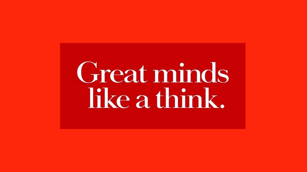
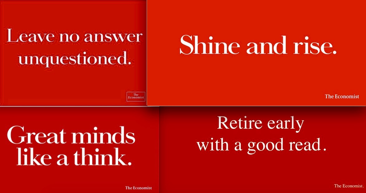
Way back in 1988, David Abbott, founding copywriter of London agency Abbott Mead Vickers (now AMV BBDO), came up with a “disruptive” campaign idea for The Economist. Instead of repeatedly trying to prod consumers to buy the next week’s issue, he proposed the radical strategy of making people who read the magazine feel smart and making people who didn’t read it feel like they were missing out. The tone of the headlines — and there were scores of them — was always the same. That’s what a tight, clear brief and strategy nets you. (See more of the early campaign executions here.)
The visual-less “White out of Red” campaign quickly doubled the magazine’s subscription base and kept growing it for 20-plus years. Admit it, smart person: You’re reading those headlines, and now you want to read The Economist.
It’s brilliant image advertising, which is now fruitless, according to many of today’s digital marketers.
The ‘unexpected’ headline (or ads that make you feel superior for using a product by smartly chiding people who don’t use the product)

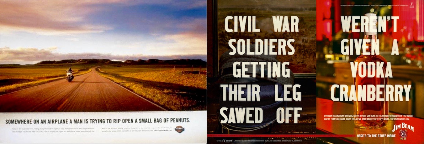
Take the ad on the left. Everybody knows what a Harley-Davidson is. Instead of talking about what it is, this 2002 Cannes Lion-winning ad by Carmichael Lynch shows what it is (without a big stupid product shot) and talks about what it isn’t. Feel the creative tension. Right: The first part of the headline on this 2008 double-page ad (by Energy BBDO) is historic and very visual, while the second part is very sarcastic and present-day. It’s a sly way for Jim Beam to say, “We’re a 200-year-old brand” without saying it. Were legless soldiers given Jim Beam? Quite possibly! Here are two more ads from the campaign.
Make the headline the visual

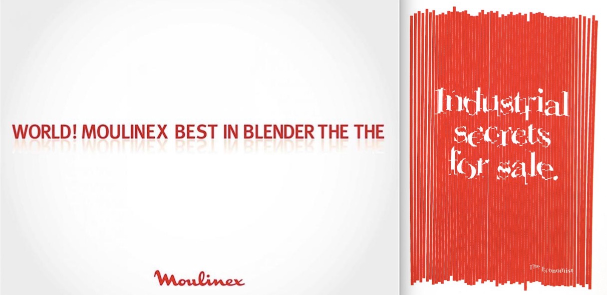
Headlines can be unexpected visuals, too. On the left: 2009 ad for the Moulinex blender by BBR Saatchi & Saatchi, Tel Aviv. Simply wonderful! There were two more unneeded executions in the all-type campaign. Right: The Economist again. If this ad doesn’t make you want to subscribe, then you must not be in the target demo.
There are other established “types” of great headlines, including challenger brand directly competitive lines, like the 1960s Avis “We’re No. 2, but we try harder” DDB ads and this hilarious confrontational 2012 billboard by Newcastle Brown Ale.
You aforementioned digital marketers may be saying, “These are print ads; nobody does print ads anymore.” Right you almost are! Print is dying, but the need for great headlines isn’t. And great headlines with static visuals can be turned into social media ads, display ads, even fantastic cheaply produced videos.
But, yeah, you’re probably right. It ain’t worth the risk.
More in Marketing

How did Nike’s embattled heritage brand Converse reach a 15-year revenue low?
The last few years have seen Converse continue to underperform compared to the rest of Nike’s portfolio.

Why Pfizer and other blue-chip brands are building internal AI search hubs to reclaim control
As AI upends traditional rankings, big spenders like Pfizer and other blue-chip brands are building internal task forces.

OpenAI has quietly launched its ads manager as it races to build out its ads business
The AI platform quietly launched its ads manager within its ChatGPT ads pilot advertisers last week, and also lowered the barrier to joining the test.


