Sorry one-dimensional copywriters, turns out pictures still beat words. The best winning ads from this year’s Cannes Lions were all image-based ideas, all ideas with unexpected visuals.
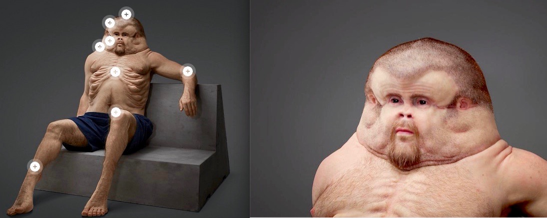
Let’s start with the “Meet Graham” project by Australia’s Transport Accident Commission (agency: Clemenger BBDO, Melbourne). It rightly won almost every award it was up for. Scientifically engineering a new human body built to survive car accidents was a brilliant idea. But it is the Graham model that captivates us. You can’t stop staring at him.


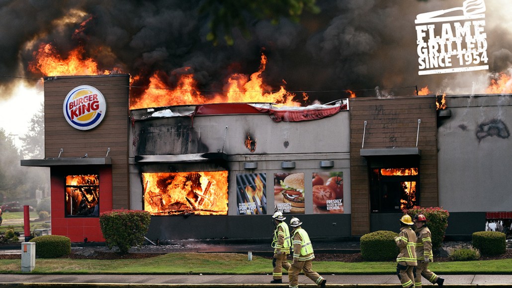
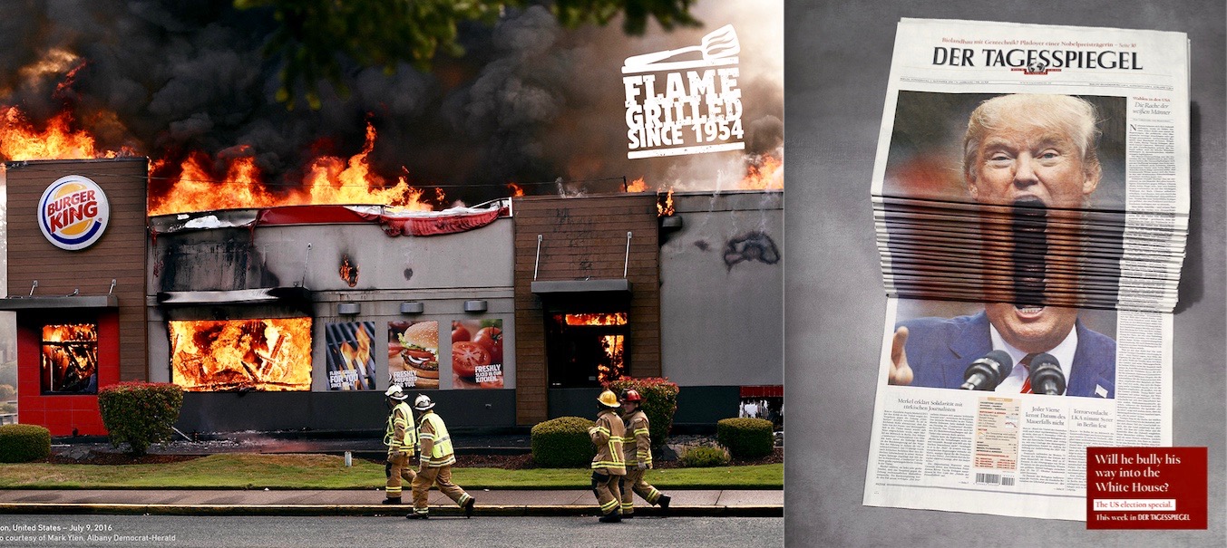
Now take a look at the two big winners in the Print category. The Burger King “Burning Stores” campaign won the Print Grand Prix Lion (agency: David, Miami). And a campaign for German daily newspaper Der Tagesspiegel (agency: Scholz & Friends), led by the above Donald Trump execution, won a Print Gold Lion.
Of course, all “print” ads are now also “digital” ads because of internet sharing. And these executions were two of the most shared ads worldwide, both when they were released and last week at Cannes. They were almost certainly shared more than any of the actual Cyber Lion winners. The reason for this is simple: The visuals are arresting, engaging and unexpected.
With the BK campaign, the copy was simply a signoff of the concept. The copy on the Tagesspiegel Trump ad actually takes away from the visual. The ad would be better with just a logo — a great ad for a newspaper with zero words. Ain’t that something?
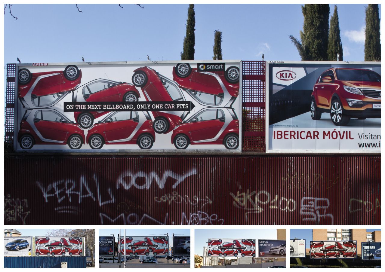
As is illustrated with the Tagesspiegel ad, you don’t need to go to Crazytown to create an unexpected visual. The agency simply used the product. Another example of this type of great visual thinking is the below 2014 billboard for the Smart car:

You are stopped, you are engaged and intrigued — by a “boring” product shot billboard (agency: Contrapunto BBDO, Madrid). The headline isn’t what stopped you (though here, it does add to message).
Even Twitter gets it. Its wordless hashtag billboards won an Outdoor Grand Prix Lion. (The campaign did not deserve a Grand Prix, but maybe a Bronze Lion. I think the only reason it won is because it’s “Twitter.”) Also winning an Outdoor Grand Prix Lion? The visually tense “Fearless Girl” installation, which won 18 lions, including four Grand Prix.
In the Film categories, the two best pure (not “purpose”) product ad winners featured unexpected, captivating visuals. Samsung’s Gear VR “Ostrich” spot (agency: Leo Burnett, Chicago) won a Gold Film Craft Lion and made me cry. (I like birds.) And Wieden+Kennedy’s “Five Year Plan” Old Spice spot (below) won a Gold Film Lion and made me laugh out loud (“Linda!?”).
Social media mavens are finally figuring out what good ad creatives have known since the late 1950s: Visuals persuade and sell better than words. And unexpected visuals that present a product benefit or image in a dramatic, original way sell the best.
Write that previous sentence down, new-to-the-ad-game tech and consultancy agencies. Because hiring all the slick content writers/journalists/social gurus you can find will not change this absolute advertising truth. Creativity has been seriously injured by your ilk, but it ain’t dead yet.
More in Marketing

Digiday+ Research: Retailers take a more complex approach to loyalty
Loyalty programs have changed over the last year: The number of retailers who offer them has increased, and the programs are now more complex.

The Trade Desk is changing how advertisers buy — and what they can see
The Trade Desk’s new buying modes bundle costs and automate decisions. Here’s what that means for advertisers.

AI talk at retail events shifts to proving real results, defining a true strategy
AI is moving further and further away from the experimentation phase. That was clear at this year’s Shoptalk Spring.


