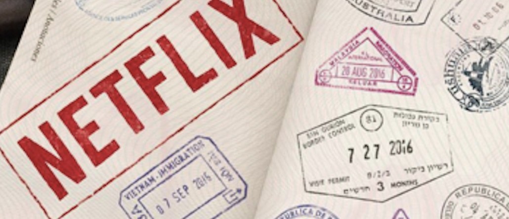
N stands for Netflix’s — and it also stands for “new.”
The streaming service rolled out a new “N” emblem today across its Facebook, Twitter and Instagram profiles surprising its users. The red N, which replaces the full brand name, follows the flat, so-called “material design” trend that’s seen in recent Google, YouTube and Instagram redesigns.
Netflix isn’t ditching its red and white logo it unveiled in 2014. Rather, the redesigned “N” is a new element for its mobile apps and social media profiles. The full “Netflix” word will still be used on advertisements and show bumpers.
Reactions were mixed:
Another week, another logo fail… What the hell is this #netflix 2003? pic.twitter.com/mRmu2JnC2N
— Dam (@DamsTweets) June 20, 2016
New Netflix logo… pic.twitter.com/vT4qviBzVo
— Linda (@bangbangbruja) June 20, 2016
I like the new @netflix logo pic.twitter.com/OH1C0EFudX
— Jose del Corral (@J0se) June 20, 2016
And someone already posted a think piece about the change on Medium, calling it “cold” and “not needed.”
Netflix is the latest tech company to freshen itself up, following revamps from Facebook and Uber.


More in Marketing
High stakes, big budgets: How brands are navigating a massive sports year
Global ad spend on sports has increased, and brands like Grey Goose, John Deere and Lavazza coffee brand are investing.

Amazon to issue 3.5% surcharge on fulfillment services as fuel, logistics costs rise
The surcharge will apply to Fulfillment by Amazon in the U.S. and Canada, as well as some cross-border and Buy With Prime services.

Fenty Beauty launches WhatsApp AI advisor as messaging becomes beauty’s next commerce channel
The experience allows users to chat directly with the brand in Whatsapp to get product recommendations, tutorials and reviews.