Last chance to save on Digiday Publishing Summit passes is February 9
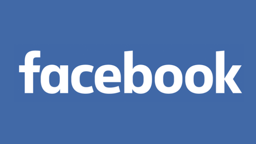
For the first time in a decade, Facebook has changed its logo.
Unlike Spotify’s change that ignited an Internet firestorm, Facebook’s tweaks are subtler and maintain its signature blue color.
In the new version, the double story a is now single-story, the o’s are thinner and the stem of the b is rounded. The iconic “f” remains lowercased.
This GIF, via Brand New, shows the slight changes made:
Facebook’s Creative Director Josh Higgins described the logo to the design blog Brand New as “more friendly and approachable.” As the social network increasingly shift its focus to mobile, the clear lettering in the new logo makes is appear snappier and crisper on mobile screens.
Facebook worked with Eric Olson, the designer of the original logo, to freshen up the typeface Klavika instead of rolling out a full revamp.
Stewart Devlin, the chief creative officer at Red Peak Branding told Digiday that it looks “unbalanced,” but doesn’t think it will stop people from using Facebook. “The old logo wasn’t an amazing piece of typography but it did have attitude,” Devlin said in an email.
The new logo will appear when Facebook is spelled out (i.e. on the login screen) and the favicon will remain the same.


More in Marketing

Star power, AI jabs and Free Bird: Digiday’s guide to what was in and out at the Super Bowl
This year’s Big Game saw established brands lean heavily on star power, patriotic iconography and the occasional needle drop.

In Q1, marketers pivot to spending backed by AI and measurement
Q1 budget shifts reflect marketers’ growing focus on data, AI, measurement and where branding actually pays off.

GLP-1 draws pharma advertisers to double down on the Super Bowl
Could this be the last year Novo Nordisk, Boehringer Ingelheim, Hims & Hers, Novartis, Ro, and Lilly all run spots during the Big Game?