Secure your place at the Digiday Publishing Summit in Vail, March 23-25

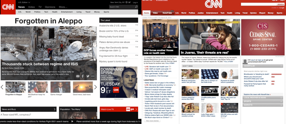
CNN.com has gotten a new face for the new year, and it is a reflection of the evolving habits of its increasingly mobile readership.
With its latest redesign, launched this weekend, CNN wants to make it easier for mobile visitors to read CNN stories and pass them along. The redesign is a huge undertaking for CNN, which publishes over 200 stories a day and gets 60 million monthly visitors a month, according to comScore. More, that audience’s consumption habits are changing: Nearly half of the site’s November readers in the U.S. visited on mobile devices, which creates new challenges for CNN’s designers.
“It was definitely time for a new look,” said CNN Digital editor-in-chief Meredith Artley. “The old site just didn’t reflect some of the shifts we’ve seen in our storytelling and audience over the last year.”
One of the big shifts is a greater reliance on original Web-only video, which CNN has poured significant resources into since 2014. With Digital Studios, launched last April, CNN has created original explainers and animated features meant to live on the Web, not television screens. The CNN.com redesign showcases that better, with a video landing page that features a large video player and links to CNN Digital’s original series. (Similarly, almost every story on CNN.com also features a related video clip, which the redesign’s backend changes make easier for reporters to embed.)

Another addition to the site is a live news ticker, which sticks to the bottom of the page as it scrolls through CNN’s top stories. “We were publishing all the time, yet the site always felt static,” Artley said. “The ticker feels more dynamic. We wanted to bring that sense of motion to the site.”
At the same time, CNN is also balancing the role of the homepage with the rise of social, which is dominating publishers’ referral traffic. While CNN still gets roughly 60 percent of its traffic from homepage visits, the rise of social distribution threatens to unseat the importance of its homepage as more readers come in through the side door. Artley said that CNN.com’s homepage is still centered around showcasing the biggest, most important stories, regardless of the trends in referral traffic.
“The homepage’s biggest strength and weakness is that it’s a powerful firehose,” said Artley. “We love that, but we know it’s not just about the homepage.”
Many of these changes aren’t sitting too well with some CNN readers, which have noticed that the new design comes with a few downsides, including longer page loading times. It takes 21.5 seconds for the new CNN.com to load — three times as long as the previous iteration, according to one test. Some readers have also taken issue with the decreased real estate CNN has dedicated to headlines on the homepage.
Artley said that CNN was aware of some of the early issues, particularly with the news ticker, which has had some stability problems. But she added that the new CNN.com is more of a soft launch than a final product, and CNN plans to tweak parts of the site over the next few weeks and months as it monitors site performance and user behavior.
“The days of the massive website relaunches are coming to an end,” she said. “It took us a long time to get this one out. We wanted to get this in a good place to launch it, but we also know that no site is ever perfect.”
More in Media

In graphic detail: Middle-tier creators are fueling the next phase of the creator economy
Facts and figures behind the growing middle tier of creators who make less than macro creators, but convert more.

How medical creator Nick Norwitz grew his Substack paid subscribers from 900 to 5,200 within 8 months
Creator Playbook: Unpacking the strategy behind medical YouTuber Nick Norwitz turning to Substack to significantly grow his brand.

Media Briefing: In the AI era, subscribers are the real prize — and the Telegraph proves it
In an era where AI is eroding referral traffic and third-party distribution, a subscriber who pays directly has become the most valuable reader a publisher can own. Springer just bought over a million of them.


