for the Digiday Programmatic Marketing Summit, May 6-8 in Palm Springs.

David Ogilvy is quoted as having said, “On the average, five times as many people read the headline as read the body copy. When you have written your headline, you have spent 80 cents out of your dollar.” That figure may well be higher now, with people increasingly coming to the news by clicking links in their social media feeds.
And so as publishers are getting increasingly tech savvy in the quest for audience growth, A/B testing, advanced by the likes of Google and Amazon, is becoming table stakes.
Upworthy is the most frequently cited example of this trend, having built its 2-year-old viral site on the back of A/B testing, in which a small portion of the audience is shown a different version of a Web page and their behavior tracked so that the site can be improved in real time. But other, older sites are jumping on board, using the practice to sharpen their ad and editorial game.
Upworthy is a client of Optimizely, a 5-year-old site that provides A/B testing tools to more than 8,000 customers. About one-third of Optimizely’s clients are media companies, including, in addition to Upworthy, CNN, CBS and Forbes. Most start out using A/B testing on different versions of ad creative running on their sites, said Helen Phung, head of communications for Optimizely.
But as publishers grow more sophisticated, they’re doing more A/B testing on the editorial side, to optimize social sharing and to customize the reader experience based on the type of device they’re using.
The rise of social platforms is behind the interest in A/B testing, said David Spitz, president and COO of RebelMouse, which does such testing for publishers and brands including The Dodo, GE and Mondelez.
“Reaching audiences beyond one’s own properties is becoming more critical,” he said. “In those environments, you don’t have a captive audience, and you don’t always know the context as well as you know the context of your own site.”
Along those lines, the Dodo uses A/B testing to fine-tune headlines and find the ones that will resonate the most on social media. It’s learned, for one thing, the word “epic” can make a difference. So “An Epic Battle Between Acrobatic Dogs and a Gardening House” got twice the click-throughs from Facebook and shares than the non-epic “Battle Between Acrobatic Dogs and a Gardening House.”
Much testing also has been done around content-recommendation modules, which have been controversial because their presence and content can clutter or downgrade the look and feel of a publisher’s site. Upworthy wanted to know if adding recommendations would lead to more social sharing. It tested various versions of modules and found that placing them to the right of an article, as in the screen shot below, led to a 28 percent increase in social sharing over the control site.
Business Insider ran a similar test to see how readers would respond to different recommendation configurations, one set selected by editors and the other by an algorithm, as shown in this example here. The takeaways were somewhat surprising: The machine-generated module at the bottom of the story performed modestly better than the human-chosen one that was placed below a story headline, as shown in this screen grab below.
“So our conclusions are that, one, readers value both editor-selected and algorithm-selected related stories; two, both placements are effective; and, three, using both together is the best,” CEO and editor-in-chief Henry Blodget said.
BuzzFeed is another publisher that uses A/B testing extensively. It has a homegrown tool that editors can use to test headlines and thumbnail images, said Dao Nguyen, BuzzFeed’s publisher. The site also uses A/B testing to evaluate site features and design changes.
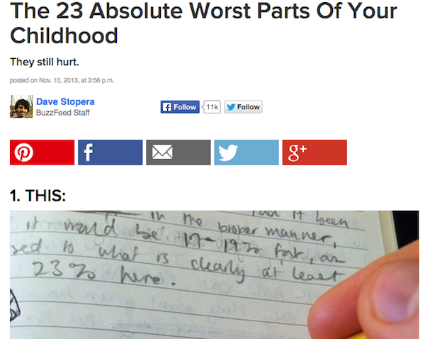
In one example, BuzzFeed noticed that people coming to the site from Pinterest “overwhelmingly want to pin again,” Nguyen said. The question was, how could BuzzFeed make it easier for them to pin content from the site. So BuzzFeed ran a test with a small number of users where it removed other sharing buttons. “Even if you took into account all the lost Facebook and Twitter shares, the amount of pinning overwhelmingly increased,” she said.
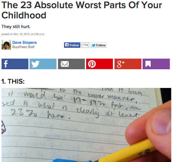
For example, when a reader landed on the story below from Pinterest, they got a version with fewer share buttons. Five in this case, when coming from Pinterest:
But when coming to the same story from search, the reader was presented with six share buttons:
That was a relatively dramatic change, at least for BuzzFeed, but A/B testing can show how even seemingly small alterations can have a big impact on audience behavior. When BuzzFeed updated its share buttons with a flatter color, sharing rose 20 percent, Nguyen said.
Because A/B testing centers on small changes, it favors an iterative approach to design rather than wholesale redesigns. As even testing guru Scott Huffman at Google (which is credited with spreading A/B testing as much as any company) is aware, it can encourage a test-taking mentality at the expense of out-of-the-box thinking.
BuzzFeed’s Nguyen asserts that while BuzzFeed avoids massive overhauls, its constant small tweaks add up to big changes to the site over time. She does, however, note the risk in assuming that just the results of one test can apply elsewhere on the site. “We’re not a company that’s slaves to the numbers,” she said. “We use data to inform decisions; we don’t use it to dictate strategy.”
More in Media

From page views to propensity: How the Daily Mail is retooling for a zero-click world
The pressure of zero-click underpins a wider product overhaul: games upgraded from sideshow to front door, new hubs like Crime Desk designed to keep niche communities coming back, an AI-powered dynamic paywall tuned to user behavior; a bigger bet on personalization and the app as a primary destination.

Bauer Media Group slashes publishing headcount in company-wide restructure
Some claim cutbacks will impact 20-30% of publishing headcount, with AIOs and escalating costs linked to Iran conflict cited.

Media Briefing: The ‘SaaS-pocalypse’ is spreading to publishers
As AI vibe-coding tools help publishers build their own software and products, the “SaaS-pocalypse” reshapes build-versus-buy decisions.


