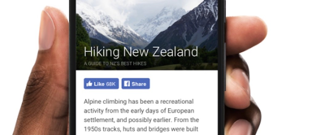
Facebook’s ubiquitous Like button is finally getting a modern look.
Facebook is ditching the social network’s “F” and replacing it with a thumbs up button in an attempt to boost engagement and load quickly more on mobile. Compare the old button (left) and the new button (right), below:

“Our hypothesis was that more people would understand the thumbs up icon on the Like button,” Facebook said, explaining that the redesigned version had to be brighter and bolder since 30 percent of Like button impressions happens on mobile. Last year, it completely redesigned its logo with mobile in mind. A full 82 percent of its ad revenue comes from mobile.
In addition to the Like button, the Share, Follow, and Save to Facebook buttons are all getting a similar new look. Facebook is telling publishers that the new suite of buttons will soon appear live in Instant Articles, too.


More in Media

Kai Cenat’s Streamer U was a ‘masterclass’ for brands looking to tap content creators
The creator bootcamp brought in big brand partnerships and big engagement metrics, which could bring more brands to the streaming sponsorship table.
Kroger’s new CEO, a Walmart veteran, is focused on speed and execution
Foran joined Kroger in February after serving as CEO of Air New Zealand since 2020. Before that, he was president and CEO of Walmart U.S. for about six years.

In Graphic Detail: The real impact of creators at the World Cup
The 2026 World Cup buzz was all about creators; we look at the numbers breaking down their impact at the global tournament.