Secure your place at the Digiday Media Buying Summit in Nashville, March 2-4
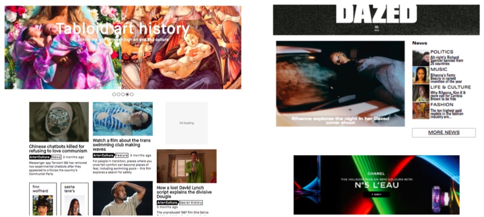
Lifestyle and culture magazine Dazed redesigned its website this September with the goals of getting people to read more articles, making native ads more visible, and focusing on fewer, more effective display ads.
The redesign has increased time on site by 21 percent to two minutes and 19 seconds, according to the publisher. The article page was tweaked to show three related articles and one native ad, based on prior site behavior.
Dazed has served 5.7 million native ad impressions across the site in the last month, like this text-based article on portraits from citizens of Memphis in partnership eyewear brand Ace & Tate. These are co-created by the Dazed editorial team and the advertiser. According to the company, readers that come from its homepage (roughly 15 percent of all traffic, Dazed estimates) are spending on average seven minutes with its native ads, rather than roughly two minutes before the redesign.
Those changes were driven by advertising clients requesting more visibility for their native posts. Previously native ads were getting lost on the old homepage, which was an updated feed of the most-read articles, according to Bridget Mills-Powell, head of digital at Dazed.
Publishers are keen to keep people glued to their site, as time spent is proving a more attractive metric to advertisers than pageviews or video views. USA Today has redesigned its site around personalization to encourage readers to stick around, leading to a 75 percent increase in time spent per article.
As part of the redesign Dazed overhauled its display ads, scrapping ones that were “great for impressions but bad for viewability,” said Mills-Powell. Native ad revenue currently makes up half of Dazed’s digital revenue, with display advertising accounting for the other half, although Mills-Powell anticipates native will overtake display next year. Dazed introduced a bespoke header unit, which existing clients Hermes, Balenciaga and Gucci have used on campaigns. The latter had 1.66 percent click-through rate during the week the site went live, industry average click-through rates are woefully low at 0.35 percent, according to Google. As a result, viewability has also gone up by 20 percent, according to the company.
Most people won’t access Dazed by visiting its homepage, but those that do are its most loyal and engaged users. Since the redesign, the number of visitors to the homepage who go on to view three stories has increased by 34 percent and the number clicking on two stories has increased by 43 percent. Dazed doesn’t typically share absolute traffic numbers.
An internal core team of five have been working on the Dazed redesign for about two months. Dazed will keep A/B testing over the next few months, one avenue it’s looking at is how to tailor content to users based on referral, whether that’s social or search.
Image: courtesy of Dazed via Facebook.


More in Media

From feeds to streets: How mega influencer Haley Baylee is diversifying beyond platform algorithms
Kalil is partnering with LinkNYC to take her social media content into the real world and the streets of NYC.

‘A brand trip’: How the creator economy showed up at this year’s Super Bowl
Super Bowl 2026 had more on-the-ground brand activations and creator participation than ever, showcasing how it’s become a massive IRL moment for the creator economy.

Media Briefing: Turning scraped content into paid assets — Amazon and Microsoft build AI marketplaces
Amazon plans an AI content marketplace to join Microsoft’s efforts and pay publishers — but it relies on AI com stop scraping for free.