In 2010, when husband and wife team Scott Palmer and Kristi Knoblich were looking for just the right legal marijuana high, they found a real gap in the market. Edibles either tasted bad, were poorly labeled or just didn’t do it for them.
So they decided to make their own.
Noticing that cannabis went especially well with chocolate, the duo worked with a chocolatier to use a “cold water” method that used no butter or any other solvent to create weed chocolates.
For the duo, who were both cannabis users, or “patients,” as they refer to legal users, it was a turning point. (“Patients” is how brands refer to legal users of medical marijuana who use it to treat ailments from joint pain to anxiety. It also sounds better than “stoners.”)
Six years later, their brand, Kiva, is one of the frontrunners in the cannabis market in California. “Kiva’s become the golden standard by crafting a brand and packaging that would be aspirational for any industry — especially in an emerging space like cannabis where there aren’t any set rules yet,” said Pam Webber, CMO of 99Designs, an online marketplace for graphic design that has done branding for several cannabis brands.
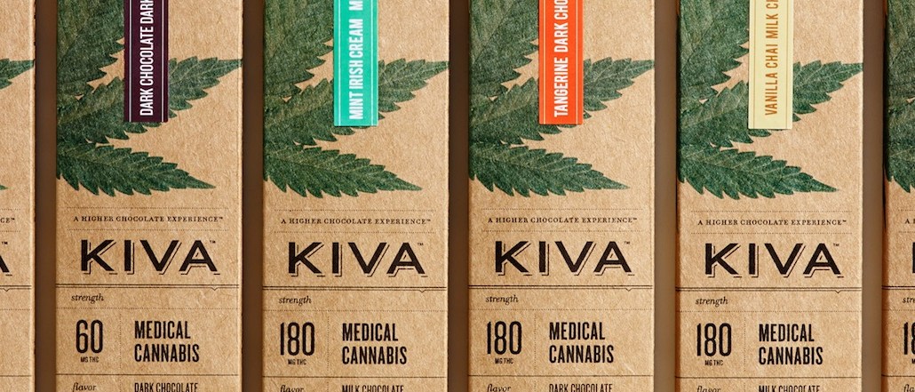
The brand, which only makes edibles — mostly chocolate of a variety of flavors and now, mints — has made a name for itself thanks to a stripped-down, clean product line that takes the guesswork out of how to buy and ingest cannabis. The brand is also active in the education space, working with the National Cannabis Industry Association to make the experience of buying cannabis pleasant. And, because of its aesthetic, it’s appealing to a wider swath of the population. It’s also got a sales pitch focused on California-style quality: pesticide-free, award-winning cacao beans, for example.
It’s a big opportunity. Marijuana legalization is coming; half of the states in the U.S. today have legalized use of cannabis for recreational and medical use. And Bloomberg estimates that the market will hit $50 billion by 2026. Ad agencies and the marketing machine at large have kicked into high gear as well.
But the very opportunity presented by the industry is also it’s biggest challenge: It’s grown like, well, a weed. There are thousands of ways to ingest the substance, and the legal experience remains complicated. Dispensaries in California can have hundreds of strains, and there are long lines at stores.

Kiva’s growth has been largely because it understood these complications. The first problem was the experience. Christie Strong, head of communications at Kiva, said that the decision to have dosage very clearly labeled was meant to dispel any confusion in the product. Each bar of chocolate indicates the dosage. At several packaging points, there’s THC components and information included.
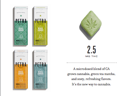
The brand most recently also debuted what it’s calling “micro-dosing” — a new mint product with about 2.5 milligrams of THC in each mint. “Medical cannabis is not a niche product. It’s been used for thousands of years. It has this stigma in America. It needed to be normalized. Packaging was a way to do that,” she said.
The second, the in-store experience, was also solved by packaging simplicity. Kiva sells products in easily identified ways. “When you walk into a collective, it’s absolutely overwhelming. And exciting,” said Strong.
That’s why Kiva’s entire focus has been on creating educational packaging and teaming it with a social presence that’s all about why cannabis is useful for pain, stress or other ailments. (Getting high is a “side-effect,” per Strong.) The brand said it’s on a healthy growth trend and currently available in California, Arizona and Nevada, with plans to open in Illinois, Colorado and Oregon soon.
Webber, who has tracked the industry for a while, said that 44 percent of registered logos feature the marijuana leaf — including Kiva. That’s a good thing: Cannabis is immature enough a market that having the leaf helps in product recognition. Designs have to “evoke professionalism and trustworthiness in the product,” said Webber. So Kiva’s leaf is more botanical, very “herbal,” she said.
Companies now differentiate on other things, like naming or packaging that appeals to a new subset of cannabis user. “Packaging and branding is getting away from hippie, stoner vibes,” said Webber. Hence the craft paper used to package, and smart ways to display products inside dispensaries so the product would look just at home among Ghirardelli chocolates as it would pot.
It’s not about people bringing brownies to concerts any more. Kiva wants to be the cannabis brand of choice for soccer moms, too, said Strong. “A lot of people use cannabis to go unconscious. But we’re all about conscious cannabis use.”


More in Marketing

Electronic Arts is betting that in-game ads can out-earn CTV
To make in-game ads stick, EA has built its own stack rather than rent one. Now it wants to shape the standards before anyone else does.

Future of Marketing Briefing: Why Bose is building an entertainment company
Bose has a new entertainment division. Its CMO hasn’t used a creative agency in five years. The two things are related.

The rise of pharma ad tech
Insiders say it comes at the cost of legacy platforms such as DSPs and SSPs.