Pantone’s choice for Color of the Year, the shade that the color institute and consulting agency picks as the one that will define design and style trends, as well as fit the national climate for the upcoming 12 months, has become the peak annual event for a company whose work is mostly done behind the scenes.
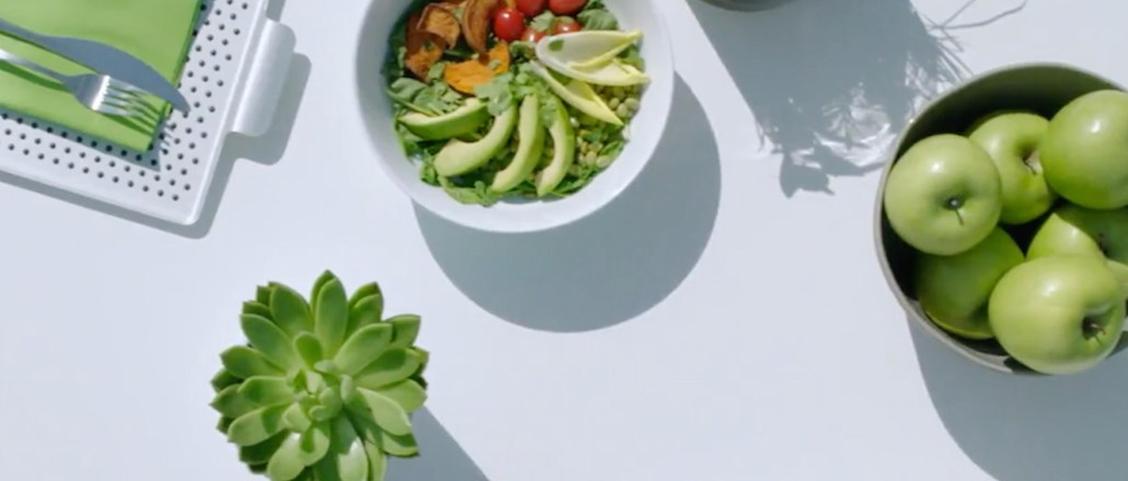
On Thursday, Pantone named “Greenery” (or Pantone 15-0343), the 2017 Color of the Year. The yellow-green hue is associated with spring, rejuvenation, Kermit the Frog and $11 kale juice. The reasoning? Even Pantone is feeling the fallout of the 2016 election cycle.
To read the rest of this story, please visit Glossy.


More in Marketing

Future of Marketing Briefing: The case for and against the death of the big brand ad
Marketing has a new favorite argument: is it still smarter to talk to a million people at once, or to find the thousand people they already trust?

Lifestyle brand Stanley 1913 uses AI behind the scenes — but execs claim it won’t touch ad creative
Not every brand is racing to let AI anywhere near its ads. Stanley draws the line there on purpose.

TikTok’s Kat Marquez unpacks NBA and WNBA creator deal
TikTok’s latest move to secure its share of the leagues’ growing audiences sees it play gatekeeper between creators and rights holders.