Since its humble beginnings in an apartment in Brooklyn in 1999, digital agency Huge has grown to more than 750 employees and has opened eight offices around the world. But after nearly a decade of the same old agency branding, Huge decided it was time for a change from its original logo designed by Huge’s founder, David Skokna, who left the company in 2010. Here’s what the old logo looked like:
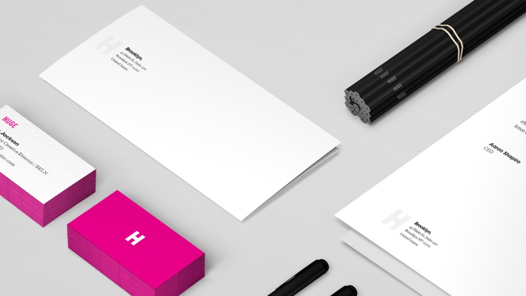
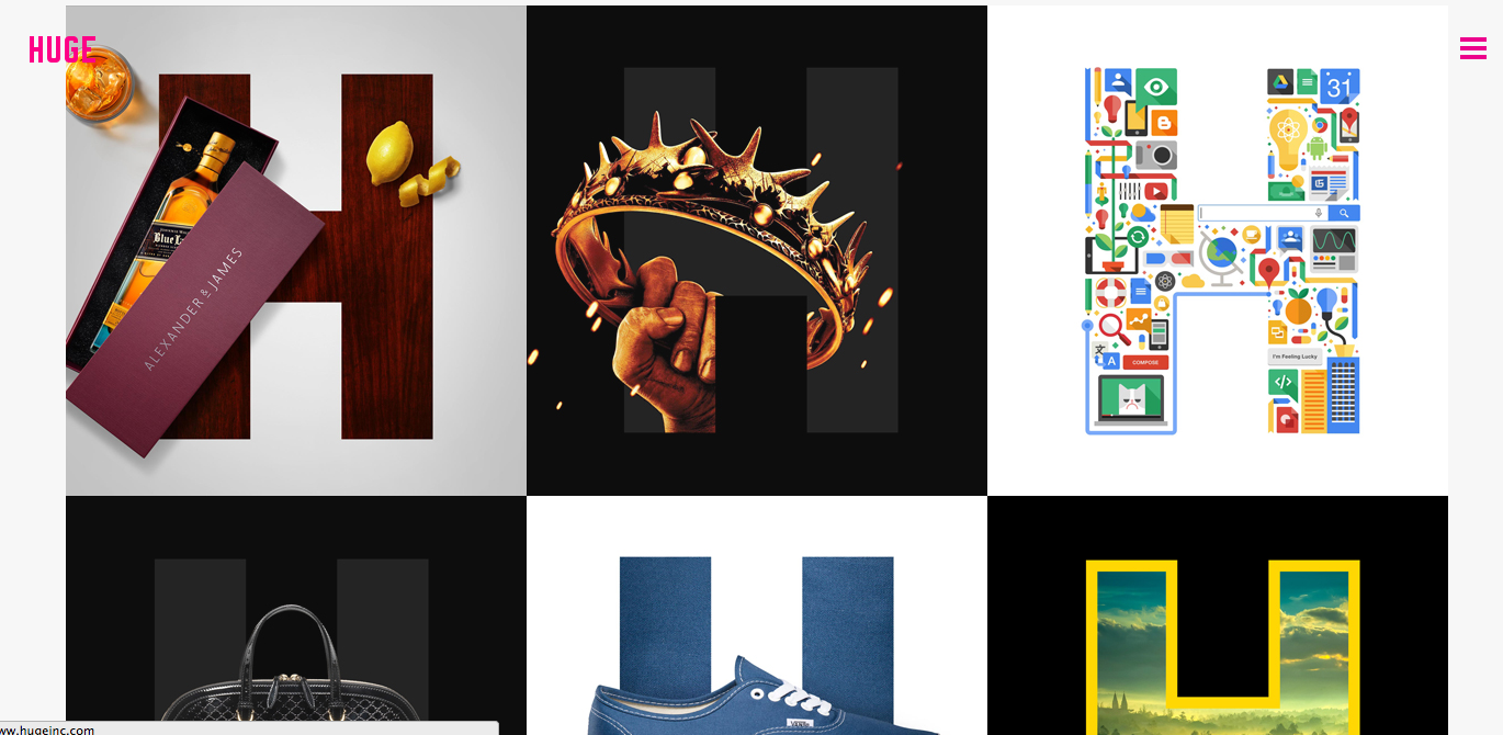
The new design, though staying mostly true to its former iteration, uses a grid system for the logo, and introduces a new serif font called Galaxie Copernicus to use as a body text. The website also features a series of ‘H’ flags by its designers to represent its clients, and its work.
Digiday spoke with Huge’s executive creative director Jon Jackson about the process behind Huge’s redesign, the changes afoot at the growing agency, and why it was ready for an update. Excerpts:
Why the change?
It was really about making an update from where Huge was seven years ago. I think we’re seven years more advanced. It was time for a bit of a refresh. The original logo was Din typed out and was nothing too thought out. Also, since there are so many of us now — client decks that we use have been handed down and translated, and they’re now a shadow of their former selves. We wanted to eliminate the growth and bloat of the style guides that got all funky.
How’d you work out the design for it?
Almost all of our designs start with a grid, and so I thought it’d be great to use a grid to do our own branding. To me, the best thing about it was trying to make a system that really stuck with the way that we approached things. It’s all about simplification. We were also using [the color model] CMYK when we started, but in the redesign, we just decided to use M, gray, black and white. It didn’t need a lot of unnecessary design and embellishment. But a lot of it is still in process.
How different is it really from the old logo?
I mean, it’s not a catastrophic change, but we cleaned up the letters, and it’s been a smart and timely redesign. No one has said that we’ve totally changed the brand. The introduction of the serif typeface for me is a no-brainer. I was down in Cabo fishing with a few friends, and there was a nightclub down there using magenta and Avant Garde, and it didn’t look sophisticated. We don’t want to look like a rave club; we want to look professional.
What was the redesign process like?
To me, the whole process is a challenging one when you’re your own client. There’s a lot of crazy stakeholders, and everyone has an opinion. It’s easy for it to get watered down because there are so many cooks in the kitchen. There’s a lot of people, and there’s a very select vision of a few. I think we just want people to think that we totally give a fuck about what we’re doing.


More in Marketing

Future of Marketing Briefing: The case for and against the death of the big brand ad
Marketing has a new favorite argument: is it still smarter to talk to a million people at once, or to find the thousand people they already trust?

Lifestyle brand Stanley 1913 uses AI behind the scenes — but execs claim it won’t touch ad creative
Not every brand is racing to let AI anywhere near its ads. Stanley draws the line there on purpose.

TikTok’s Kat Marquez unpacks NBA and WNBA creator deal
TikTok’s latest move to secure its share of the leagues’ growing audiences sees it play gatekeeper between creators and rights holders.