Secure your place at the Digiday Publishing Summit in Vail, March 23-25
From the original banner to Tosh.0: The hits and misses of publisher ad plays
There is nothing wrong with your computer. Do not attempt to update your browser. You are about to be exposed to relics of web advertising’s past, and some of it won’t be pretty. (If you find yourself feeling the onset of PTSD, fast forward to 2006).
Since the early days of the Net, publishers who took the digital plunge have experimented with ways to monetize their pages, and this try-and-test mindset has continued to this day.
“Advertising is still very much being learned online,” said Jeremy Belcher, associate director of user experience at Big Spaceship. “Some publication thinks, ‘We haven’t tried this. Let’s do it.’ And then others see and replicate it.”
Scroll through these triumphs and challenges to see where publisher monetization started — and where it’s going.
1988 – Prodigy can’t quit print
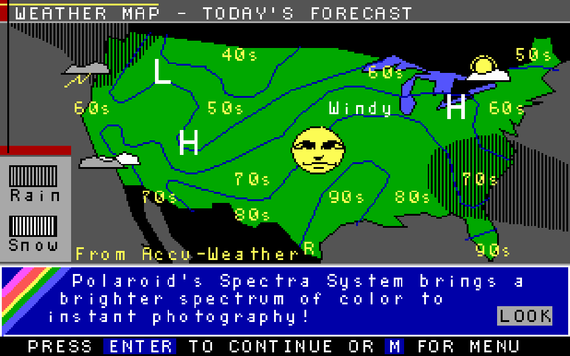
Even before today’s web, paid online services like Prodigy launched the first display banners for clients like Sears in the 1980s, but they were literally for display only.
“When the web first started to take off, most sites were essentially a rollover of print,” said Belcher. “That’s where the banner ad comes from. Now [publishers] could cash in on a couple extra bucks by making a digital version.”
At first, users could see the message, but they couldn’t click.
“In the same way that you might have a billboard in a space, it’s not exactly trackable,” said Belcher. “It’s just pervasive and persistent branding all around, a matter of impressions and eyeballs.”
1994 – Never clicked an ad? You will.
That changed when a law firm bought the first clickable banner ad from Global Network Navigator, the first web publisher to be supported by advertising. The pay-per-click versus pay-per-impression game was on.
Much more famous is AT&T’s “You Will” clickable banner campaign. With an opaque message that dared users to click, the ads boasted a 44 percent click-through rate (largely due to the novelty, though it was a creative execution for its day).
Their ubiquity soon gave birth to banner blindness. “Eye-tracking tests show you over and over again that if something looks like an ad, people ignore it,” said Belcher. “That’s what led to these experimentations with other ad formats.”
Unfortunately, banner ads reigned unopposed for nearly a decade.
2003 – When plain text popped
It looks stale and stilted now, but when Google launched its AdSense option for publisher monetization in 2003, it was a breath of fresh air for users exposed to the ads in a text-based web.
“Text tended to look a bit more like a native part of the site versus banners, which look more like additions or sponsorships,” said Belcher. “So text was less likely to be ignored.” Of course, these too eventually became invisible to scanning users.
AdSense also represents the industry’s entry into retargeting. “It’s real-time, targeted advertising,” said Belcher. “You’ve searched for whatever the thing is, and then they’re advertising that thing directly to you.”
2006 – Web advertising gets its diva
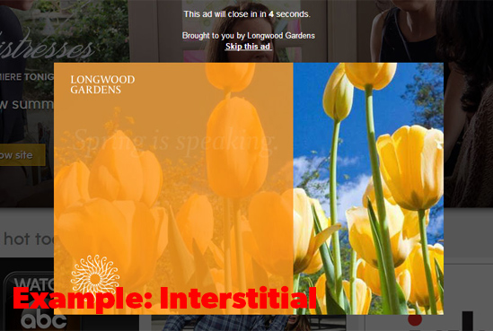
By 2006, publishers were ready to shove advertising into the limelight with interstitials, which had finally come of age. The peacock of formats, they were big, bold and in-your-face: perfect for the increasingly visual web and exactly what advertisers wanted, allowing publishers to charge a premium. Why?
“To counter banner blindness,” said Belcher. “And as far as business goals, it actually does work.” But the bigger the ad, the higher the risk of bad UX. “If the ad servers are slow and the interstitial lags, people might just leave your site entirely, which backfires in the most complete way.”
Another publisher tactic? The interstitial countdown, constraining users to stare at an ad for an allotted time before proceeding to their content. “Whether or not that actually spurs a user to take an action, I can’t say,” said Belcher. “But it increases viewing time, and publishers can turn around and charge advertisers more money.”
2007 – Taboola plays matchmaker
Harkening back to the targeting lessons learned from AdSense, Taboola was founded to connect publisher content to relevant ads (or advertorial) through an on-page widget. This can often work well for the whole trinity of publisher, advertiser and user if it shows ad content that helps users continue their journey.
“But if I’m reading an article about Syria and I get to the bottom and it’s a blatant [sponsored] publication for why [a company] is the best choice to buy your connected services, that isn’t relevant at all,” said Belcher of the service’s tendency to sometimes surface out of context links. “No user values that.”
2008 – Hitching a ride on the main attraction
“With the reduced real estate of mobile, the [content and advertising] are all up in each others’ faces,” said Emily Wengert, vp of user experience at Huge.
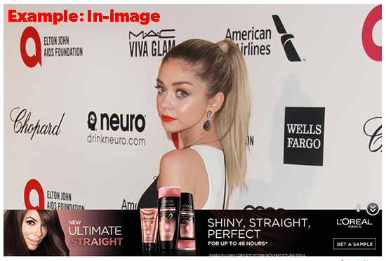
To solve that problem, publishers looked for solutions that economized on space without adding to clutter. In-image advertising, launched by GumGum in 2008, places ads in contextually-related editorial images. This allows publishers to reduce the amount of advertising in traditional places like their right rail and regain space for content, all while keeping the ads highly visible. The format is even more common in today’s increasingly visual web.
“People are visual, so using images makes advertising more embedded in their journey,” said Wengert. “There are examples out there that really do it well, when the advertising and the image are related, like if you’re able to show the clothing they’re wearing to sell the outfit. It’s a service layered on top of that image.”
“But when there’s no strong connection, it starts to break down,” she added. “Then it’s something you try to brush out of the way, like a cobweb, to get at something you actually want.”
2010 – Advertising as ends, not means
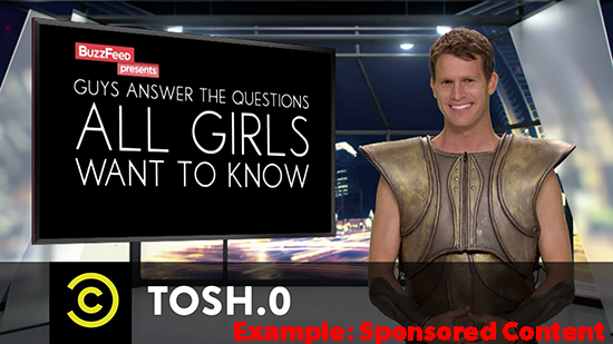
There’s clearly been a tension between foregrounding the ad and foregrounding the content since publishers started to monetize. BuzzFeed put that debate to bed by making the two parties one and the same.
In 2010, the pop culture publisher launched its first piece of sponsored content to support Comedy Central’s Tosh.0, and the industry hasn’t looked back since.
Of course, the tactic doesn’t suit everyone. “The difficulty depends on the brand,” said Wengert. “If you’re the Hunger Games trying to advertise your movie, it’s much easier to create adjacency.”
2015 – Data, data everywhere
Publishers now know that foregrounding formats isn’t enough. As foreshadowed by AdSense way back in 2003, targeting has become the new publisher arms race. Those with the data to deliver the right message to the right person in the right context, regardless of its packaging, are set to win. Even images are becoming data points thanks to blossoming image recognition tools from companies like GumGum that allow brands to pair their messages with resonant visuals.
“The future of advertising is going to be highly personalized, highly targeted and well-timed,” said Belcher. “It would be wise for publishers to figure out how to incorporate that into their sites. In the end, that’s what’s going to grab the most attention. It goes from being an annoyance, something to be ignored, to something that’s actually helpful.”
More from Digiday

Middle East conflict casts shadow of global ad outlook
The ad market had questions about 2026. Now, it has more.

Sephora announces partnership with F1 Academy
As the official beauty retail partner of the series, the beauty giant will appear on a dedicated Sephora-branded car.

Customer reviews become a key battleground as AI revolutionizes product discovery
AI Platforms like ChatGPT and Perplexity are reshaping how customers discover products online.
