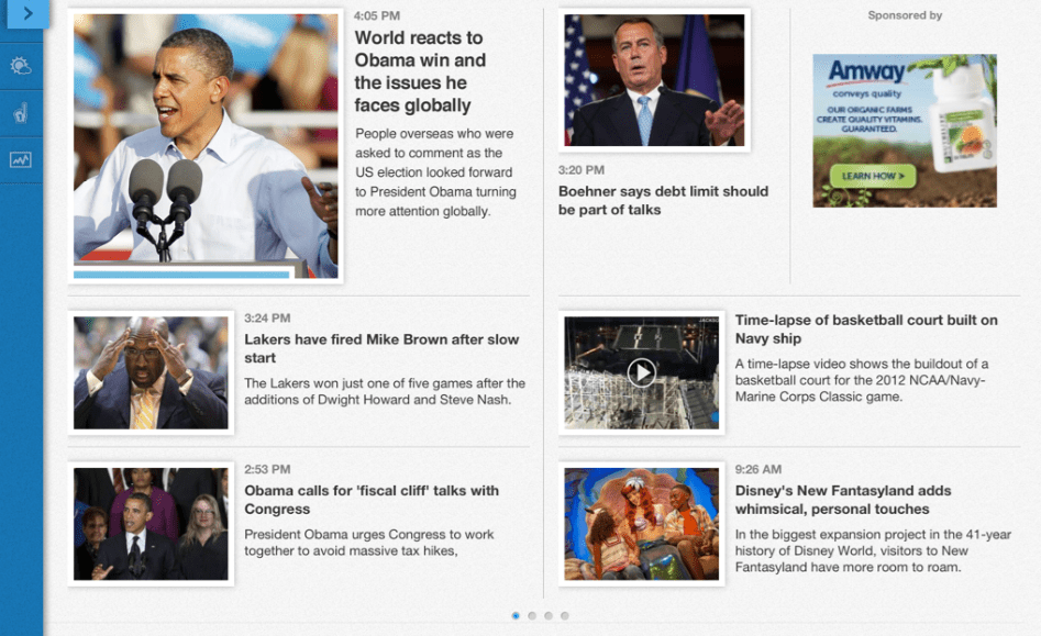
USA Today’s following up its drastic new design for its website and paper with a refreshed iPad app.
Among the new bells and whistles: USA Today can now program the app directly for different times of the day. The app is more visual, has live video coverage and more interactive weather capabilities.
“It goes beyond a news-reader and provides greater utility and a more dynamic experience that allows consumers to get their news quickly when and how they want it,” said David Payne, Gannett’s chief digital officer.
The app has elements from the current browser version of USA Today, and also sees a lot of the similar design cues, such as the left-right-close as a navigational construct. There’s also more customization in the app, so a reader can have a better customized view of the content they like. The old app was a one-size-fits-all approach and now has a list view and visual representation.
Another new feature is its airplane mode, which gives readers the ability to download stories and be able to read them even when not connected wirelessly. Having live video from across Gannett is also in this beefed up version. Clearly, the company has realized that it has a vast trove of content across its 80 different publications and can use technology to promote stories from one outlet to another. Perhaps the most interesting aspect of the new app is that USA Today can now program content — as well as the visual aesthetics surrounding the story — based on the time of day. For example, you may see more of a list of content delivery in the morning, as research finds people are just scanning headlines, compared to a more visual view of the news in the evening, when we’re in lean-back mode.
Beyond these new updates for readers, the redesigned app has implications for advertisers, too. Inside an article in the app, there will only be one ad per page. So while inventory is less than what it was, and this was part of the overall redesign in October, there will be other units such as a full-screen interstitial ad between section fronts and articles.
“Our theory is that if we can create HTML5 ads that live across desktop screens and touch screens and make them highly engaging — include a lot of video — that’s the way to change the ad ecosystem,” Payne said.
While the company’s launching this new version of the iPad app, it’s still heavily invested in its mobile browser. With more than 30 million iPads in the U.S., a publisher can only reach a certain amount of people coming in natively. USA Today wants to have a consistent experience across the browser and in the iPad app.
“A lot of work has been done to make experiences better from a ad standpoint and a utilization standpoint,” said Payne. “It gives us a bigger footprint.”
More in Media

The biggest creators feel growing pains as they try to build successful standalone companies
Successful creators like Alex Cooper or MrBeast are creating media companies, to varying degrees of success and struggle.

Media Briefing: Publishers cautiously count AI licensing as notable revenue amid programmatic strain, in Q1 earnings
Amid declining referral traffic and programmatic ads, publishers are beginning to see meaningful revenue from AI licensing deals.

Retailers are rushing to build AI apps. It’s unclear if shoppers will use them
There are almost 900 apps on ChatGPT and 353 Claude connectors, according to AppDiscoverability.com, which tracks AI app data.


