Twitter’s original logo designer explains why the bluebird worked so well, and how ‘X’ changes everything

Every bird hatches from an egg, but only one was born out of circles.
This week, Twitter’s beloved bluebird logo was killed by an “X,” marking the end of an era for the social network as it undergoes a first rebrand under Elon Musk.
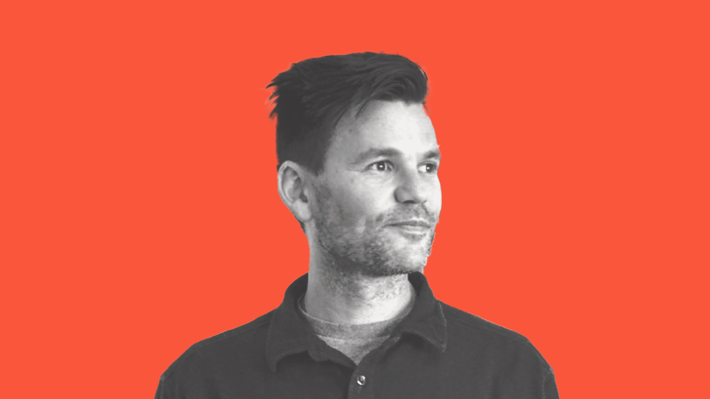
The image, created by artist Martin Grasser and two other designers, debuted in 2012 and became iconic. However, the process of creating it included sketching countless birds and using circles to develop a sense of “underlying neutrality and simplicity” to symbolize the app.
Since then, Grasser — now an artist and founder of the design firm Studio Mococo — has worked with a variety of brands including PayPal, SoftBank, Bumble and Rdio. He’s also immersed himself in the world of generative art, including a new collaboration with the generative artist Vera Molnár that debuts today at Sotheby’s.
In an interview, Grasser spoke with Digiday about developing Twitter’s logo — which he also explained in a viral Twitter thread on Sunday — the ways design in marketing and tech have evolved, what he thinks of the new logo and how his creation process resembles an analog far ahead of the current conversations about generative AI.
“Once you agree on the construction method, that is really what’s driving the shape,” Grasser said. “What gives the bird whatever charm it has is that it’s constructed by that single shape. It’s just a really pleasant shape and I think that resonated with people.”
Note: This conversation has been edited for length and clarity.
Was designing Twitter’s logo your first foray into drawing birds?
My interest was in two-dimensional form. That’s really where the overlap for me was: How do you flatten something out and sort of modulate two-dimensional space in a way that renders well at a big size and a small size? A logo’s got a bunch of duties to perform, and you kind of have to design with those in mind. It was mostly a background in type design and understanding how form and shapes work at very small sizes and optical corrections that you can make to allow for clarity of shape.
What helped the logo stand the test of time even as the platform evolved?
With [Twitter co-founder Jack Dorsey and project creative director Todd Waterbury], there was just a push towards simplicity, and you can see that in the final logo. It just feels harmonic almost, or something to me [that] feels like a major chord. Something [that] feels like it works in the space that it’s built-in, and that was about removing embellishments and removing details to just focus on one core message to get across.
Jack and Todd both had an extreme focus on simplicity. The platform, at least at the time, had a sense of simplicity, brevity and clarity. I remember Todd talking about brevity and clarity a lot, and that’s an interesting visual cue to go off of: What does brevity look like as a design?
Your iterative process of drawing so many versions of birds while designing the logo reminds me of how people talk about generative AI helping designers to develop and scale ideas. What do you think about that?
I’m a practicing artist who releases art on Art Blocks and Art Blocks Engine. If you look at the Twitter logo, I’m hard-pressed not to make the link between [that and] generative art. You can look at the circles popping up and almost imagine writing a program. “Give me what’s in my Illustrator file: Two circle birds, three circle birds, four different circle sizes made out of two circles.” It’s all these various iterations.
What I’m excited about is for brands to start to understand how to use this to speak and to build communications that feel more modern … There’s a really exciting opportunity if brands can start seeing designers as artists and how that can shift the economy for creation.
Did you expect the bird to have as much cultural concentration as it’s had?
[Twitter] is an interesting company because you don’t really interact with the logo. It’s not like you buy it and get it shipped to you, but it was everywhere else: On a six-pack of beer, a bag of walnuts or whatever, on three tennis balls you pick up. There was a ubiquity about it. No matter what, the Twitter logo is going to be ubiquitous by just being Twitter’s logo, but I think that we were able to combine it with something simple.
Any thoughts on the rebranding and what you think it means from a design perspective? What’s your take on it as the designer who did the one that came before X?
The challenge you’re going to have is that the letter “X” is sharp and aggressive. It’s a super fascinating letter from the standpoint of its construction. It has a bunch of optical corrections so it’s not just two lines intersecting. There are a bunch of weight shifts and lineup shifts that happen at the intersection of the “X.” Their challenge is going to be making it friendly and approachable. The name makes sense as a one-stop shop for your everything app. It’s up to them to make it work, but it feels like they have every opportunity.
What’s the role of design in social media now and how is the landscape different?
I just feel like it was a more optimistic time when I designed that bird. In a lot of ways, it almost represents the adolescence of the internet and I like what we found. Twitter delivered on it really well for a really long time, but the sheen is off or something. We’re not so accepting of tech optimism. That’s a thing that has changed: We’re all a little bit more aware.
I just think back to when we were all so excited about the promise of connection and globalization — we were all going to be connected — and there was an excitement…Back then, we were counting on this technology to help us so much.
If you were asked to design or redesign a logo for another social network, what design principles would you prioritize?
It’d be really interesting to build something generative for the user. That would be the beginning of an interesting conversation around logos. I know people are doing that, but what it looks like, when it works, or when it’s completely digital, could be something that could be interesting.
That being said, people seem to love the bird. And the response I got on Twitter just shows how people can connect to simple shapes. It’s just a bird drawing, but obviously, it can be more than that.
More in Media

Media Briefing: Overheard at the Digiday Publishing Summit, March 2026 edition
With no sign of search traffic returning, publishers are doubling down on subscriptions to build direct reader revenue — but it’s not easy.

People Inc.’s Jon Roberts on the AI licensing boom – and the revenue lag
People Inc’s Jon Roberts discusses the boom in AI content licensing marketplaces — and the revenue that could materialize for publishers.

YouTube is building infrastructure for the full creator-brand partnership life cycle
YouTube’s Gemini-powered Creator Partnerships promises to alleviate pain points in the influencer marketing pipeline.


