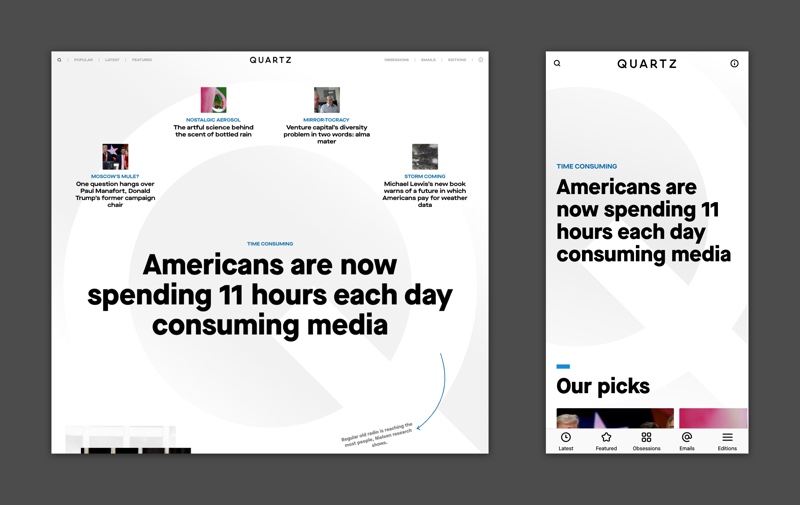
Quartz is expected to unveil a new version of its site on Aug. 1 that’s aimed at increasing newsletter subscribers, keeping readers on site longer and delivering advertising through private programmatic marketplaces.
The redesign, the site’s fifth in six years, will also make it easier to implement a paywall or other product features required when Quartz begins to go after subscription revenue, a priority of Quartz’s new owner, Japanese media company Uzabase.
“We wanted to adopt a new, more modern tech stack to put us in better position for the next six years,” said Zach Seward, Quartz’s chief product officer. “Once we knew we were going to rewrite the site from scratch on the engineering side, that presented the opportunity to revisit everything else.”
As with many other recent publisher redesigns, improving site speed was a top priority. Quartz’s page-load speed already ranks in the top third of websites, according to Google’s page-speed test, but Seward said he wanted the experience of navigating Quartz’s site, particularly in moving from one page to another, to feel faster.
Quartz dumped infinite scroll from its mobile site two years ago, and the forthcoming version won’t have it on the desktop version either. In its stead, Quartz will run three tests aimed at growing user time on site. An article-recommendation widget will show either a trending story, an article that is closely aligned to the topic or a story that deals with one of Quartz’s core editorial coverage areas. In the latter two cases, the stories can be hand-picked by editorial staff or automatically chosen by the CMS.

The ad load will remain the same, but the site will accommodate more kinds of ads beyond the branded content that remains Quartz’s focus. In May, Quartz joined Concert C-Suite, a private ad network that features titles including Vox Media’s business-focused sites and CNBC, which offers ad units that are new to Quartz. The new site will also feature full-page display ads like ones Quartz began tinkering with last year when it launched two sub-brands, Quartzy and Quartz at Work.
To improve navigation and help first-time mobile visitors sign up for email newsletters faster, the site’s newsletters, along with Quartz’s editions and beats, moved to a navigation bar at the bottom of the mobile page. About two-thirds of Quartz’s audience visits via mobile devices.
More in Media

Inside The Daily Mail’s creator-led content playbook
Inside the structure, strategy, and metrics of the Daily Mail’s creator-led content push.

Media Briefing: Overheard at the Digiday Publishing Summit, March 2026 edition
With no sign of search traffic returning, publishers are doubling down on subscriptions to build direct reader revenue — but it’s not easy.

People Inc.’s Jon Roberts on the AI licensing boom – and the revenue lag
People Inc’s Jon Roberts discusses the boom in AI content licensing marketplaces — and the revenue that could materialize for publishers.


