The heat of the summer is giving publishers redesign fever.
The New Yorker, Cosmopolitan, and Complex have all relaunched their websites with a particular eye for mobile and social. The Web ages page designs quickly, and this latest batch of redesigns show that these magazine publishers are trying their best to keep up with the pace of change online. Here’s what they’ve cooked up.
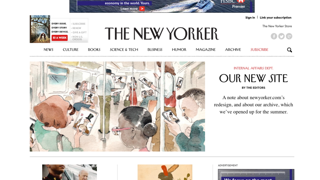
The New Yorker  The New Yorker is not only shifting its digital strategy — it’s updating its website as well. The new NewYorker.com, launched today, features many of today’s design best practices: it’s clean, responsive, and built with mobile visitors in mind. It also comes as the New Yorker plans to increase its digital metabolism: TheNewYorker.com already posts 15 stories a day, and it plans to post even more content with the new design — including podcasts, interactive stories, videos and slideshows.
And then there’s the site’s new paywall, which it plans to introduce later this year. As with The New York Times, The New Yorker’s metered paywall will give readers access to a handfull of articles a month before asking them to pay up. The New Yorker calls it logical and easier-to-use.
Cosmopolitan.com 
The new Cosmopolitan.com is, in a word, flashy. The site, which Hearst launched earlier this month, is very much on-brand, with large images, bold headlines, and, a header background image that the site’s editors refresh each day.
There’s also a surprising amount of tech here as well. The new Cosmopolitan.com tailors itself to the habits of the reader, tweaking article links depending on which kinds stories each reader clicks and shares the most. The approach makes sense: If Cosmopolitan’s editors want to keep readers clicking, it helps to present them with more content that they’ve already demonstrated an interest in.
Likewise, Cosmopolitan is also keeping in line with industry best practices with its new infinite scrolling functionality, which lets readers scroll though ever-lengthening stream of related content.
Complex.com 
Clean. Responsive. Focused. Simple. These are the words Complex uses to describe the new Complex.com, which it says is built with the user experience in mind. For one, Complex.com features a so-called “unified design,” which means that readers will get the same experience on smartphones and tablets that they will on desktops.
Complex is also heavily pushing its video output here. Instead of opening on new pages, videos on Complex.com quickly open in popup overlays and load very quickly thereafter.
Sports Illustrated 
SportsIllustrated.com expects half its traffic to come from mobile devices by year’s end, which is why it built its latest redesign with that in mind. The same goes for readers coming in via social channels, which represent an increasing amount of SI.com’s traffic. SI.com wants to keep them around longer with bigger social sharing buttons and links to 120 Sports, Time’s new sports video site.
[polldaddy poll=8198679]


More in Media

Kroger’s new CEO, a Walmart veteran, is focused on speed and execution
Foran joined Kroger in February after serving as CEO of Air New Zealand since 2020. Before that, he was president and CEO of Walmart U.S. for about six years.

In Graphic Detail: The real impact of creators at the World Cup
The 2026 World Cup buzz was all about creators; we look at the numbers breaking down their impact at the global tournament.

Media Briefing: Brand authority and trust are becoming publishers’ newest AI assets
Some publishers are betting that trusted brands and editorial authority are becoming their biggest competitive advantage with LLMs.