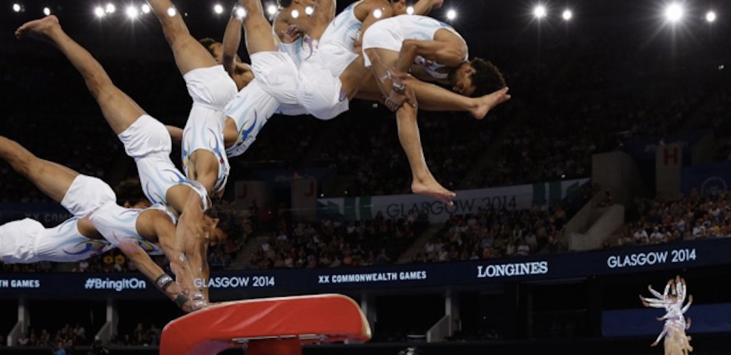
While plenty of people will get a thrill from watching Tom Daley’s synchronized diving, few will be scrutinizing it at the level of the Guardian’s data visualization team, as it calculates the torque of each twist from the springboard to the exact angle he enters the water.
Each day throughout the games the Guardian will produce a standalone visualization of one of the key events, mining an array of stats on technique, performance and how athletes compare with previous Olympians. It’s one way to compete on coverage with other broadcasters, according to Xaquin Gonzalez, editor, Guardian Visuals.
“We’ll have the help of an international judge so we can deconstruct the performance in the women’s gymnastics this weekend,” Gonzalez told Digiday. “We can’t wait to see Simone Biles, she’s the queen of the balance beam.”
So far the team have produced three visualizations all from swimming events, which dominated the first few days of the Olympics scheduling, including the 200-meter men’s freestyle, the 400-meter women’s freestyle, and the women’s freestyle relay.
But it has taken three months of planning: A dozen staffers from the 45-person strong Guardian Visuals team have been planning which events to feature, making sure there’s a range of countries, genders and sports. The team has been compiling previous records from sporting finals and combining it with test data from the Press Association’s API to work out how best to tell that story ahead of the events themselves.

“First we look at what is the story is we want to tell, then we find the ways we can tell it,” explained out Gonzales.“Even if something crazy and unexpected happens, like dropping the baton, we can annotate the visualizations for that.”
So for swimming heats, underwater photos work fine. But for the upcoming gymnastics events, the Guardian will be relying more heavily on multi-exposure pictures to detail the twists and turns of the athletes, imagery that sports photographer Tom Jenkins has been taking for years. For the cycling time trial, the team have come up with a simple visualization comparing all the lanes, similar to that in the swimming, but scrolling vertically.
Because of the time difference, events often take place at around 2 a.m. U.K. time, then it can take as long as five hours for the team of five to pull in the data and add the text and images, and then publish to its platforms. “The aim is to have the consistent narrative of how it happened, replay what happened, and give context to the key moments.”
The team will be monitoring how people respond to this content on social media. So far, the visualizations have driven traffic, although the publisher was unwilling to give specific figures. One measure of success Gonzales is hoping for is dwell time, with a goal of a minute in the case of the first visualizations. Over half of readers are viewing through mobile, which ties in with what the publisher sees across the rest of its content.
The Guardian has been producing interactive graphics for years. It has won accolades for The Counted, an interactive database of people killed by the police in the U.S. The data visualization team was set up two years ago by chief digital officer Aron Pilhofer to house all visual storytelling, apart from video. “By deepening the collaboration between developers, designers and journalists we’re able to embed visual journalism into the core of our work,” Pilhofer said in an email statement. “As readers consume news in ever evolving ways the need for instantly digestible, informative and compelling stories will only increase.”
“Two years ago this team didn’t exist,” agreed Gonzalez. “Anyone can write, but data visualization and visual storytelling are a way to differentiate your product, in the same way that building a strong community is important for your journalism.”
Images courtesy of the Guardian.
More in Media

In Graphic Detail: The scale of the challenge facing publishers, politicians eager to damage Google’s adland dominance
Last year was a blowout ad revenue year for Google, despite challenges from several quarters.

Why Walmart is basically a tech company now
The retail giant joined the Nasdaq exchange, also home to technology companies like Amazon, in December.

The Athletic invests in live blogs, video to insulate sports coverage from AI scraping
As the Super Bowl and Winter Olympics collide, The Athletic is leaning into live blogs and video to keeps fans locked in, and AI bots at bay.


