BuzzFeed jumped into the news-app fray Thursday, and the devastating Charleston church shooting gave the publisher a chance to show off its serious side. BuzzFeed has been branching out from its viral roots to hard-hitting journalism, and while most people still come to the site for its lifestyle and entertainment fare, the app represents an earnest attempt to go after a news audience.
In contrast to the riotous main site, BuzzFeed went with a black background and subdued headlines for the app. The BuzzFeedy elements are there but muted. Along with BuzzFeed stories, users will encounter fare that’s been curated from the likes of The New York Times, The Guardian, The Atlantic and the Washington Post. It’s as if BuzzFeed is saying: Judge us by the company we keep. “Convincing the public [BuzzFeed is a true news brand] is hard,” but that’s where the app could go help, said The Poynter Institute’s Kelly McBride.
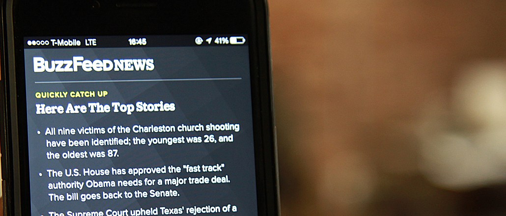
Main features include “Quickly Catch Up,” one-sentence summaries of the day’s top stories, followed by a context-rich feed of articles. Users can get alerts on topics including breaking news, world, U.S., politics, LBGT, celebrity as well as specific stories like the church shooting.
There’s a growing recognition among publishers that readers are fatigued by feeds of endlessly scrolling articles, which has led some sites to ditch the infinite scroll. The BuzzFeed app has a nice sense of finality to it, with a message that punctuates the end of its stream that reads, “You’re all caught up.”
We caught up with BuzzFeed news-apps editor Stacy-Marie Ishmael, formerly of the Financial Times, to talk about the strategy behind the app. Excerpts:
Did you design the app with a sense that readers are exhausted with infinite scroll in mind?
We’re not optimizing to force people to tap through to the “Catch Up” stream. At the same time, we want to present a universe of interesting options and stories. It’s helpful to signal to people when they’ve “finished” something, even though news itself is never “over.” It’s also useful from an editorial perspective — did what we select form a cohesive and useful whole for someone browsing through? And endless scroll is a challenging user experience on mobile.
There’s not an obvious hierarchy of stories. What determines the volume of stories and order they’re in?
That’s entirely a question of newsflow and the resulting editorial judgment about what to include. We happened to launch on a day filled with breaking news and ongoing, important stories. So the app needs to reflect that. It’s a mix of the urgent, the important, the fun, the entertaining, the useful. I wouldn’t describe it as a hierarchy of importance.
There are limited personalization options. Do you plan to add to them over time?
We will continue to experiment with these, but we aren’t going to get super granular. Alerts require considerable editorial investment, and that’s something you have to balance against hyper-personalization.
The articles load fast, in contrast with many mobile news sites that are notoriously slow. How did you build it for speed?
It’s a mix of design choices that help the app “feel” fast and back-end optimizations that actually reduce the time it takes for our audiences to access what they want. We are obsessed with performance, and we spent a huge amount of time and effort trying to deliver on that front.
What’s the metric of success for the app?
We are paying attention to a combination of elements, including shares, time spent, and whether people are using the different features of the app, like opting into notifications.


More in Media

Kroger’s new CEO, a Walmart veteran, is focused on speed and execution
Foran joined Kroger in February after serving as CEO of Air New Zealand since 2020. Before that, he was president and CEO of Walmart U.S. for about six years.

In Graphic Detail: The real impact of creators at the World Cup
The 2026 World Cup buzz was all about creators; we look at the numbers breaking down their impact at the global tournament.

Media Briefing: Brand authority and trust are becoming publishers’ newest AI assets
Some publishers are betting that trusted brands and editorial authority are becoming their biggest competitive advantage with LLMs.