Join us Sept. 14-16 in Miami to connect with top publishing leaders
This is the first of a new video series called Future Craft where we profile creatives about how they’re adapting their craft and modernizing their technique for our evolving digital world.
As screens get smaller so do the images and text that fill our mobile phones, tablets and smartwatches. The font that Web designers and developers choose has suddenly become hugely important. It turns out not every font is legible on these shrinking spaces — because many were originally created for print.
“Print is I think more often the center of the work that we do because it’s higher resolution. We can just more clearly see what’s going on,” said typeface designer Tobias Frere-Jones. He’s been in the business for more than two decades, best known for creating typefaces used by the Obama campaign in 2008, The Wall Street Journal, and the Whitney Museum.
Frere-Jones says typeface designers need to consider font for our screens more than ever today. He compares type in print and on the Web to music on FM and AM radio stations. “It’ll be the same song, but there’s some subtility and nuance that will not come through on the AM radio no matter what you do.”
Screens are made up of pixels, which light up to flesh out each character. When text is shrunken down to fit our smallest screens, there are fewer pixels to smooth out the edges. Each letter is rendered less sharp as a result. Frere-Jones points out that the ubiquitous Helvetica and Arial both fare poorly at small sizes on screen.
So Frere-Jones set out to design a new typeface that would consider both print and what he calls the “hostile” environment of the smaller screen. To be sure, the problem of small text was not a new one. Typographers from hundreds of years ago had already solved the problem: They responded to shrinking pages by spacing the letters out, enlarging the interior of each lowercase, and simplifying details.
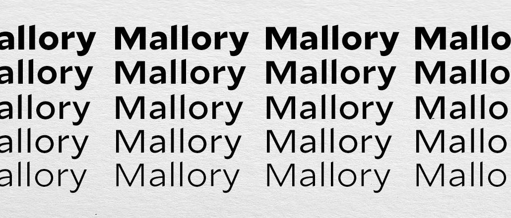
Frere-Jones applied the centuries old technique to create what he calls “MicroPlus” fonts for the Web. He releases the Mallory type family today, his first typeface design since starting his own foundry, Frere-Jones Type, after a bitter lawsuit with his former partner Jonathan Hoefler over ownership of their business. Frere-Jones says smaller fonts specific for the Web will be a required component in all future typeface designs from his foundry.
Mallory is an all-purpose font. It is legible on screen and in print but Frere-Jones also included currencies for countries that have released new symbols in the past few years like the Indian rupee and Turkish lira. Mallory also includes extra support for languages like Navajo and Vietnamese.
“It just made sense for the type to work on our phones and also for a corporation that would use it for its identity to speak to all these different markets,” said Frere-Jones. “I prefer to make things that have a lot of capability in them. Fonts that can that have solutions at the ready for multiple content, environment, and audiences. Mallory would have to keep pace or it would just not be relevant.”


More in Media

Media Briefing: Publishers are rebuilding their newsrooms for the post-Google era
Publishers like USA Today Co. and NYT are reshaping audience teams and creating new roles to prepare for an AI search future.

How 11 retail media networks are trying to differentiate themselves to advertisers
With the launch of myriad retail media networks, these new divisions of various consumer-facing companies are now fighting for ad dollars.

WTF is a ghost creator?
Some companies are hiring creators not for their audience, but as a mouthpiece for a very specific brief. Think execution, not creativity. This is the ghost creator.