Connect with execs from Axios, The New York Times, Paramount and more.

There’s been a flowering of digital-only news startups, from Nate Silver’s Fivethirtyeight to Ezra Klein-fronted Vox. Each has has been noted for its editorial positioning and bold-faced-name journalists behind it, but great content can be undermined by poor presentation. We asked the experts: Who got it right?
1. Vox
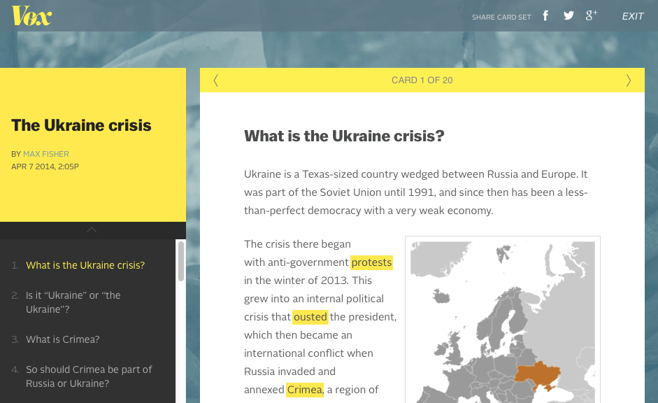
With the newest site from Vox Media, Klein promised a next-gen version of traditional news by combining Vox Media’s technology with his explainer brand of journalism. The site, launched Sunday night and designed in-house, felt immediately accessible, with its Wiki-style cards that explain complicated topics like Ukraine and Bitcoin. The cards translate well to smartphones, which is likely how many of readers will access the site. Joe Zeff, founder of Joe Zeff Design, said it makes him feel “smart.” “Vox does the best job of establishing a brand identity, regardless of whether you like bright yellow or frilly type,” he said. “I can imagine an endless series of cards that help me understand various things.”
2. FiveThirtyEight
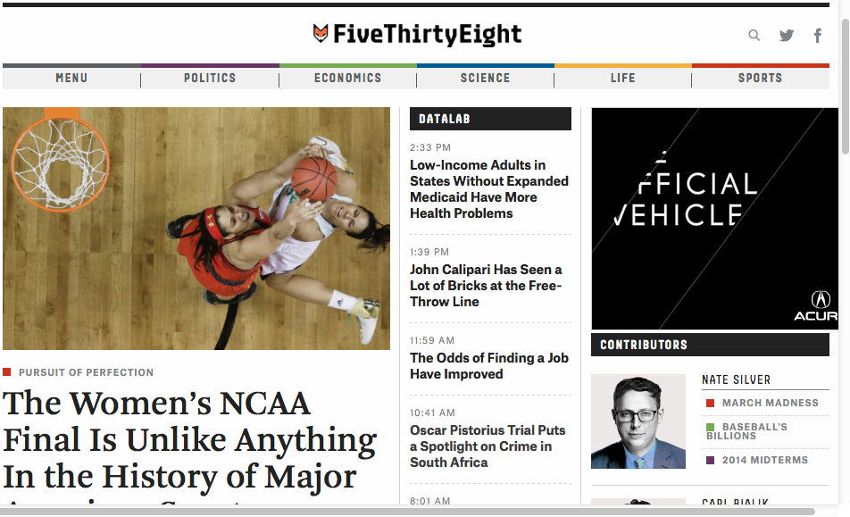
Nate Silver’s new data-driven news site launched to mixed reviews, with critics saying it lacked an (expressed) ideology and was too inaccessible for the casual reader (but too light for the expert). As for the design, Twitter feeds on story pages are debatable as a use of space, and it takes a lot of scrolling to get to the text of a story. But there’s a lot of good to say. If it comes off a bit cold, the look is straightforward, and a story-heavy home page lets you see a lot at once. It’s “no bullshit … approachable and legible,” said Joe Stewart, partner, Work & Co.
3. The Intercept
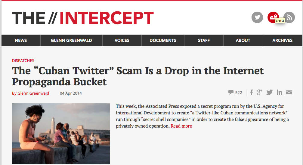
The first site from First Look Media, backed by eBay founder Pierre Omidyar, is published by former Guardian columnist Glenn Greenwald, who plans to use it as a platform to hold governments and corporations to task. Despite that weighty mandate, the site, launched in February, looks surprisingly like a bare-bones blog, with one article stacked on top of another. The extra-wide headlines don’t do the site any favors, either. “If you look at how much your eyeballs have to work, it’s just laborious,” said Stewart.
4. Re/code
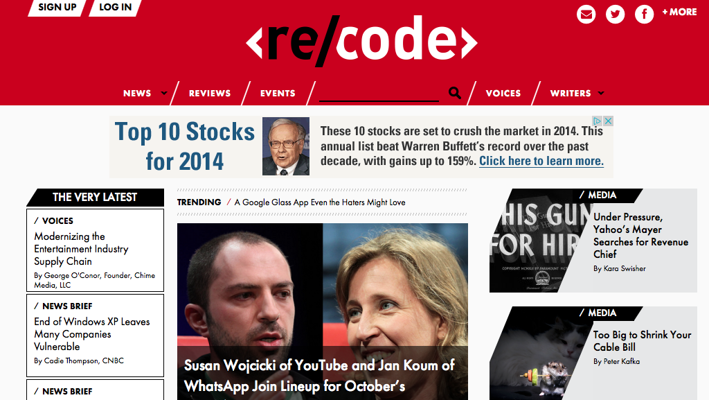
Walt Mossberg and Kara Swisher founded the new tech news brand on the ashes of All Things D, the tech site that The Wall Street Journal ended earlier this year. The site, designed by Sub Rosa, does well at telling the reader what’s new and important. But the heavy use of lines and small type makes it hard to read. “It looks like a gumball machine,” Zeff said. “Everything’s the same size and shape, and as a result, I don’t know where to look first.”
5. The Information
The new tech pub from former Journal reporter Jessica Lessin had many skeptics wondering how she’d get people to pay the hefty $399 annual subscription fee. Despite the premium price, the site looks anything but. While some will appreciate the clean design by San Francisco’s Upperquad, others say its blog-like presentation and generic-looking stock art will undermine the editorial mission. “I can’t imagine people coming here and thinking, I need this,” said Kevin Kearney, CEO, Hard Candy Shell.

Vote for your favorite below.
[polldaddy poll=7953178]


More in Media

In Graphic Detail: The state of streaming highlights the power of creators
“Just Chatting” is the driving force behind views on major streaming platforms, thanks to the appeal of personality-driven creators

Hot Ones creator Sean Evans on YouTube vs. TV, the interview boom and what comes next
Hot Ones host and TIME 100 top creator Sean Evans chats about the creator economy’s past, present, and future

Why brands are bringing creators to the World Cup sidelines
Brands are bringing creators to the World Cup sidelines to boost engagement, tap into new audiences, and be a part of the cultural conversation.