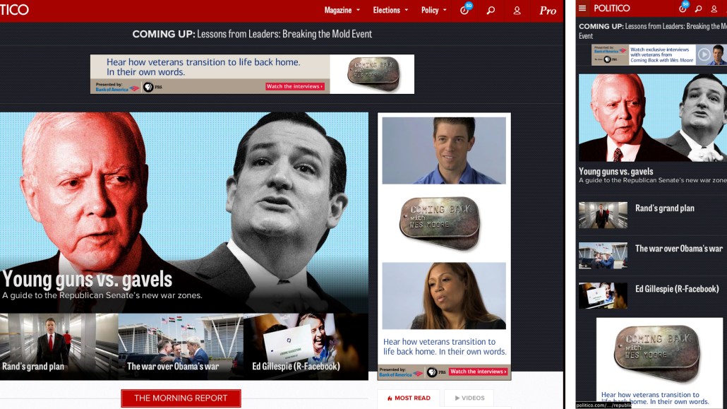
Along with a new batch of media site redesigns come a few firsts, as well. Politico, for example, has redesigned its website for the first time in its seven year history, and The Guardian’s U.S. recent refresh marks the first time it’s redesigned almost entirely in public, with its readers’ input.
Here’s a look at the thinking behind the redesigns, and what the publishers were able to pull off.
Politico

Politico’s old design was getting a little long in the tooth. With its new visual update, the political newspaper wants to not only create a cleaner reading environment, but use the new design to give readers more obvious cues that Politico does more than 500-word news bites — it also does lots of original content as well.
“I’ve always found it frustrating on websites when you click and you can’t tell if a story is going to be three paragraphs three thousand words,” said Politico editor Susan Glasser. “Our design wants to help readers understand that.”
But while Politico wants to draw more attention to its original content, it’s still not losing any of its speedy metabolism. Timeline, one of the site’s new features, for example, gives readers an itemized rundown of the 50 most-recent Politico stories, and subsections like “The Morning Report” and “Latest on Politico” tell readers know which recent news items they need to read.
“When we report the news, we want to own the cycle, not be owned by it,” Glasser said.
Harvard Business Review

Harvard Business Review may sound like the publication of choice for stodgy, Ivy League MBA types, but the site’s new redesign, its first in four years, is a part of its attempts to attract a larger, more digital audience.
One big component of the new design is personalization. Readers who register for the new HBR system can save and organize useful articles from HBR’s 4,000-article archive into their own personal libraries, which they can share with others. All of those preferences also help HBR make reader recommendations, creating an effective feedback loop that, ideally, will keep readers coming back.
But HBR is still in the business of moving subscriptions, not just creating fancy user experience. The site hopes its new redesign, which is focused on the user experience and subscriber-only tools, will encourage more people to sign for its subscription plans. (HBR expects to add 100,000 new subscribers as a result of the redesign.)
“If your revenue is exclusively based on advertising, then you do crazy Forbes stuff. But that’s not the case with us. We have a balanced situation,” Eric Hellweg, HBR’s managing director of digital strategy, said in October.
The Guardian US

While Politico and Harvard Business Review are targeted towards relatively focused audiences, The Guardian has cast a much wider audience net. This means that it’s accountable to many, many more readers when it switches things up.
The Guardian’s solution? Crowdsource the latest redesign to its U.S. homepage, which gets 27 million unique visitors a month. Between announcing its redesign and debuting the final product, The Guardian got over 26,000 comments from readers, who were all-too-eager to tell the site what they thought of its progress.
The Guardian said that the ultimate goal behind the new homepage is make its journalism “easier to find and engage with”. With that in mind, homepage stories are designed to be easier for readers to differentiate: Shorter, more newsy stories, for example, don’t get as much homepage space as The Guardian’s longer, more in-depth reporting. It’s similar to the strategy Politico is cooking up.
“The simple list view still dominates most news sites: there’s either a vertical or chronological hierarchy of importance,” Guardian News Media digital strategy director Wolfgang Blau told Digiday in October. “We wanted to offer more nuance and assign levels of importance.”
[polldaddy poll=8438313]
More in Media

Amazon bets creator video podcasts can be the next TV network – if it can fix measurement
Amazon’s Upfront presentation leaned into its podcast offerings, which the company believes are the next generation of TV networks.

Media Briefing: BuzzFeed’s $120M sale marks another step in the repricing of digital media scale
Byron Allen’s $120 million BuzzFeed deals marks another turning point in the collapse of the platform-era media business model.

Mail Metro Media shifts ad strategy toward PMPs and fewer ads as it unifies stack
Mail Metro Media wants to drive 300% PMP growth over the next three years as part of plans to turn a high-volume digital direct business into an outcomes shop.


