Brands are increasingly incorporating mobile advertising into their mobile marketing strategy. But judging from some of the ads on the mobile Web and in applications, some brands are still failing at the basics.
“When it comes to content, the online Web and mobile Web are, pardon the pun, worlds apart,” said Jeff Hasen, chief marketing officer of Hipcricket, a mobile marketing specialist. “More and more discussions with consumers tell us that they are punishing brands that do not deliver in their mobile executions. Those entities that do are gaining customers and brand loyalty.”
Digiday examined some recent campaigns to see where they fall short. There were many flawless executions, but a surprising number made very simple mistakes, like not having mobile-ready sites for their ad campaigns.
TCI
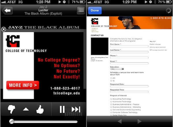
The College of Technology’s mobile banner encourages consumers to tap to get more information on getting a degree and building a better future. However, when the ad is tapped, consumers are taken to a page with a form to fill out that isn’t mobile-optimized. This makes it hard to both navigate the landing page and to tap on the correct sections to fill out the form. The number for TCI on the upper right corner is not click-to-call-enabled, further ruining the experience.
Caesars
In an ad for its Total Rewards loyalty program, Caesar’s leads consumers to a desktop site, making it incredibly hard to further engage with the brand beyond the click. There are several engagement opportunities on the site, with an option to share the True Rewards with friends on Facebook and followers on Twitter. However, because the site is not mobile-optimized, it is almost impossible to see these features, which are located in the upper right corner of the screen. Unless consumers pinch and zoom, they most likely won’t see these features.
Experian
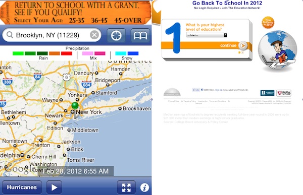
The higher-education brand ClassesUSA also does not lead consumers to a mobile-optimized site. The landing page is a form that consumers need to fill out to receive more information. It is a data-capture effort on the part of ClassesUSA. Unfortunately, consumers are not keen on sharing their information as it is. The fact that the site is not optimized makes it even harder to get someone to fill out the form.
Rewards USA
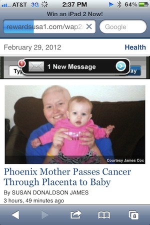
This banner ad on ABC News’ mobile site has no clear call to action. In fact, it takes a minute to even realize that it is a banner ad. There isn’t even a mention of the brand in the ad. A clear call to action is imperative for engaging consumers and getting them interested in an offer, product or company.
Lexus
This Lexus ad on Pandora is well done. However, once a user clicks on it, it takes more than a minute to connect to the mobile-optimized landing page. Testing load times for mobile advertising is a must for brands. Consumers get frustrated fast and will quit after just a few seconds if an ad does not load right away.
More in Media

Retailers are rushing to build AI apps. It’s unclear if shoppers will use them
There are almost 900 apps on ChatGPT and 353 Claude connectors, according to AppDiscoverability.com, which tracks AI app data.

Why news publishers are getting into the sports business coverage
Yahoo and Dow Jones are betting on the booming sports business beat, launching new verticals to capture high-value audiences and advertisers.

From ad tech tax to AI data brokers: the new middlemen keep 100%, publishers say
For some publishers, third-party content scraping lands as an even bigger affront than the ad tech tax they’ve spent years navigating – not a share of the pie, but the pie itself.
