for the Digiday Programmatic Marketing Summit, May 6-8 in Palm Springs.

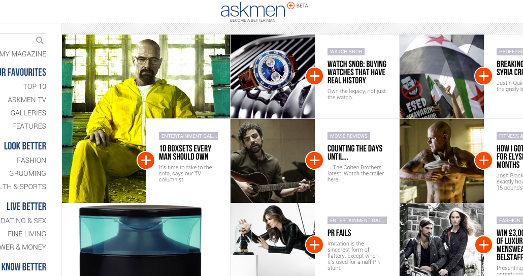
Men’s site AskMen.com will roll out a new, mobile-friendly site design Thursday that reflects the industry trend toward more images and less clutter.
Out go the clunky boxes – of both content and ads –in favor of a site that goes big on images. Instead of multiple below-the-fold ads, AskMen is running only two ads per page (from one advertiser). The hope is that it will create both scarcity for advertisers and a more pleasant reading experience for visitors.
Two key trends pushed AskMen to reimagine the site: mobile and images. The redesign is a concession to the fact that the company now gets about half of its audience through mobile, according to comScore. The site was built using responsive design so that content and ads are consistently represented across multiple devices.
Equally important are images. “Pictures are worth a thousand words,” said Ryan Johnson, AskMen’s director of marketing and business development. “Men are very visual so it made sense to go in that direction.”

AskMen, which had 4.1 million uniques in July according to comScore, is just the most recent publisher to take a “less-is-more” approach. It follows sites like USA Today, Mashable, The New York Times and Inc., all of which have redesigned their sites in the last year with an eye toward a tile layout. According to Johnson, this redesign, eight months in the making, is the company’s biggest step since it first came online in 1999.
“The design is conceptually new versus an evolution in terms of how readers navigate, how they discover content and what they can do with the content they discover,” he said.
Toward that end, every article page comes with a single share button, essentially a big plus sign that enlarges to allow people share to Facebook, Twitter, Google Plus, email and a new AskMen feature, My Magazine. With My Magazine readers can customize their AskMen experience by selecting content they’d like to share with friends or read later.

AskMen’s audience is composed primarily of the enviable 18-34-year-old male demographic and is consequently not entirely without its detractors. Its content is heavy on lists and slideshows, like this one about top men’s hairstyles. You’ll also find advice columns like this one on sex tips and articles helping you find out if your boss is a psychopath. Though advertisers and buyers are taking a wait-and-see approach to the effectiveness of the design, they have historically been happy with AskMen.
Last year, Peter Gardiner, the former chief digital officer at Deutsch, told Digiday: “If you’re looking for young, hip guys, they’d be on your list. They have an interesting array of ways to connect with consumers.”
And while AskMen has historically leaned heavily on SEO, the new site wasn’t built with the specific goal of driving traffic. Johnson noted that a high percentage comes in via search, and to keep people on the site, the new design focuses on what it calls “perpetual click” functionality. Perpetual click lets readers to click to the next most-related piece of content.
“The perpetual click and highly related ‘next article’ functionality was built with the understanding that readers coming from search are topic-focused and would benefit from a series of more related content easily available to them,” Johnson said.
Ads are also responsive. This means more efficiencies: create the ad once, and it’ll look the same across multiple devices.
“It’s a uniform experience,” Johnson said. “Now you’re just buying inventory across the whole [site] and don’t have to make the distinctions we used to make.”
With a fresh look, AskMen also sees more opportunities for advertisers. Because the site is image heavy, Johnson said that the big image on the index page is now sponsorable. Additionally, Johnson said, having one advertiser per page means a brand can own the whole page. The focus, Johnson said, was addressing viewability by having the two ads above the fold.
AskMen looked to luxury print magazines as inspiration for design. “We’re trying to get at that from a digital perspective,” Johnson said. “We wanted to give opportunities to advertisers to recreate the value they get from large-scale print ads.”
More in Media

Vibes over metrics: Why more creators are holding IRL events to own their audience
IRL events are becoming increasingly important pillars of a content creator’s growth strategy; here’s why.

How The Financial Times is betting on personality-led vodcasts as its next subscription lever
By pairing star journalists with a subject‑specific standalone YouTube channel, the publisher hopes to deepen parasocial relationships off‑platform and cultivate future subscribers.

From page views to propensity: How the Daily Mail is retooling for a zero-click world
The pressure of zero-click underpins a wider product overhaul: games upgraded from sideshow to front door, new hubs like Crime Desk designed to keep niche communities coming back, an AI-powered dynamic paywall tuned to user behavior; a bigger bet on personalization and the app as a primary destination.


