Join us on July 30 in NYC for a breakfast & panel
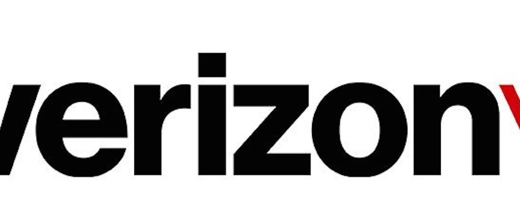
The new Verizon logo is missing a few z’s.
Retaining its black and red color scheme, the revamped logo uses lowercase letters adorned with a checkmark in top right of it. Gone is the dated, swooping “z” and the clunky “lightning bolt” that has been used for the past 15 years.
Our look is evolving along with our customers. https://t.co/HpiOzjeEWT pic.twitter.com/zQOoymgmmh
— Verizon News (@VerizonNews) September 2, 2015
Verizon said in a blog post that the new branding represents “simplicity, honesty and joy in a category rife with confusion, disclaimers and frustration.” The new look from design firm Pentagram comes a day after Google showed its flatly designed logo.
The change caps off a productive year for the telecommunications giant, which acquired AOL in a $4.4 billion deal, gave customers the option to ditch long-term contracts and is about to roll out a mobile video service called “Go90.”
Sadly, for a telephone company, the logo’s reception from observers was spotty. Acknowledging that the logo is “more modern and cleaner,” James Fox, CEO of Red Peak Branding told Digiday that the smaller check mark is a “diminishing move” since it’s not as pronounced or energetic as the former “lightning bolt.”
Twitter users mocked the logo, with one saying it looks it was designed in two minutes and another saying it made them feel “sad.”
The always boisterous T-Mobile CEO John Legere also mocked the Verizon logo on Twitter, tweeting a checklist with the new check mark pointing out his rivals flaws:
.@VerizonNews’s new checkmark logo CHECKS all the boxes. Send me more using #NewVerizonLogo https://t.co/0ZqWcZm4zF pic.twitter.com/ORnVwiBjH9 — John Legere (@JohnLegere) September 2, 2015
When Verizon said “honesty,” we don’t think this is what they meant.
Image courtesy of Verizon.


More in Marketing

Brands won this season of ‘Love Island USA’
Brands are eagrs to find their way into shows like Love Island USA and events that have become appointment viewing.
Reddit questions if AI data deals could hurt its ad business
Reddit’s ad business is built on the value of its community conversations. Now the company is debating whether selling those same conversations to AI companies could undermine that advantage.
Digital video ad spending is booming – trust in premium inventory isn’t.
Digital video ad spend continues to climb, but buyers say bigger budgets bring tougher questions about inventory quality, supply chain transparency.