Connect with execs from Axios, The New York Times, Paramount and more.
Looks like Google has some Apple envy.
The new Google Store looks a lot like Apple’s familiar site. Both feature a scroll format that draws the browser downward, dominant imagery and minimalist font to showcase their gadgets. And both have the same goal: To get customers to buy laptops, wearables, cell phones and tablets. Google created its new store in order to optimize sales specifically for their hardware – the company was selling too many products to keep them tucked under the Google Play umbrella.
The store’s similarities to Apple’s poses the question: Who designed it better?
Visual design
Both Google and Apple follow the same design rules on the stores’ homepages: White background, minimalist font and giant images paired with one-line product descriptions. But David Martin, CEO and founder of Fantasy Interactive, thinks Google has the edge.
“Google has a cleaner experience, there’s more consistency,” said Martin. “Apple seems afraid to redesign because they have something that works, they don’t want to take that risk. What they have today is not a representation of one of the best companies in the world. The website feels like a website rather than a modern day user experience.”
The Apple Store pages are bogged down with an inconsistency of information across the site, according to Martin, and too much variation in how visuals are used. For instance, the iPhone product page draws customers to explore a “worldwide photo gallery,” the Macbook product page immediately prompts visitors to select size and color, and the Apple Watch page is one huge product image after another.
Verdict: Great web design is important, but not as important as sales dollars. Google’s store is more consistent in getting the customer to the product while maintaining a clean and modern visual experience.
Customer experience
Shopping online can feel isolating for customers who don’t know their way around the specs of a Mac or Chromebook. In order to get the customer to the point of purchase, they need to trust that they have all of the information given to them in a way that’s easy to understand.
Most of Apple’s product information is provided via image-heavy, spread out snippets, worded in overdramatic Apple-speak (“iPhone at its largest. And thinnest.”), catering to customers who know the market and how to compare stand-alone specs.
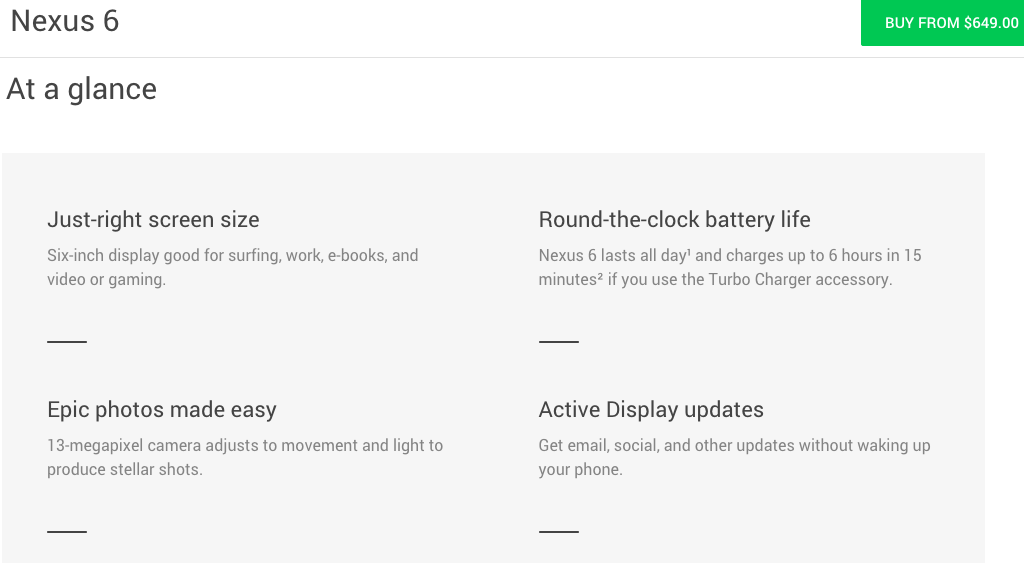
The Nexus product page on the Google Store, on the other hand, tells a different story. An At-a-glance section drives to the center of what a customer, clueless or not, wants to know: how long the battery should last; whether the camera is up to snuff.
To finish it off, Google links to reviews from tech-savvy sites like Gizmodo, Engadget and The Verge. Of course they’re providing favorable opinion of their own products, but they’re also cutting out a step for a customer preparing to buy: Googling reviews.
Apple is still building their customer experience on top of the underlying notion that they’re superior – people will want their products even if they don’t understand why. Google built a customer experience that’s primed for purchasing in 2015.
“When you go to the [Apple] store, it feels like it’s a couple years behind in look and feel in comparison to what products they have,” said Martin. “Google is on a mission to surpass what Apple is doing, and that’s what I see happening.”
Verdict: Google, easily.
Call to action
Google’s appealing design and product pages optimized for customer experience won’t amount to much if the store can’t seal the deal. According to Martin, the “call to action” is what gets the customer from the homepage to the point of purchase.
When browsing through different products, both Apple and Google feature “Buy” buttons at the top of the screen that stay in place even as the rest of the page scrolls down. Where you end up on the page, the option is right there, waiting for you to click. This format supports what Martin calls the “three battery cell model.”
According to Martin, each customer starts with three battery cells when they visit an online store. The first battery cell is depleted as soon as you get to the homepage. The second cell depletes when you decide what to click. Only one battery cell is left to actually buy the product.
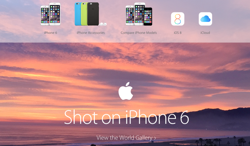
Despite Google’s dominant “Buy” button, based off this model, Apple has the edge – its call to action starts on the homepage, above the fold. A toolbar at the top of the screen tells you to “Shop Mac,” or “Shop iPhone.” Directly below, you’re told to preorder the Apple Watch.

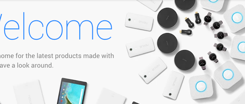
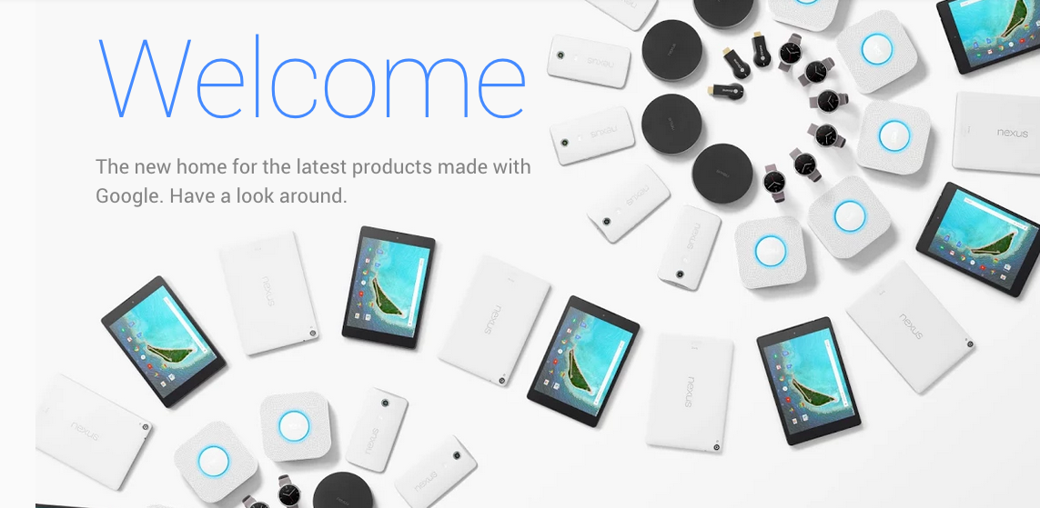
Google takes a more relaxed approach. “Welcome,” the Google Store tells you, “Have a look around.” That’s all that’s above the fold – scroll down, though, and customers are enticed to shop in order to earn Google Play credit.
Verdict: For now, Apple wins the call to action head-to-head. But once the Google Store’s novelty wears off, that could easily change.


More in Marketing

How Bandit Running is expanding internationally while staying hyperlocal
Bandit’s focus on core running communities has helped it grow enough to start expanding outward.
Criteo is subject to a takeover bid, further proving private equity’s continued interest in ad tech
Vista Equity and Quinti Capital place a 50% premium on stock, raising questions over where the PE firms see value.

Dentsu strikes Meta deal to build plumbing for mass influencer activation
Top CMOs are assembling armies of creators, but many lack the infrastructure required to get the most out of them. A deal between Dentsu and Meta aims to fix that problem.