Mozilla invites the internet to design its new logo. What could possibly go wrong?
If you can’t beat ’em, get ’em involved.
The internet loves bitching about logo designs, from Instagram’s rainbow form to Hillary Clinton’s blue “H.” So to avoid potential social media trolls, Mozilla is inviting everyone to participate in the design process of a new logo that it will debut this September. It’s not working out quite the way they’d hoped.
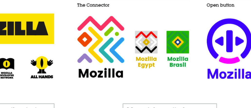
With the help of agency johnson banks, Mozilla has come up with seven general concepts that it has put up for vote. The winning concept will then be finalized into a more refined design. The seven concepts include ideas like “Connector,” a colorful rainbow-like icon that is inspired by circuitry and tribal patterns, and a blue and purple “Open Button” that represents the open nature of the Internet.
Mozilla hopes that others can help it narrow from seven possible themes to a few concepts that will proceed to iterative design work.

“We have our opinions about these paths forward, our early favorites among the field,” Tim Murray, Mozilla’s creative director and lead on this project, wrote in a company post. “But for now we’re going to sit quietly and listen to what the voices from the concentric rings of our community — Mozillians, Mozilla fans, designers, technologists, and beyond — have to say in response about them.”
People can simply click on each design on the company’s website to see its full system and leave comments. This open-source approach looks like a good fit for Mozilla as the nonprofit believes in net neutrality and transparency.
But David Moritz, founder and CEO for design firm Viceroy Creative, thinks shifting the burden of design onto the public is a mistake. “This is abdicating responsibility for the vision of the company,” said Moritz. “It’s the company’s role to share its vision with its customers. This kind of open feedback is appropriate in some areas but not in identity.”
Others just don’t like the seven candidates.
I am so sick of this logo design trend of the “folding ribbon” effect. It’s dumb, it’s ugly and it’s already overdone. #AndroidN #Mozilla
— Mike Cannella (@MikeCannella_) August 24, 2016
“Those new #Mozilla logos are all horrible,” Twitter user @JSonic7 tweeted.
https://twitter.com/JSonic7/status/768334423431319552
Joe Jensen, creative director and co-owner of design company SmartNet Solutions, is not impressed by the proposed designs, neither. He even thinks that some of them are distracting, similar to a stereoscopic image that needs to be deciphered.
“I’m a little surprised that none of them incorporated the historical ties of Mozilla to Netscape or its main product, FireFox,” said Jensen.


More in Marketing

OpenAI’s ChatGPT ads get its first conversion API partner in LiveRamp
The partnership enables advertisers to connect chatbot ads to real-world purchases for the first time via conversion data.
LinkedIn wants to own B2B creator discovery with new creator marketplace
LinkedIn is aiming to make B2B creator discovery more scalable for brands looking to tap into its growing creator ecosystem.

Inside the messy middle of January Digital agency’s AI adoption
Brands and their agency partners have started using agents to plan, execute, and optimize ad purchases.