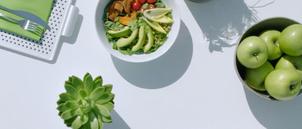
Pantone’s choice for Color of the Year, the shade that the color institute and consulting agency picks as the one that will define design and style trends, as well as fit the national climate for the upcoming 12 months, has become the peak annual event for a company whose work is mostly done behind the scenes.
On Thursday, Pantone named “Greenery” (or Pantone 15-0343), the 2017 Color of the Year. The yellow-green hue is associated with spring, rejuvenation, Kermit the Frog and $11 kale juice. The reasoning? Even Pantone is feeling the fallout of the 2016 election cycle.
To read the rest of this story, please visit Glossy.


More in Marketing
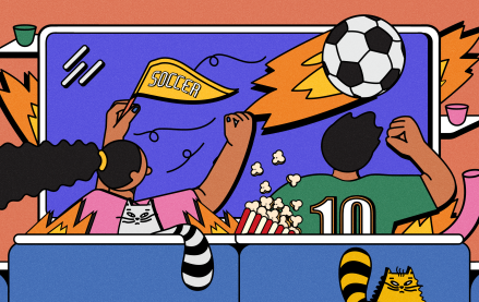
Ahead of Euro 2024 soccer tournament, brands look beyond TV to stretch their budgets
Media experts share which channels marketers are prioritizing at this summer’s Euro 2024 soccer tournament and the Olympic Games.
Google’s third-party cookie saga: theories, hot takes and controversies unveiled
Digiday has gathered up some of the juiciest theories and added a bit of extra context for good measure.

X’s latest brand safety snafu keeps advertisers at bay
For all X has done to try and make advertisers believe it’s a platform that’s safe for brands, advertisers remain unconvinced, and the latest headlines don’t help.