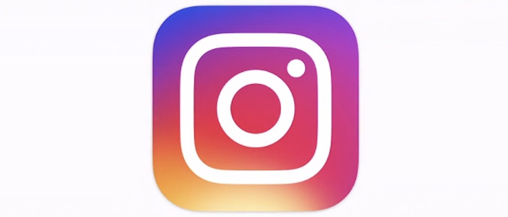
Instagram looks completely different.
The Facebook-owned photo sharing app unveiled a brand-new logo today, along with a refreshed interface, in its most dramatic redesign since it debuted five years ago. “Inspired by the previous app icon, the new one represents a simpler camera and the rainbow lives on in gradient form,” Instagram said in a blog post.
The brightly colored logo is a stark contrast from the new black-and-white internal design, which has been leaking out to users over the past few weeks. Both designs imitate Apple’s iOS 7 redesign that showcases flatter lines and brighter colors.
Instagram’s redesign is rolling out to its family of apps, including Layout, Hyperlapse and Boomerang. The redesign is available to download immediately.
Data from Brandwatch indicates that more people like the overall redesign, but don’t like the new logo. Of the 12,000 mentions online 58 percent are positive and 42 percent are trending negative.
More in Media

Inside The Daily Mail’s creator-led content playbook
Inside the structure, strategy, and metrics of the Daily Mail’s creator-led content push.

Media Briefing: Overheard at the Digiday Publishing Summit, March 2026 edition
With no sign of search traffic returning, publishers are doubling down on subscriptions to build direct reader revenue — but it’s not easy.

People Inc.’s Jon Roberts on the AI licensing boom – and the revenue lag
People Inc’s Jon Roberts discusses the boom in AI content licensing marketplaces — and the revenue that could materialize for publishers.


