for the Digiday Programmatic Marketing Summit, May 6-8 in Palm Springs.

It’s one of the big challenges facing online news sites: People are coming through side doors to find their news, where they spend less time on site and return less often than those who come direct. It’s a fact that was illuminated by this Pew Research report and reinforced by the internal New York Times’ Innovation report.
But while publishers are devoting plenty of energy to roping in visitors via search and social — and once there, getting them to click again and again — some are also tending their home page carefully. In spite of rumors of the homepage’s death, it does remain the province of their repeat, loyal visitors, which is also known as a loyal audience.
Here is how five top sites are taking care of their best customers.
CNN
CNN is unusual among news sites in that 60 percent of its visitors come through the homepage. As a result, the site has a team of about 15 people who work in shifts to keep it as fresh as possible, since homepage visitors tend to come back throughout the day, said homepage editor Carl Lavin. The team makes as many as 200 changes a day to the site — from as small as A/B testing a headline to changing the hero image — and uses the homepage to showcase the site’s variety and relevance and distinct content. In the evenings, when mobile visitors come more often, the homepage team makes sure any news updates are presented prominently.
“The side door often includes something someone in your circle has pointed out to you, that you have seen in your social feed, and that somebody is talking about,” Lavin said. “What the homepage is giving you is a greater range than you might be getting from your social context.”
Sports Illustrated
The Time Inc. site also has a high percentage — more than half — of its visitors coming direct, so those loyal visitors were just as important as side-door visitors when it relaunched in June. Unlike people who come via a shared link, search or straight to a section front, front-door visitors are looking for the editors to tell them what the biggest news is. So they’ll see a range of content but also clearly see what’s most important, as they did Friday when SI’s LeBron James scoop dominated the top half of the site. “It gives us the ability to use our journalistic bona fides,” said Paul Fichtenbaum, editor of the Time Inc. Sports Group.
Beyond variety, SI.com programs the homepage throughout the day in sync with the sports calendar. In the evening, when loyal readers switch to their phones, SI has the ability to play up the latest scores on its mobile home page.
Glamour
Glamour’s most loyal visitors tend to come in mid-morning. They tend to sample a lot of different kinds of content — news and politics in particular. So the site programs a variety of content with an emphasis on those subjects on both the homepage and the “most popular” section. The site also leads off with a big hero image, to promote Glamour overall as a luxury, beauty and fashion destination.
“Catering to your best reader is never a bad thing,” said Mike Hofman, Glamour’s executive digital director. “The homepage has incredible utility as the billboard for the brand and who you are and what you stand for. I think there’s an important statement the homepage makes that other pages can’t match.”
Forbes
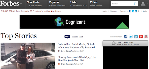
The business site has seen its social traffic go up, fueled by its perennial lists and BrandVoice contributors who share their posts with their networks. But 65 percent of its homepage audience still comprises repeat visitors, so Forbes kept them in mind with the design of its landing page. The stories editors deem most important come first, but there’s emphasis on most popular offerings, too, ranked in a variety of ways. Hidden behind the author’s head shots is more information about each (a feature particularly relevant to Forbes, given the writer could equally be a staffer, an outside contributor or a brand). Diehard readers have the option of registering to personalize the site by authors and topics.
That the homepage is sold out to advertisers speaks to its continued importance, said CRO Mark Howard. “It’s sold out well in advance because marketers still want to be there to capture return and repeat visitors,” he said.
The Verge
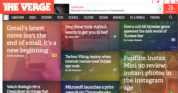
When you’re a new site entering the noisy tech space, it’s particularly important to make your mark. The Verge went with a big, boxy design and subtle tinting to announce itself two years ago and has been constantly iterating since then; according to the New York Times Innovation report, the Verge redesigned its homepage 53 times in two years.
“In general, we see the homepage as still having a lot of value,” Chad Mumm, vp, creative director of Verge parent Vox Media. “That’s where your diehard reader is. It’s a way to send a signal of what the editorial team thinks is important. It’s a way to establish the hierarchy.”
More in Media

Vibes over metrics: Why more creators are holding IRL events to own their audience
IRL events are becoming increasingly important pillars of a content creator’s growth strategy; here’s why.

How The Financial Times is betting on personality-led vodcasts as its next subscription lever
By pairing star journalists with a subject‑specific standalone YouTube channel, The Financial Times hopes to deepen parasocial relationships off‑platform and cultivate future subscribers.

From page views to propensity: How the Daily Mail is retooling for a zero-click world
The pressure of zero-click underpins a wider product overhaul: games upgraded from sideshow to front door, new hubs like Crime Desk designed to keep niche communities coming back, an AI-powered dynamic paywall tuned to user behavior; a bigger bet on personalization and the app as a primary destination.


