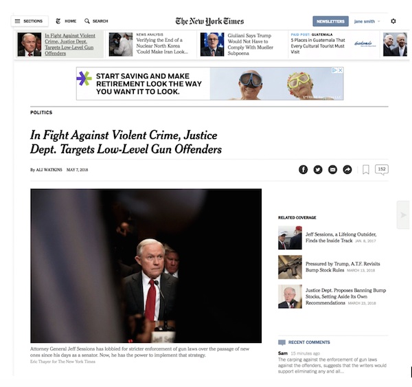
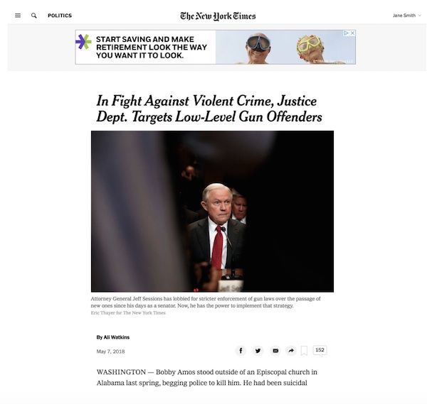
The New York Times brings unified ad, editorial approach to its new article page

Publishers are pushing collaboration across departments to boost subscription growth as well as advertising. The New York Times took such an approach in redesigning its online article pages. The new story page, which will be visible on all its pages starting May 8, is notable for its single-column layout that strips away clutter and makes journalism the focal point.
“Our core product team began redesigning the story page a little over a year ago,” said Allison Murphy, vp of ad innovation, a new position created in late 2017 to bridge the Times’ data, ad and editorial departments. “It was the first time we were able to have a unified experience for readers and advertisers from the beginning. I and my team sat side by side with product design, newsroom reps.”


The page is built around the Times’ FlexFrame display units introduced two years ago that dynamically adjust to fit the screen. Small, standard banner ads were removed and replaced with full-bleed, in-stream units that run down the entire page and are responsive to the page’s width.
The Times is beating the drums for its premium-priced FlexFrame as digital ad sales declined year over year in its most recent reporting period. FlexFrame units make up close to half of the display units sold, and one goal of the new story page is to increase that share to over 50 percent, Murphy said. The FlexFrame is the Times’ answer to standard banners with their falling click-through rates and CPMs. Murphy said FlexFrames perform better; on the new article page, their click-through rate is double what it is on the old article page, and in eye-tracking tests, users paid four times more attention to the FlexFrame ads on the new page versus the old page.
“There’s less distraction on the page, and that was part of the philosophy: Be more intentional about what you’re offering users,” she said.
For the editorial side, the goal was to have a story page designed for personalization as the Times moves in the direction of making recommendations that are specific to the user, and push people down the funnel to subscribe. The resulting page has containers at the bottom of articles that can be customized more easily than before, so they can be used to show related stories or personalized recommendations as the editor sees fit.
Frannie Hannan, a senior product manager who worked on the story page, said the process was notable for its collaboration. In the past, for example, a subscription solicitation message would be layered on top of a page afterward. This time, the message was integrated into the page design, so it loads at the same time and matches the style of the rest of the page.
“I think it’s a turning point for how products get built here,” she said. “When people work separately, we often end up with a less desirable outcome.”
The page design also reflected the increased role the Times’ data team plays at the organization, by supplying analytics that help decide where and how often to show ads and subscriber messages. The stripped-down page proved the hypothesis that having less on the page leads people to read more, Murphy said.
“There’s inevitable tensions around how you use finite space on the page,” she said. “We had a clear company strategy — everyone is committed to being a subscription service first, so we need to have something readers love. We had to meet viewability targets and goals for return rates and metered pageviews.”
Murphy acknowledged it’ll take time to train advertisers to buy FlexFrames by making them easier to create and buy. To that end, the Times is also expanding the format to new sizes and adapting it to its Paid Post native ads so that users can read the ads without leaving the page they’re on.
“I want the majority of our ads to be FlexFrames, and this page is part of it. We’re close to that, but this isn’t an industry that changes fast,” she said. “Standard is simple. But our goal is to say: ‘We’re going to give you so much more performance and make it easier to buy, so why wouldn’t you?’”
More in Media

After newsroom cuts, The Washington Post turns to creator-led video deals
The Washington Post is betting on creator content to open up new revenue and audiences, after newsroom layoffs.

Inside The Daily Mail’s creator-led content playbook
Inside the structure, strategy, and metrics of the Daily Mail’s creator-led content push.

Media Briefing: Overheard at the Digiday Publishing Summit, March 2026 edition
With no sign of search traffic returning, publishers are doubling down on subscriptions to build direct reader revenue — but it’s not easy.


