for the Digiday Programmatic Marketing Summit, May 6-8 in Palm Springs.

Music sites from Fader to Rolling Stone have recently revamped their sites with more than just an ear for music, but an eye for what works on the Web. This means not only making it easier for readers to discover new music, but also creating better reading experiences around long-form content and news as well.
Here’s how they’re doing it.
TheFader.com
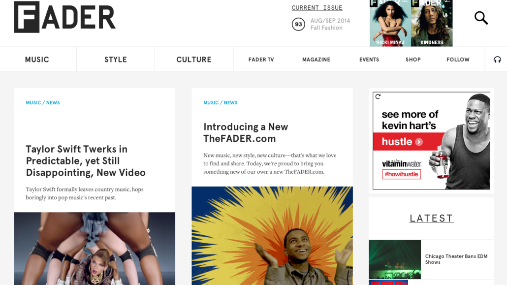
Fader launched its clean responsive new site on Monday. Created in conjunction with Wondersauce, the redesign uses many of the most popular design cues found on sites like Medium, including large photos and custom templates for feature articles. The redesign, which was the site’s first one in six years, has also created a better environment for brands like Vitamin Water, which is a launch partner for Fader’s new dynamic ad units.
Fader president and publisher Andy Cohn said that the redesign was aimed at replicating the experience of reading the Fader print magazine, particularly its award-winning photography. “We took a step back and realized that we had a site that didn’t do all the original content justice,” he said.
Music discovery is a major component here as well. Alongside the new design Fader introduced a new music player, which sits on top of the page and lets readers listen to Fader playlists regardless of where they are on the site. “In terms of priorities, this was right at the top,” Cohn said.
RollingStone.com
Like Fader’s redesign, Rolling Stone’s new look is built around clean article pages and responsive design. Beyond the site’s shorter news posts, the redesign also does a better job of showcasing Rolling Stone’s feature reporting. Stories like this one about Kabul, Afghanistan, for example, feature large images and no pagination. All of these design improvements also sweeten the deal for Rolling Stone’s native advertising programs and custom site takeover skins, which have helped it draw the attention of big advertisers like Google.
Still, the new Rolling Stone largely plays it safe overall, eschewing many of the technical feats of the Fader redesign for an approach that feels more like a cosmetic tweak than a complete overhaul.
Pitchfork
While Pitchfork hasn’t done a dramatic redesign since 2011, the site has taken a more iterative approach with some of its recent additions. For one, it has become well-known for its Snowfall-like cover stories, which combine in-depth reporting with a variety of visual bells and whistles. The most recent one, a lengthy feature on indie artist How to Dress Well, features large images, parallax scrolling, and the option of playing the artist’s music in the background.
Beyond that, Pitchfork has also focused its site around how its readers look for news and discover new music via both its bread-and-butter music reviews and its native music player. Pitchfork Advance, a feature it launched in January, lets readers listen to full streams of new albums along with virtual liner notes called “CD booklets.”
[polldaddy poll=8255019]
More in Media

Taboola’s next act: an AI answer engine for publishers
HuffPost UK, Reach and USA Today Co. are rolling out Taboola’s AI-powered answer engine to boost engagement.

USA Today Co.’s AI licensing deals drive ‘notable’ revenue in Q1, despite pressure on traffic and programmatic
USA Today Co.’s AI licensing deals helped drive meaningful year-over-year revenue growth in Q1, despite pressure on traffic and programmatic.

How former college athlete and Airbnb host turned Love Island fame into widespread success
Love Island star TJ Palma had a successful career before his fame, now he’s generating even more revenue for his businesses through creator content.


