for the Digiday Programmatic Marketing Summit, May 6-8 in Palm Springs.

It’s been a week since the Health Insurance Marketplace opened and the government unveiled healthcare.gov. The Health and Human Services Department website is meant to serve as the health insurance exchange for the 36 states that chose not to build their own healthcare exchange to permit Americans to buy health insurance as mandated under the Affordable Care Act.
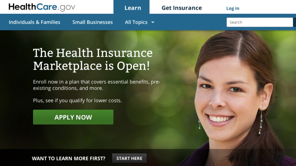
The problem is, the website has been woefully inefficient, crippled by software bugs and design flaws. Designers in particular grouse that there are significant layout and hierarchy flaws, which prevent visitors from doing the one thing they have come to do in the first place: apply for health coverage.
“It’s a huge design and communication issue,” said Dan Maccarone, co-founder of Charming Robot, a design shop. “They’re really making this more complicated than it has to be.”
A few specific, pretty basic complaints from the pros:
Call to action
Designers say that the call to action on the site, the one “must have” functionality, is maddening. There’s a big green “Apply Now” button that sits above a different call to action — “Want to learn more first? Click here.” Those buttons, designers say, should be flipped.
Too many layers
When applicants click on the big green “Apply Now” button, it asks them to choose their state, after which they’re taken off the main federal site to the state’s own page where they’re asked to click “Register.”
“I’m four clicks in, and it’s frustrating,” Maccarone said. “It may look nice, but it’s extremely frustrating.”
Too much work
The problem is not just the number of clicks, said Michal Pasternak, chief experience officer at Huge, but rather the setting of expectations that once you’ve clicked, you’ve begun the application process. But you haven’t. You still have enter all your information to figure out which plan is right for you.
“That’s the frustrating part of it,” she said. “The big challenge we see, you have to enter a lot of information before you can see what your choices are. In general e-commerce best practices, you try to collect as little as you can without giving a lot of value. It’s a value exchange. It very quickly erodes trust when something isn’t performing well.”
Aesthetically jumbled
Designers also don’t love the small, yet important stuff, like font choices. The text style and size are the same for both the “Learn” and “Get Insurance” links, even though the latter is arguably more important.
George Hastings, UX designer at design firm Area 17, thinks most of the labeling is similarly confusing and oddly labeled. “There’s a lack of consistency and not distinguishing what you’ll get,” he said.
No signposts
There’s no clear roadmap for navigating the site once you’re in it, UX experts complain. First, there’s no signposting of how many steps it’ll take to get you through the application process. For people who are already confused, not having any orienting signage – or even a back button – can cause anxiety.
“When I have to fill out information, which is probably not my favorite priority, if they don’t tell me what I need or how long it’ll take, it’s just a scary thing for users,” Hastings said. “If you don’t hold their hand, they can get lost.”
Cluttered carousel
Then there’s the carousel. It’s got five tabs to start (Get covered: A one-page guide; Find the Marketplace in your state; Get lower costs on health insurance; See what Marketplace insurance covers; Get help with your application) and then an arrow for more information. Designers point out that anything beyond the arrow will only generate about 1 percent click-throughs.
“It’s not a very good UX practice, especially with content of getting an insurance plan,” Hastings said. “For an image gallery, that’s fine. Not for this.”
Building a website, particularly of this magnitude, has to have the user in mind at all times, said Hastings. There needs to be an understanding that applying for health care is stressful. He added that while the rest of the content on the site — outside of the call to action function — is about education (tips and FAQ), it does “a pretty poor job” in accomplishing even that because of the confusing navigation.
Over at Griffopolis, DC Griffith, an experience creative director, goes into great detail in a post “How Lean UX Failed the US Obamacare Website” on many of the design issues of the health care site.
The Centers for Medicare & Medicaid is aware of the issues with its site, it tells Digiday, and there is general discontent within the Department of Health and Human Services with how the last week has played out.
“We continue to increase access to HealthCare.gov in light of strong demand,” a spokesperson wrote in an email. “Wait times have been significantly reduced, and more people are logging on and applying.”
Not everything about the site is terrible. Huge’s Pasternak said the actual language on the site doesn’t feel impenetrable or overcomplicated. She added that the visual language is pretty simple and clean. The site’s also responsive, accessible through any device. But these don’t overcome the major misses.
“Overall, they were anticipating this volume, and they knew it was a risk to not handle it,” Pasternak said. “They could have been more prepared in how they dealt with that.”
More in Media

Adobe relies on Firefly to win over creators
Adobe wants Firefly to do for AI-native creators what Photoshop did for a generation of ad creatives – become the tool they can’t work without.

News UK turns The Times’ first-party data into synthetic audiences for advertisers
News UK is turning The Times’ first-party data into a synthetic audience planning tool for advertisers.

Beehiiv adds even more features to go up against competitors and win over creators
Weeks after podcasts, Beehiiv continues to add to its platform infrastructure to court creators, but is it enough?


