Last week, Digiday looked at some of the more uglier, poorly designed publisher sites. This week, we asked Hard Candy Shell’s CEO Kevin Kearney, Code and Theory’s co-founder Dan Gardner, Judd Schoenholtz, user experience director at Huge Los Angeles, and Disqus’s director of design Chris Jennings to take a look at sites they think are well designed.
Vox, owners of tech site The Verge, sports site SB Nation and gaming site Polygon, takes design seriously. Code and Theory designed The Verge, which has a very visual-heavy appearance. According to Gardner, the design was built with a “focus on the reading experience, article page and the way related content is presented at the article level.”
There are three big navigation bars, as well as a tab to let the reader know how many new articles are on the site. Articles up top are presented with colorful backgrounds, and scrolling down, readers jump into The Verge’s content, presented with images and with text.
“One of the things media companies don’t do: they aren’t programming in any real way, just put things up in the order they get them in,” Kearney said. “The Verge’s homepage does a good job. They have big story, top story, reviews, read this now — they’ve done a good job of sectioning out types of content. It’s more about how they present stories.”
Typographically, Kearney said, Vox does a good job, arguing that with the evolution of technology, there’s no excuse for media companies to be “lazy where you choose between Times New Roman, Arial or Verdana. They’ve done a nice job of choosing types to fit with each brand.”
“In general, their sites, especially The Verge and Polygon, are great examples of representations of content that takes the best of digital and the best of what we’ve done in print,” Kearney said.
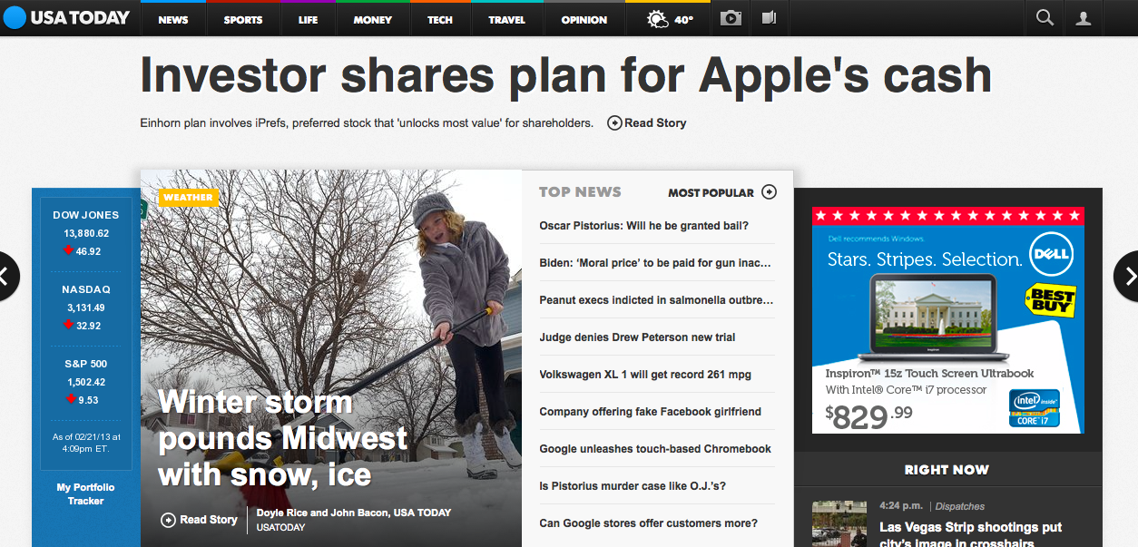
Gannett’s flagship publication had a facelift last September to focus on more aesthetically-pleasing ways of delivering content: more color, more photos, more infographics. On the desktop and tablet browser sites, USA Today’s readers can toggle between its sections, as well as stories without using the back button. It also redesigned the site so that instead of cluttering space with ads, there is only one box ad and interstitial ads between sites. Its team of in-house team designers and front-end developers built the site in partnership with Fantasy Interactive.
“From a design perspective, it may be overdone with dimensioning and layering, but it’s not a bad idea,” Kearney said. “The way they present slide shows is smart. It’s heavy on an app feel, but at least they’ve gone in the right direction. Sections are important for them, and it’s how people think about their brand. They’ve done a nice job taking advantage of modern technology, even if I think the design aesthetic is a bit app-generic and a little obvious and a little too attempting to be Apple.”
The Atlantic Media Company’s new global business site has hyped itself as a “mobile-first” publication. Unlike other publisher sites, Quartz has no homepage, instead putting the first story first. On the left column are links to other stories. There’s a navigation bar up top to its categories. Additionally, the site has infinite scroll making ad placements part of the stream of content. The site was built by Area 17.
“I was initially put off by its app-like feel, but it’s just so clean,” Jennings said. “Ads appear to meet a higher standard, don’t distract, and are designed to be content that is potentially additive to the experience. I see the ads as pacing between articles; much like commercials in a TV show. I think that’s an important model to follow in the future.”
Kearney, too, thinks Quartz has an iPad feel to it and emphasizes how the publication has “done a good job with how they’ve incorporated advertising, doing native ads that feels right for their brand.”
Though he added: “Overall, in the end, it’s just a glorified reverse-chronicled stream, which is on the left,” Kearney said. “It takes seemingly more cues from tablet reader experiences.”
One of the challenges for traditional publishers is creating a beautiful digital environment. Last month, under new owner Chris Hughes, The New Republic launched a modern site. Designed by Hard Candy Shell, The New Republic’s new site reads like a magazine, but “takes advantage of things like motion and animated GIFs,” said Jennings.
“For a brand with a great editorial and visual history, the new site certainly pushes that tradition,” Gardner said. “Firstly, it looks great. The new design clearly presented the editorial agenda while also providing just enough choices for the user to dive deeper. Further, to deliver on user behaviors, many nice features were put into the site, such as the completion bar which gives readers a nice indication as to how long / much more of an article exists, the audio option, and easy bookmarking.”
Launched in 2011, Bill Simmons’ long-form sports site Grantland is a clean approach compared to its ESPN counterpart. There’s plenty of white space, a well-spaced navigation bar and only two ads (a banner and box ad) on the homepage. Inside articles, there’s nothing to distract the reader. The site’s designed by an “unnamed freelancer” and finished by David Cho, director of business development for Grantland.
More in Media

Inside The Daily Mail’s creator-led content playbook
Inside the structure, strategy, and metrics of the Daily Mail’s creator-led content push.

Media Briefing: Overheard at the Digiday Publishing Summit, March 2026 edition
With no sign of search traffic returning, publishers are doubling down on subscriptions to build direct reader revenue — but it’s not easy.

People Inc.’s Jon Roberts on the AI licensing boom – and the revenue lag
People Inc’s Jon Roberts discusses the boom in AI content licensing marketplaces — and the revenue that could materialize for publishers.
