Google is looking younger as it gets older.
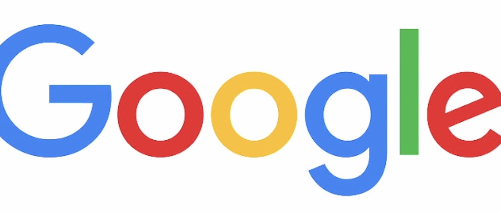
The search giant unexpectedly rolled out a new logo today, complete with a simpler sans-serif typeface while maintaining its signature parade of colors, albeit more muted. Perhaps not surprising is that the new logo evokes the company’s new parent company, Alphabet, thus providing a unified appearance across the two brands.
As Google does, the new logo was announced in a Google Doodle on its homepage showing a hand wiping away the old logo with the fresh identity.
Keeping with the “simple, friendly and approachable style” of its former logo, Google explained that the new version combined “the mathematical purity of geometric forms with childlike simplicity of a schoolbook letter printing.” TL;DR: It looks updated.
The custom font is called “Product Sans” and was designed in-house. The red, blue, yellow and green colors were edited to add “vibrancy” and “to maintain saturation and pop.” Google explained the surprisingly lengthy design process on its company blog.
With the cleaner and flatter font, akin to Facebook’s recent logo redesign, the new logo is made for mobile, noted Susan Cantor, the president of Red Peak Branding.
“The type is simpler, flatter and almost juvenile,” Cantor told Digiday. “I assume they’ve done this so that the brand retains its youthful, approachable feel in an era when things are becoming more impersonal and distant. ”
All of Google’s new products will soon be using the new logo, with Search being the first.


More in Marketing

Michaels claims Google-powered AI assistant doubles conversion rate of traditional search
Michaels shared early results of its new Google Gemini-powered AI assistant.

Mythbusters: AI visibility’s biggest misconceptions
AI visibility is evolving quickly, but many of the industry’s biggest assumptions don’t hold up. Experts debunk the biggest myths.

How AI costs are quietly reshaping principal media deals
AI doesn’t have a price. Principal media is absorbing it anyway.