When Grey Goose approached R/GA to relaunch the brand’s website, Ken Erke and Matt Marcus, the executive creative directors on the project and the co-creative leads of the R/GA Chicago office, recommended a responsive website, which would morph the user experience based on the device a consumer was using. The new greygoose.com can be used across mobile, tablets and desktop.
Noting that responsive sites are not yet very common, Marcus said, “I mean, it’s talked about and all — the explosion of mobile, its form factors and how to deal with these issues. But the common practice is to build a website for desktop and then launch apps for the other platforms, which were fed by the same data but do not use the same source code.”
According to Marcus, it is actually more cost-effective in the long run to create responsive websites than to build an app for every new device — tablet or mobile — that comes to market. He admitted that the process is a bit complicated due to all the planning, but once it’s done, there’s nothing more to do. The code then does all of the work. Marcus expects that most brands will move in this direction, because it is a means of future-proofing a website, ensuring it always works on new devices that come to market, regardless of screen size. This ensures a consistent consumer experience across all devices. Conversations around responsive Web technology are happening across the business landscape, but R/GA claims greygoose.com is one of the first fully functioning examples.
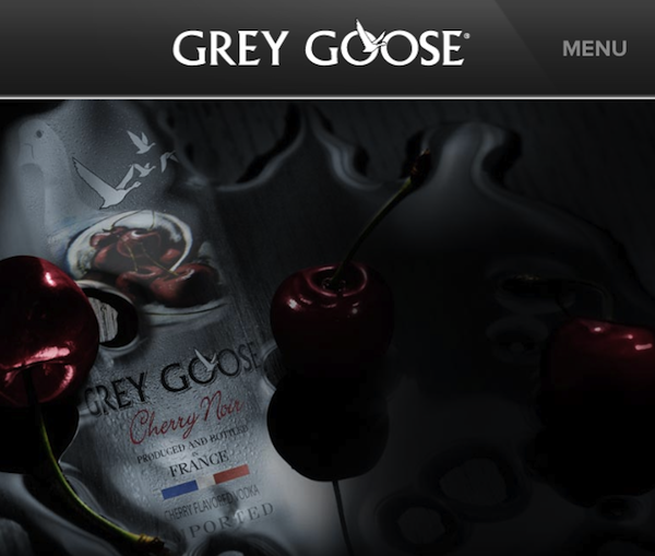
The site is packed with content around Grey Goose’s history, imagery, cocktail recipes, events and video content, which are all shareable via Facebook, Twitter and Google Plus. The HTML5 technology allows the site to be updated easily with new content streams and additional features.
Although the content across mobile, tablet and desktop is currently the same, Erke said that Grey Goose and R/GA are considering mobile-exclusive content. The site officially rolled out with a silent launch in mid-January, and Grey Goose has been tracking the way consumers are using it. Although R/GA could not disclose what’s currently in the works, the creatives did say that consumers using their mobile devices to access the site are looking at photos in the events section more often than users on the desktop and tablets. Most likely, the mobile version will be revamped to better showcase Grey Goose events and photos, maybe even with some mobile-exclusive stuff, but the R/GA execs wouldn’t confirm.
So how does the site know how to morph, for the best possible user experience? Anything under 760 pixels wide is considered a mobile device. R/GA used system text — actual text as opposed to an image of text — to ensure that the font size and layout would also morph based on the user’s device.The responsive site resizes both the text as well as the images. An interesting feature of the site is the navigation bar, which is found at the bottom of the screen, as opposed to the top.
“What’s key when building a responsive site is really understanding consumers and understanding how they are going to be engaging fans,” Erke said. “You have to get a sense of which type of content is going to get consumed and shared.”


More in Marketing

Future of Marketing Briefing: The case for and against the death of the big brand ad
Marketing has a new favorite argument: is it still smarter to talk to a million people at once, or to find the thousand people they already trust?

Lifestyle brand Stanley 1913 uses AI behind the scenes — but execs claim it won’t touch ad creative
Not every brand is racing to let AI anywhere near its ads. Stanley draws the line there on purpose.

TikTok’s Kat Marquez unpacks NBA and WNBA creator deal
TikTok’s latest move to secure its share of the leagues’ growing audiences sees it play gatekeeper between creators and rights holders.