for the Digiday Programmatic Marketing Summit, May 6-8 in Palm Springs.

The mobile era can behold both promise and threat to retailers. On the one hand, on-the-go buying could be a boon. But on the other, these same stores have to deal with people using mobile to buy products elsewhere after checking them out at retail locations.
Digiday examined the mobile websites and apps of Target and Walmart looking at things like layout, user experience and features and functionality. We are taking a broad view of how these two retailers are operating in the mobile landscape.
Walmart
Mobile site: Walmart’s commerce-enabled mobile site at http://mobile.walmart.com can be accessed by typing http://walmart.com into your mobile phone’s browser. The retailer has a simple site redirect, making it easy for consumers to get to the site via their mobile device. What’s interesting is that Walmart doesn’t push its products at consumers right away. Instead, consumers can browse through things like Value of the Day and Rollbacks, which are items that have recently been lowered in price. This is actually a very smart approach because it makes the site feel like more of a resource for customers to save than a sales driver. The product pages give consumers the option to share via Facebook and email. Shoppers can also view ratings and reviews for specific products. There is no option to share products via SMS, which is a miss on Walmart’s part. Overall, Walmart’s mobile site design is clean and easy to navigate. The site performance is great, with pages loading quickly.
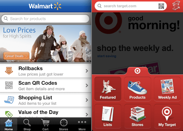
App: Walmart’s mobile app is superb. Consumers can not only browse and buy through the app, but can create shopping lists and scan QR codes to get item details and such, while in-store. The greatest potential for mobile for retailers specifically is the opportunity to increase purchase intent while consumers are in your store. Another good feature of the mobile app is the advertisement for “Great Deals,” right up front. What consumer won’t appreciate the opportunity to save money? A search functionality is displayed prominently at the top of the page, making it easy to navigate items and find exactly what you are looking for. Ratings and reviews are included on product pages, but there are no options to share products in the app. This is a miss on the part of Walmart. Consumers are the best advocates for products they like.
Assessment: Overall, Walmart is on point with its mobile commerce strategy. Both the site and the app are designed well, with lots of rich features and functionality, making a Walmart mobile shopper, a happy one. My only complaint is the lack of social functionality in the mobile app and no option to share products via SMS on the mobile website. Otherwise, it is obvious that Walmart takes mobile seriously.
Target
Mobile site: Target’s mobile site can be accessed by entering http://target.com into the phone’s browser. Target, like Walmart, also utilizes a site redirect, making it easy for consumers to find the destination. The site starts with items on sale — a smart move. A search functionality is prominently displayed at the top of the page, giving consumers the option to find specific produsts. The site layout is a bit clunky, with a lot of things going on at the same time. Its not as clean and crisp as Walmart’s. But the site loads super-fast and I like that you can view products based on price or view best sellers of the category of products you are looking for. This is something I have yet to see on a mobile website. The product page lets site viewers find specific products in a Target store near them. You can share products via email, Twitter and SMS, but not through Facebook, which I found sort of weird. Overall, the site is well designed, works fast and has a lot of rich features and functionality.
App: Target’s mobile app is amazing. The layout is so unique and hip. Users can shop the Target Weekly Ad, create shopping lists, view products an find stores near them. There is a barcode reader built into the app, letting consumers scan items to see if they are sold in Target. Also, Target does not let app users miss the fact that they get free shipping on all orders. This message is displayed prominently throughout the app. Consumers have the ability to share specific products via email or text. There is no option to share via Facebook or Twitter. A miss on the part of Target in my humble opinion. But overall, the app is definitely a great experience, especially for the more loyal Target shopper.
Assessment: Target’s use of social functionalities in both its mobile website and app is something other retailers need to learn from. Letting consumers share products is one of the best way to increase purchase intent among other consumers. I think it is obvious that Target is very focused on mobile, with its mobile website and application providing top-knotch experiences for consumers.
Conclusion
Both Walmart and Target have got their mobile commerce strategies figured out. Walmart is the clear winner with a cleaner layout and design than Target for both app and mobile website. This does not mean that Target has not done a good job. It was easier to navigate the Walmart site and app. However, Target incorporates social functionality into both its mobile site and app better than Walmart.
More in Marketing
OpenAI starts laying foundations for ChatGPT ads in EU
Updates to the company’s conversion pixel signals a consent-first approach to ads in Europe, shaped by stricter EU privacy rules.

Baller League’s creator strategy: reach is not the same as fandom
Baller League’s growth strategy: build fandom first, sell franchises second.

Marketers question expensive AI visibility tools as inconsistent results fuel skepticism
Marketers flock to AI visibility tools in a zero-click world. But inconsistent results and a lack of benchmarks are fueling skepticism.


