Agency sites are perhaps the perfect indicator of just how far Web design has come in the past 10 years. Back then, most agencies’ Web presences were surprisingly basic and housed little content and information compared to today’s equivalents. They were essentially little more than online portfolios with phone numbers, in many cases.
Digiday dug through the Wayback Machine‘s archives to see which agency sites we could unearth from 2003 and 2004. Here’s what we found:
AKQA
The look and feel of AKQA’s site actually hasn’t changed that much in the past 10 years. The usability, content and font sizes have been greatly improved, however.
360i
After starting life as a search agency, 360i’s business has come a long way since 2003. So has its website. Today’s version is here.
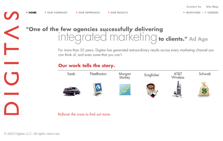
Digitas
Digitas opted for a simple and clean approach to its site in 2003, and it didn’t use Flash like many of its competitors. Here’s how it looks now.
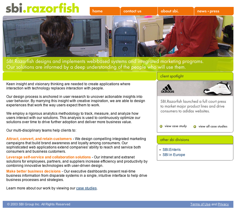
Razorfish
By 2004, Razorfish had been acquired by SBI and had taken on its branding. It didn’t even live on its own URL: razorfish.com redirected to sbigroup.com. After several more years and acquisitions, this is how the digital shop’s site looks now.
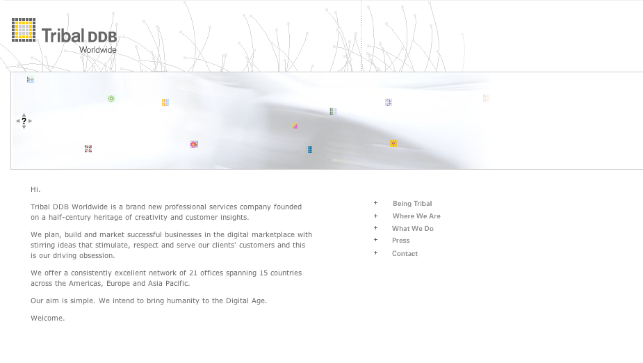
TribalDDB
Like Digitas, TribalDDB’s effort was also a minimalist affair. It’s current design isn’t completely dissimilar to its earlier version.
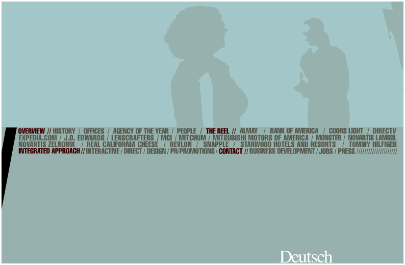
Deutsch
Like many of its competitors at the time, Deutsch went all-Flash for its 2003 site. Like today’s version, it was built largely around showcasing its work.
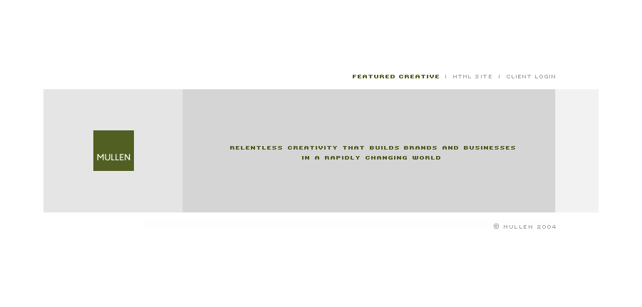
Mullen
Mullen’s 2004 Flash site was extremely basic. It featured examples of its creative, and that was about it. Today’s HTML5-based interactive site is worlds apart.
Modem Media
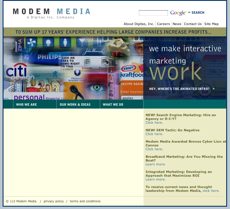
By 2004, Modem Media was part of Digitas. Even for that era, its website felt clunky and dated.
BBH
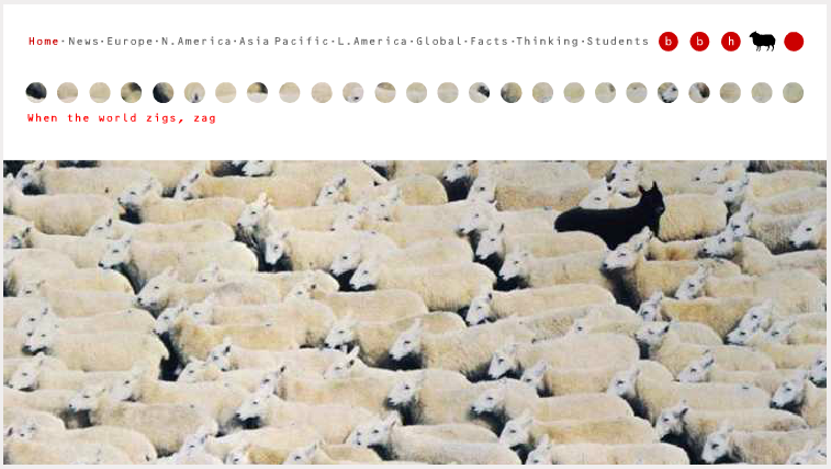
Like Mullen’s, BBH’s 2003 site was sparse and basic. It’s current one is anything but.
Saatchi & Saatchi
Compared to some of its competitors’ sites, Saatchi’s stuck out in 2004. The well-executed Flash site invited users to explore different “rooms,” each of which featured work and info about the firm. Its current site still uses Flash and feels somewhat dated.
Wunderman
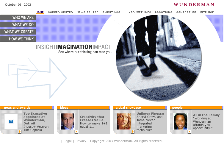
Wunderman’s 2003 site wasn’t exactly showy, but it was content-rich. It’s current online home isn’t that different and pulls in a range of social content.
mcgarrybowen
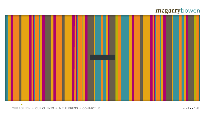
mcgarrybowen’s 2004 Flash-based site came with an audio soundtrack, unfortunately. Luckily its current one doesn’t.
More in Marketing

Future of Marketing Briefing: Memes used to be a joke. Now they’re a strategy
This Future of Marketing Briefing covers the latest in marketing for Digiday+ members and is distributed over email every Friday at 10 a.m. ET. More from the series → Last month, a U.S. Special Forces soldier was indicted for insider trading — not on stocks, but on a prediction market. He had detailed knowledge of […]

Digiday+ Research: Marketers’ AI use rises, but tech skills stall
Marketers’ adoption of AI technology has risen significantly in recent years, but training employees on using these tools lags behind overall adoption.

Possible expands to Lisbon in 2027, keeping its focus on marketing, tech, culture and creativity
Digiday caught up with Carolina Cespedes of GoGo Squeez, Remy Stiles of agency Kepler and Oz Etzioni of Clinch, as well as Possible’s co-founder and owner.


