Last chance to save on Digiday Publishing Summit passes is February 9

The runaway success of Pinterest has caught retailers’ eye. While years ago many would model their sites off Amazon, more and more are using Pinterest as their inspiration. Look no further than e-commerce giant eBay.
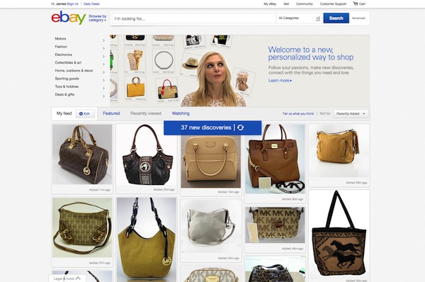
EBay recently redesigned its site into a more visual interface that looks very much like Pinterest in the way that it displays products. There is a prominent grid of products in the layout. Visitors can scroll through the photos in much the same way as Pinterest.
“The Web is definitely changing and we are building on that,” said Marie Floyd Tahir, vice president of design for eBay Marketplaces. “EBay has always been focused on being great at the transaction and making sure people could find things and search for things. We have great support for that. But there is so much more to shopping, that is so visual.”
The main aspect of the eBay redesign is a stream of relevant products on the eBay homepage that is custom built for each user based on previous purchases, searches and all the other data eBay has on us.
The approach is not for everyone. Several designers said that sites like eBay aren’t well equipped for a Pinterest style layout. EBay’s marketplace has a mix of large and small sellers, therefore a lot of the photos aren’t professional style, quality photos. A retailer that’s going to adopt a Pinterest-like design needs to be ready to invest in the photo assets. That means different backgrounds and scenes. Maybe even a few props. Think of catalogs. That’s a great example of visual variety and there’s no reason that photos for a catalog can’t be repurposed for the Web.
“The new eBay is dull,” said Kevin Kearney, CEO of Hard Candy Shell, a Web designer. “The Pinterest design is meant for people who are in exploratory mode or looking for inspiration. That isn’t the core use case for the eBay customer.”
According to Kearney, the interest in Pinterest should not be so literal. Yes, the Web is currently undergoing a shift from words to images. And yes, retailers need to figure out a better image strategy and make their photos edgier. But Pinterest is just one example of this move to a more visual Web.
EBay, however, claims that since it began piloting the new design late in 2012, people have been spending more time on the site, just browsing items, which is exactly what the company was hoping would happen.
“The redesign, for us, was a way to go beyond the transaction,” Tahir said. “It’s a way for us to inspire people to buy something that they weren’t necessarily looking for.”
Chloe Gottlieb, executive creative director at R/GA New York, on the other hand, feels that eBay’s redesign is a bold move that other retailers could learn from. The stream aspect of the redesign is what she finds most interesting. The layout speaks to a shift from pages to streams of content; content that isn’t tied to a specific page and that is more modular than ever before.
“What they are trying to do is move to a homepage that isn’t curated by the brand,” Gottlieb said. “They’ve created a feed that is a more personalized version of eBay. So instead of wasting time and looking at stuff they would never buy, consumers get served relevent items in their feed based on purchase history and the like.”
There’s also been some arguing on how usable the new eBay interface is. Gottlieb said that people will be able to figure it out. After all they got the hang of Pinterest, didn’t they.
“Retailers that are moving to these more visual interfaces are making their products more easily shareable,” Gottlieb said. “Commerce is becoming more social through the sharing of pictures and eBay gets that.”
Image via Shutterstock
More in Marketing

In Q1, marketers pivot to spending backed by AI and measurement
Q1 budget shifts reflect marketers’ growing focus on data, AI, measurement and where branding actually pays off.

GLP-1 draws pharma advertisers to double down on the Super Bowl
Could this be the last year Novo Nordisk, Boehringer Ingelheim, Hims & Hers, Novartis, Ro, and Lilly all run spots during the Big Game?

How food and beverage giants like Ritz and Diageo are showing up for the Super Bowl this year
Food and beverage executives say a Super Bowl campaign sets the tone for the year.


