for the Digiday Programmatic Marketing Summit, May 6-8 in Palm Springs.

In the agency world, business cards aren’t just rectangular pieces of paper with contact details — they are windows into agencies’ very souls. Whether subtly classy or playfully quirky, each card offers a glimpse into what the agency stands for.
And there are just as many interesting cards as there are agencies.
So it’s only fair that our first installment of the best agency business cards last week, we follow up with another one.
Brownstein Group

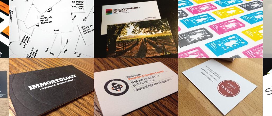
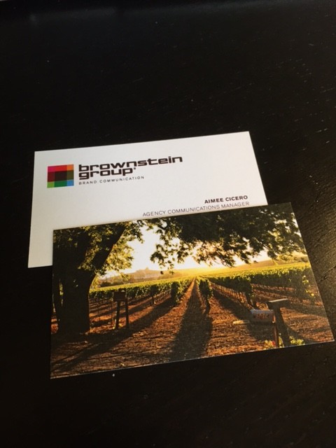
The Philadelphia-based agency has always prioritized fun and cleverness in creativity, and its cards echo that with the mullet of business cards: business in the front; party in the back. The front of the card is simple and features the agency’s logo — its take on a classic Rubik’s cube. The back of every employee’s card is different, as each employee gets to chose an image that they feel best represents their personality or interests. Examples include an image of a winery in Sonoma, California, or a caricature of one’s pet.
Immortology

Immortology’s mission is to build immortal brands, so it was natural for the agency to want its cards to have a timeless look and a permanent feel. So it settled for the letter-pressed heavy linen stock combined with a clean type treatment, accented with a little orange. The dragon eating its tail is the agency’s take on a 5,000-year-old symbol of immortality called the “ouroboros.”
“The three circles made by its tail represent our clients, their customers and their competitors — all of which need to be clearly understood to create legendary brands,” said David Smith, creative director at the agency. “The outer circle is another ouroboros which symbolizes the virtuous cycle between customers and client that is created by enlightened marketing.”
CP+B

Face it, though. No matter how slickly designed your card is, most people will either throw it away or toss it in a pile a forgotten desk drawer. Which is why CP+B really wanted to provide some utility with its cards. The Boulder-based agency recently created a stencil business card, made of thin plastic with an array of laser-cut iconography including Hermy — its elephant mascot.
“Since at CP+B, we love the craft of advertising and want to spread that love, and because we also believe that all ideas should start on paper without the influence of computer programs, we came up with the stencil business card,” said Dave Swartz, vp and executive director of art direction & design at CP+B.
Baldwin&

Baldwin& doesn’t like attaching airtight titles to its employees, instead giving them the power to attach whatever they prefer with their names. David Baldwin, for instance, is “Lead Guitar” whereas Bob Ranew is “Day Dreamer.”
“You get to choose your own title and really be whatever the heck you want to be here,” Baldwin said.
Kettle

This one is basic, on high-quality stock with a solid color palette of approachable colors: yellow and white. What stands out though, is that the text is not aligned horizontally, but vertically.
“A bit of playfulness with portrait instead of landscape copy, and a simple design that just looks right, it’s a small card that embodies the Kettle brand and philosophy,” said Paul Munkholm, Kettle’s director of strategy.
Base New York

Base believes that brands are like people and embodies that spirit in its own brand, placing an extremely high value on its individuals. Which is why every Base card begins with the phrase “I am,” followed by the person’s name, followed by “And we are Base” to represent the broader group context.
Sullivan
![IMG_6524[1] (1)](https://digiday.com/wp-content/uploads/sites/3/2015/05/IMG_65241-1-744x558.jpg)
Sullivan’s business cards feature five different icons, which are meant to reflect the brand promises it makes to its clients. These are: a pair of shoes, signifying a willingness to walk a mile in its client’s shoes; a policeman’s cap, representing the agency’s mission to protect and serve its clients; a bulldozer, which symbolizes a willingness to dig deeper; a devil’s head because the devil’s in the details; and a thunder cloud for when the lightning of creativity strikes true.
“When we came up with the icons, our one objective was to create a conversation. So no matter what situation we’re in, it’s meant to spark a conversation, create intrigue and enable Sullivan to have a dialogue about who we are and what we do in a natural way,” said John Paolini, partner and executive creative director at Sullivan.
School of Thought

This San Francisco-based agency is small but emphasizes quality — and distinction. And so it designed its business cards on double thick paper. They’re taller than average size — 2.7 inches rather than 2.5 inches. It is letterpressed on one side, offset on the other, and has a custom PMS flood.
Stimulant

Stimulant’s business cards embody the features it promises clients: solid, well-built, eye-catching, and crafted with a high attention to detail. It is a combination of letterpress printing and edge-painting. In addition, the generative mesh on each card varies from card to card, so that no two cards are exactly alike.
More in Marketing

How did Nike’s embattled heritage brand Converse reach a 15-year revenue low?
The last few years have seen Converse continue to underperform compared to the rest of Nike’s portfolio.

Why Pfizer and other blue-chip brands are building internal AI search hubs to reclaim control
As AI upends traditional rankings, big spenders like Pfizer and other blue-chip brands are building internal task forces.

OpenAI has quietly launched its ads manager as it races to build out its ads business
The AI platform quietly launched its ads manager within its ChatGPT ads pilot advertisers last week, and also lowered the barrier to joining the test.


