 This is the series capper to “Mobile Next,” Digiday’s coverage of innovations in mobile media. This series is sponsored by LIN Mobile, a premium mobile marketing provider with a unified solution for precise targeting, high-impact creative and real-time analytics.
This piece was written by Kevin Wassong, CEO of LIN Mobile.
We’ve all heard that this, yes, this year really is the year of mobile. And, while that might not be entirely true yet, we’re certainly on the cusp of a higher quality and more robust mobile marketing industry.
Mobile has become the first screen in terms of time spent, with users spending 151 minutes a day on their smartphones compared to 147 minutes on TV and 103 minutes on computers, according to Millward Brown’s 2014 AdReaction Study. Mobile ad spending increased 105 percent in 2013, according to eMarketer, and is projected to hit $31.45 billion this year. Over half of that budget is spent on mobile search, and the full $31.45 billion will still only account for a quarter of all digital ad spend.
Bigger is Better: A New Standard for Mobile Creative
It’s clear that many agencies and marketers are still trying to figure out how to turn those mobile eyeballs into marketing dollars, conversions, and sales. The biggest change the industry can make to better capitalize on mobile audiences is to adopt better mobile creative. Users need mobile ads they can actually interact with on their devices, and that means making ads bigger, inline, and responsive. 300X250 units with responsive capabilities must become the new standard for mobile creative.
Creativity + Interactivity
The more visually striking and valuable an ad is to a user, the more likely they are to click, engage, and ultimately make a purchase. In the past few months, we have seen responsive, larger ads perform 40-60 percent higher across core metrics than standard mobile banners. The 300X250 unit provides both a larger pallet for design and more ways for consumers to learn about a brand and its products.
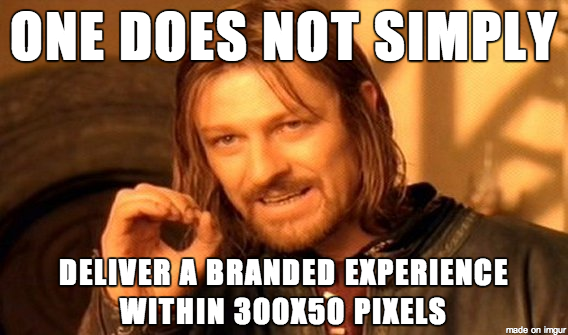
Adopting the 300X250 responsive unit over the more traditional 300X50 static unit has clear advantages: it provides significantly more real estate for brands, it translates well to any platform (mobile, tablet, desktop), and it opens up far more opportunities for interactivity. It’s the difference between having a static ad where your only option is to click through to the website, and an app-like rich media unit with forms, videos, coupon downloads, click-to-call, maps to nearby store locations, you name it.
Universal Compatibility
After beauty comes functionality, which is why it’s crucial that the industry adopt not only larger units, but also responsive ones. In February, the IAB sent out an open letter urging advertisers to use HTML5, “the one open, industry-standard, universal format for building mobile-ready creative” for all mobile ads. Using HTML5 is the best way to ensure that ads both look great and function optimally as they travel across screens and devices.
The Whole Equation
Prioritizing bigger and better mobile creative will go a long way towards improving mobile campaign performance and maturing the industry as a whole. But, let’s not kid ourselves into thinking that it’s the answer to the whole question. Great creative only takes you so far if no one sees it. Brands need feature-rich mobile ads delivered on premium inventory where real users see and engage with them, and for all of it to be managed and measured in a standardized way. It’s succeeding in all of three of the key areas — audience, ads and analytics — that will allow mobile to come into its own and become a top priority in the marketing mix.
Image via Shutterstock
More from Digiday

Digiday+ Research: Marketers optimize GEO strategies amid the effects of zero-click search
While AI-generated search results are still relatively new compared to traditional search results, marketers are deeply feeling the effects.

‘Google doesn’t care that it’s terrible’: Brand, agency execs air frustrations with The Trade Desk, Google’s Performance Max, Meta’s Advantage+
Think transparency is hard to come by in programmatic advertising? Well, get a bunch of brand and agency executives in a room, and they’ll get super transparent about how opaque the digital ad market has become.

The case for and against agentic media buying
Agentic media buying promises a reinvention of the programmatic ecosystem, but experts are divided on whether it could help – or hinder – accountability.


