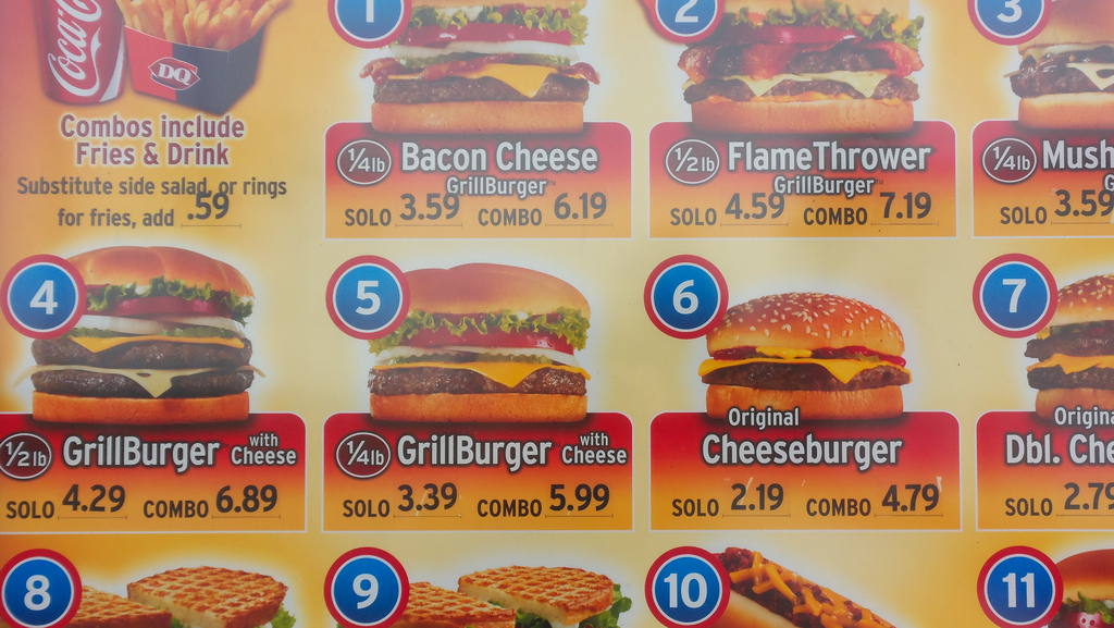
The world of modern publishing means making critical decisions on things like hamburgers. At a time when publishers have gotten design religion, the so-called “hamburger menu,” which appears as three parallel lines and hides section navigation, has emerged as a divisive tactic. It is heralded by some as modern, mobile and minimalist. Others deride it is as the latest flavor of the month, thoughtlessly deployed by copycat publishers desperate for a whiff of digital cred.
Slate, Quartz, Upworthy, Time and NBCNews all use some variation of the hamburger, where scrolling over it reveals supplementary pop-down links and site maps to more content. The menu’s popularity has risen in lockstep with mobile adoption, which has forced publishers to design sites that scale for a wide variety of screen sizes while taking up a minimum of real estate. It also serves to de-clutter the tops of Web pages, which have often been a riot of section links and various other digital doodads.
“We knew that people are coming into the site through desktop at one point and mobile at another,” said Dan Check, vp of tech at Slate, which added the hamburger menu with its redesign in September. “We wanted to make sure that there was some sort of consistent navigation experience between the two.”
But it comes with a tradeoff. Many user experience experts are not fans of the hamburger. To many, it smacks of design by committee, reminiscent of the content carousels that force readers to chase after content. “It makes absolutely no sense to me from a UI or UX perspective, if your menu really needs to be so insanely large that you can’t display it nicely without hiding it behind a click of a fairly nondescript icon, you should probably be having a closer look at your content strategy,” designer Ben Garratt wrote a year ago.
Users are often baffled by it. James Foster, a software designer at Exis Web, tested the hamburger menu and found that it was clicked 20 percent less than a simple “Menu” button. His findings support those of user experience research firm NNGroup, which found that users are still unfamiliar with the new icon.
Publishers tend to be aware of the problem. NBCNews.com adds a “menu” underneath to its hamburger icon. Time, which added the menu alongside its redesign in March, also presents new readers with a message (dubbed “hamburger helper”) that explains what the menu icon means. Sites like Upworthy, Slate, and Quartz, in contrast, don’t add the extra detail at all.

“That’s when you know you’ve done something wrong — when you have to explain it,” said Kevin Kearney, CEO of Hard Candy Shell, which has blacklisted the hamburger menu in its own designs.
But if the hamburger menu is so unintuitive to readers right now, why do so many publishers insist on using it?
Dan Maccarone, CEO of Charming Robot, argued that the problem, at its core, is a lack of imagination. Publishers are adding the hamburger menu because other sites have added it, not because there’s a lot of data to support its efficacy, he said. What works for Upworthy, for example, might not work for Time, which has an older readership that might be even less familiar with what the hamburger icon means.
“People are copying things that haven’t even been validated by the companies they are copying,” added Kearney.
But Daniel Bernard, Time.com head of product, pushes back against that assessment. While readers are still adjusting to its hamburger menu design, they’ll catch on soon enough. “One of the things we were trying to accomplish with this redesign was to think about the future and where people are going,” he said. “We felt confident that they would get there and that we could be one of the sites that helped them.”
While some of this sounds like the typical interface designer squabble, it can also have real, practical effects on publishers’ bottom lines. Design decisions that confuse readers too much will drive them away, decimating traffic. And publishers are rarely ever looking for smaller audiences.
And it’s not like every publisher is coming into this blindly. Dan Check, VP of Technology at Slate, said that the site uses the menu to segment the casual readers from the repeat ones. So-called “power users,” who are looking for specific content, will click over, the thinking goes, while those who don’t will just scroll through the main feed.
Zach Seward, senior editor at Quartz, said that the site put a lot of thought into implementing the hamburger menu, which, he said, users are increasingly expecting to see at the top of sites. Even still, he, like others, is taking a deliberate, watchful approach.
“Should it say ‘menu’ in addition or instead?” he asked. “We think about all of that and will undoubtedly test those things as we continually redesign the site.”
Photo: Flickr/Daniel Oines
More in Media

Mega creators find that their personalities alone aren’t scalable as standalone businesses
Successful creators like Alex Cooper or MrBeast are creating media companies, to varying degrees of success and struggle.

Media Briefing: Publishers cautiously count AI licensing as notable revenue amid programmatic strain, in Q1 earnings
Amid declining referral traffic and programmatic ads, publishers are beginning to see meaningful revenue from AI licensing deals.

Retailers are rushing to build AI apps. It’s unclear if shoppers will use them
There are almost 900 apps on ChatGPT and 353 Claude connectors, according to AppDiscoverability.com, which tracks AI app data.


