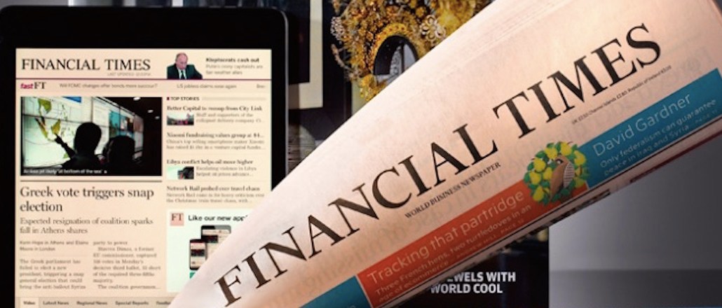
The Financial Times has been getting serious about the graphs it produces.
When Alan Smith took up the newly created data-visualization editor role at the salmon broadsheet last September, he had never worked in a newsroom before. His arrival, straight from the Office for National Statistics, reflects in part a change in the required skills in the newsroom.
Talking to Digiday, Smith expressed a few firmly held beliefs about the role of charts at the paper. They are not, for instance, a way of brightening up a page of text.
“Very often, these charts should be appearing in the first few paragraphs, explaining the basic information so that the accompanying copy can be more analytical,” said Smith. “We can use these graphics to help carry some of the narrative so that it’s not duplicative. Eventually we will be making fewer charts, but they will be better focused.”
Ten months after Smith’s arrival, here is how the FT is changing its approach to data visualization.
Change the tools and workflow.
Previously, the FT’s graphic teams were organized according to platform: a team for print graphics, online graphics and interactive graphics. Smith hasn’t made any additional hires to the 14 people that were under the broad graphics heading when he arrived. Instead, he has centralized the core team, which includes cartographers, editorial statisticians, interactive data journalists, illustrators, print and online graphic designers.
“When you have teams aligned by platform, you very often work to the lowest common denominator,” he said. “There’s an element of ‘we can’t do it in print, so we’ll make this chart online.’ The difference is in how you approach the design of it.”
The team has also started using a new tool to boost efficiency: D3, an open-source visualization library that allows staff to create different versions of graphics in one go, which can then easily be used for print, online and social media.
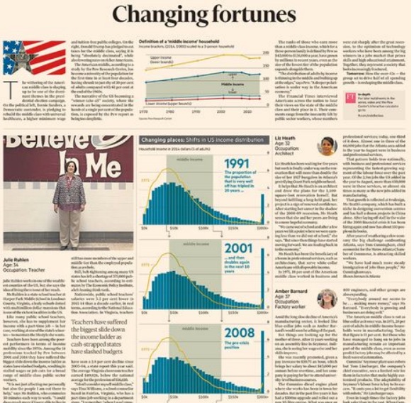
For instance, when the team wanted to show the change in wealth in America since 1971, it created an animated GIF to use in the online article. The FT published two articles, “America’s Middle-Class Meltdown: Core shrinks to half of US homes” with the chart, which had twice as many pageviews as the article without (“America’s Middle-class Meltdown”). Also, it was the FT’s highest-performing tweet last year, according to Smith. While it took a couple of days to create the GIF, adding in a line of code makes it easily adapted to print and social media, rather than starting a new workflow to create it for the newspaper.

Create graphics specifically for social media.
The FT uses social media as a mouthpiece to attract new readers and direct them to deeper analysis. When graphics are self-contained, they work well on social.
A relatively obscure story on the aging population of Japan won’t necessarily pique widespread interest, so the FT created an animated graphic straight for social media which highlighted some of the more interesting data points. “Japan has this rapidly aging demographic time bomb, which is what happens when you have a much tighter immigration policy,” said Smith. “This already makes it a much broader-interest story.”
Before this year, FT had never seen a video reach the half-million view mark on Facebook. In May, two data visualization videos, created specifically for Facebook, amassed more than 800,000 views; on average, they have 25,000 views, according to Tubular Labs. One, a high-production video on what would happen during Japan’s next big earthquake, linked back to much deeper analysis on the story on the FT. The other, which only took a couple of hours to create, is a made-for-Facebook portrait of Brazil in four charts. Smith notes its success was buoyed by the high numbers of Brazilians on Facebook and the timeliness of this year’s Rio Olympics.
The Brazil video is part of a newly launched Facebook series called “The Day in Four Charts” in which the graphics team show four of the most important stories in charts. Smith and the graphics team have noticed that the highest-performing four charts videos are those that, like the Brazil example, have a narrative arc, as opposed to comprising four random graphs.
Meet The Chart Doctor.
Seventy percent of the FT’s digital subscribers are corporate accounts, and the publication offers a few tools for business readers, like public-speaking tips and honing pitches. Last month, Smith decided to share with its readers how the FT approached graphics through a monthly column, The Chart Doctor.
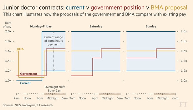
The first piece aimed to dispel the myth that all charts should be understood in five seconds, by creating a pretty dense chart explaining the junior doctors’ strike and the government’s stance. The second installment is out this week and will be showing how the FT took a hard-to-read chart and gave it a makeover into something much more digestible. “Not only does this show readers what we’re doing,” said Smith, “but it also promotes what we’re doing internally too.”

Images: Courtesy of the Financial Times.
More in Media

Retailers are rushing to build AI apps. It’s unclear if shoppers will use them
There are almost 900 apps on ChatGPT and 353 Claude connectors, according to AppDiscoverability.com, which tracks AI app data.

Why news publishers are getting into the sports business coverage
Yahoo and Dow Jones are betting on the booming sports business beat, launching new verticals to capture high-value audiences and advertisers.

From ad tech tax to AI data brokers: the new middlemen keep 100%, publishers say
For some publishers, third-party content scraping lands as an even bigger affront than the ad tech tax they’ve spent years navigating – not a share of the pie, but the pie itself.


