Secure your place at the Digiday Media Buying Summit in Nashville, March 2-4

No one likes a banner ad. But among the legions heaping hate on the unfortunate unit, designers may be the ones who dislike the banner ad most of all.
One of the problems with the standard banner ad is that it comes both in fixed dimensions and is sold based on where it appears on the page. This complicates the creation process for designers, who are often forced to start from the ad units and design around them. That’s why most article pages are built around popular right rail-based 300 x 250 banners.
“The thing is the bane of our design existence,” said Ryan McManus, design director of Hard Candy Shell. “It’s like a rock in our Zen garden. It’s an unmovable, horrible object that we have to build something around.”
Designers are more partial to a second option: working within a unique, reader-focused page design that’s centered around custom ad placements. This is the approach Quartz and Vox Media’s The Verge and Polygon have taken, winning design praise for ditching right rail placements in favor of custom in-stream ad units.
“When advertising becomes disruptive to the flow, you have more engagement,” said George Eid, partner and creative director of Area 17, which designed Quartz. “You read an article, you get a word from our sponsors, and you read another article. It disrupts the flow but engages the user. In the righthand column, that process is destructive.”
The challenge, however, is that publishers with custom ad units also need equally creative people to help sell them. Selling custom units is, by definition, a slower process that’s harder to scale, which is why its such a rare approach among publishers today. Ultimately, this is why most publishers go the easier route, and drag their designers along with them.
There may, however, be a third way. There may be a way to combine the two approaches. Consider the recent redesigns of Time.com and Fortune, which dynamically display banner ads as users scroll from one article to next.
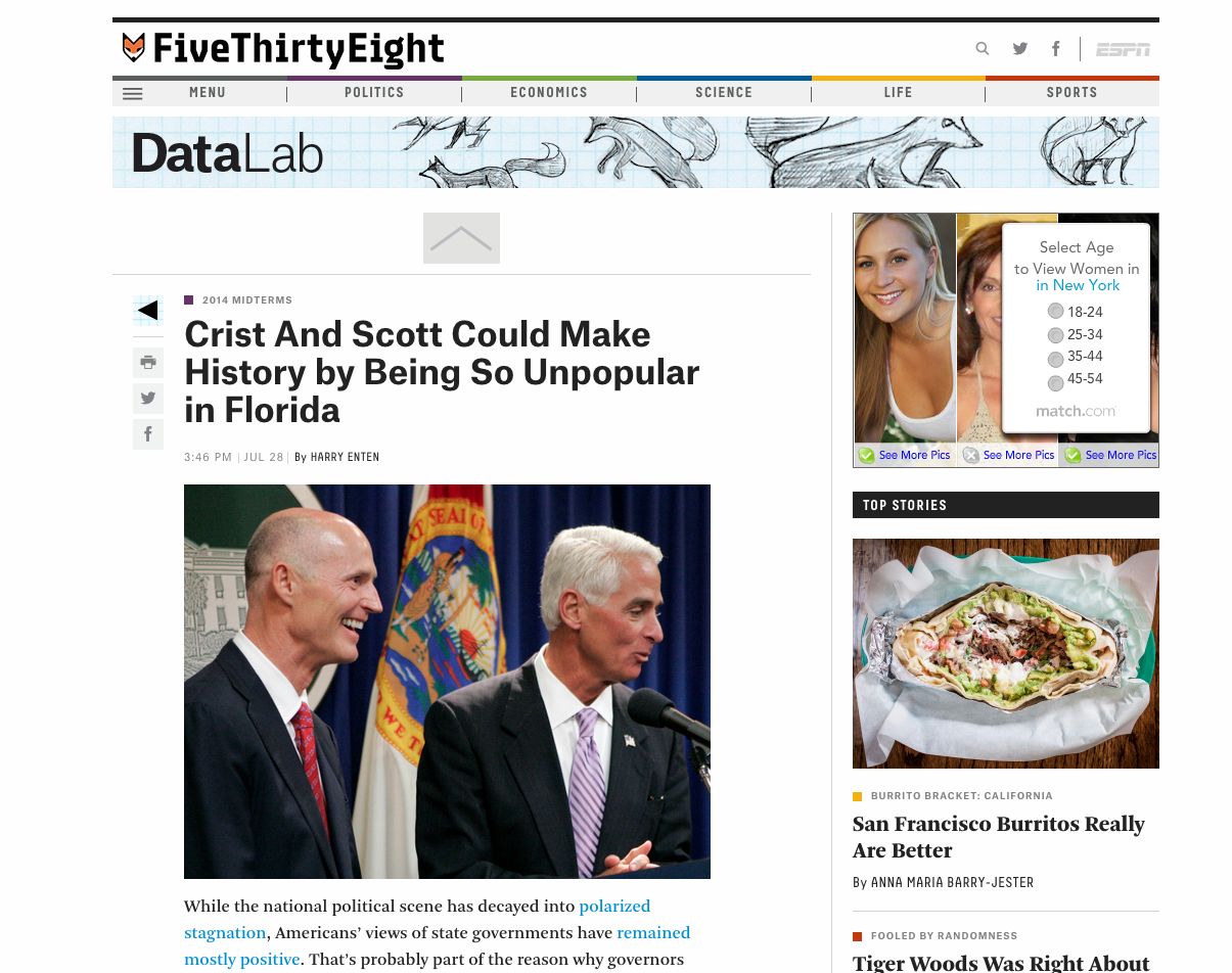
Of course, this doesn’t always work either. In the case of news sites like Vox.com and FiveThirtyEight, the result is a well-designed website with a clunky and awkwardly-placed banner.
But compromise is baked into the job. “The very nature of a designer’s task is to take an ad unit that’s been around for a long time and make it more valuable by virtue of their design,” said Austin Smith, managing partner and co-founder of Alley Interactive, which worked on the new Time Inc. sites. “That’s a hard problem, but these things wouldn’t be expensive if they weren’t hard.”
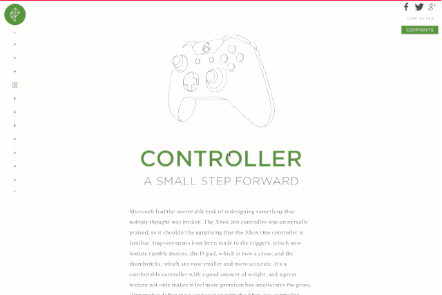
Image via Shutterstock


More in Media

Media Briefing: Turning scraped content into paid assets — Amazon and Microsoft build AI marketplaces
Amazon plans an AI content marketplace to join Microsoft’s efforts and pay publishers — but it relies on AI com stop scraping for free.

Overheard at the Digiday AI Marketing Strategies event
Marketers, brands, and tech companies chat in-person at Digiday’s AI Marketing Strategies event about internal friction, how best to use AI tools, and more.

Digiday+ Research: Dow Jones, Business Insider and other publishers on AI-driven search
This report explores how publishers are navigating search as AI reshapes how people access information and how publishers monetize content.