From The New York Times to Quartz, which publisher is king of the visual web?
Millennials don’t read, they scan. A generation of readers is caught in a perpetual scroll, so it’s no surprise that publishers that aim to capture that coveted demographic are leaning toward images to catch (if not hold) their attention.
“You’re not reading every article, you’re reading across articles,” said Kyle Outlaw, group experience director and UX expert at Razorfish. “Images help you to quickly scan what’s going on. That’s where images and headlines are really coming together.”
Digital media and its first native audience might not have killed the broadsheet-approach to news, but it’s definitely doing its best to replace it with the feed. “Visuals show your experiences without telling people about them,” said Anindya Ghose, professor of marketing, information, operations and management sciences at NYU’s Stern School of Business, in our recent publisher report. “This allows viewers not to spam their audience or overload them with textual information.”
Glossy images now reign supreme above the fold on most of today’s top sites, and even below there’s a stronger emphasis on showing over telling. But as usual, there are winners and losers; not all publishers handle this with the same panache.
To see where a handful of the top news sites stack up in this visual arms race, we analyzed four homepages, some Millennial-first, some traditional, by checking the proportion of pixel real estate held by images and visual content. Razorfish’s Outlaw put those ratings in context.
The New York Times – 21 percent
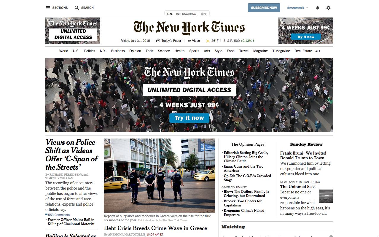
The New York Times remains an international paper of record, and its design reflects that brand promise. “They still hold fast to the newspaper paradigm,” said Outlaw. “It still looks lot like a newspaper and is organized very similarly. They’ve had to continually add and add and add, so it’s starting to become an overload.”
“The most dominant images are actually ads,” he continued, “and their placement creates a lot of tension on this page.” The size and weight of the ads throw the rest of the text-based layout out of balance, contributing to a less-than-clear hierarchy. And, like most traditional ad placements, users tend to ignore them.
While advertisers might be pleased with this prominence, said Outlaw, “it does have an impact on the design and the experience.” There are few large, glossy images to compete with or balance out the advertising. Of course, a dearth of massive images does have one advantage: faster load times, especially on mobile.
Mic – 16 percent
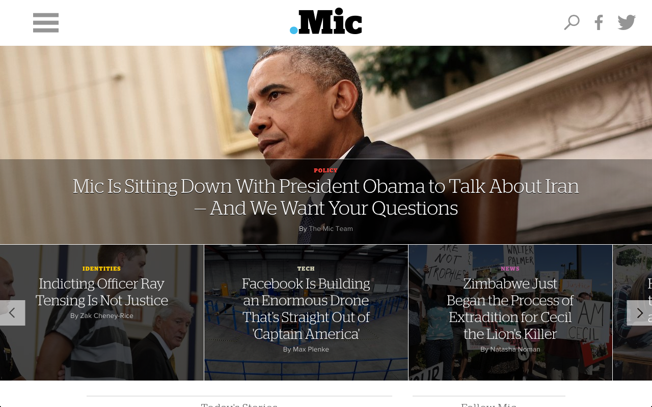
Millennial-focused site Mic actually tanked harder, when considering the full page. Based on a pure pixel count, Mic’s homepage actually rates lower than The New York Times when it comes to being image-first, surprising given the design’s sleek, graphic approach. This changes when you just look above the fold: Here users are met with Mic’s slick wall of images, each with a very specific purpose.
“Here is a layout that effectively creates a hierarchy of content,” said Outlaw. “You have a hero [image] at the very top, and then you have your secondary features right below that in a carousel, and I think that’s a very effective use of imagery. And then as you go further down the page, every headline has an image associated with it.”
Anthony Sessa, Mic’s vp of product, explained their approach as a balancing act: “[The homepage] should be a front door for the brand that represents this visual, interactive, engrossing user experience, but we also want to go back to what you might see on The New York Times homepage, which is very textual.” Vibrant, different, but just familiar enough that old consumers of news content aren’t alienated. It’s why the list format dominates below-the-fold.
“People’s eyes and minds generally go right to the image first, regardless of how great the headline is,” he added. “So our homepage is image-heavy to a certain extent.”
POLITICO – 31 percent
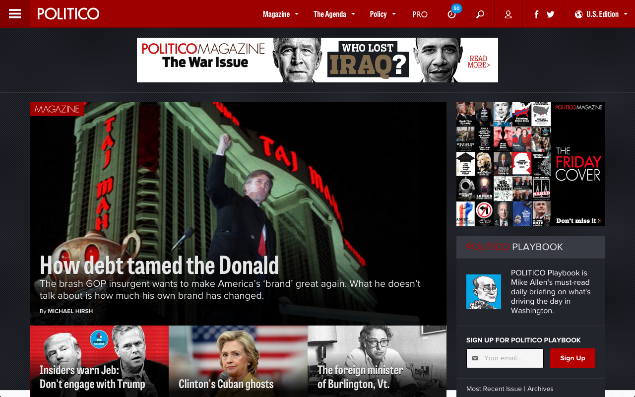
POLITICO’s recent redesign proves that even digitally-native sites have evolved to be image-first. When the site bowed in 2007, its design mimicked a traditional broadsheet:
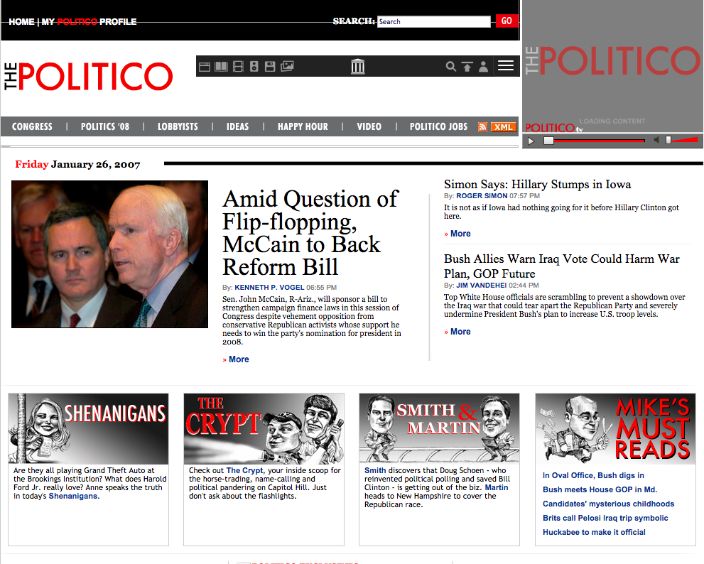
Now it is the second most image-heavy site in the mix and has the most heavy-handed approach.
“What they’re trying to do here, and this is also somewhat of a legacy approach, is put as much as they possibly can above the fold,” critiqued Outlaw. Less (at a time) is always more (digestible).
“In usability studies that we’ve done, and also third-party research, it’s clear that there’s much more tolerance these days for long scroll. Don’t worry about crowding everything into the very top. The screen is very fluid now. People have very large monitors.”
“I find [POLITICO’s layout] on mobile a little bit cleaner,” he added. “It’s the same experience, it’s just organized as a single column.”
Quartz – 63 percent
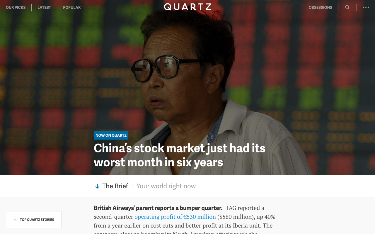
Quartz comes out on top by pulling the best practices of the other sites together into something sleek, effective and (as the score above shows) highly image-centric.
Using a simple feed approach, it uses image slices that span the entire page to characterize and foreground a number of the headlines and abstracts, expertly drawing the scanning eye to item after item. Interspersed are larger images and infographics.
With an abundance of pictures, today’s savvy publishers are finding more innovative ways to monetize them. Quartz seamlessly gets its advertisers visually involved through sponsorships.
“It feels like it fits within the general topical areas that Quartz covers,” said Outlaw. “It doesn’t feel out of place — there’s a true partnership here between [Quartz and] the advertiser. Aesthetically, the way they’ve handled it is good because you scan through, and you know it’s sponsored because it’s branded, but it’s very harmonious with the rest of the page.”
The need for this native, image-centric approach to advertising is clear. Banner blindness and ad blockers have brought the industry’s standard, IAB-led ancien regime to its knees. The platforms and publishers that offer their brands custom, visual formats conducive to new consumption patterns are the ones set to take the throne.
Still unconvinced? Check out our publisher report for more.


More from Digiday
LinkedIn wants to own B2B creator discovery with new creator marketplace
LinkedIn is aiming to make B2B creator discovery more scalable for brands looking to tap into its growing creator ecosystem.
D+ Research: Marketers embrace AI for social and retail media, but show skepticism in AI ad buying
For all the chatter about AI’s impact on marketing workflows and outputs, most marketers have yet to embrace the technology for social media and retail media, according to a Digiday+ Research survey.

Inside the messy middle of January Digital agency’s AI adoption
Brands and their agency partners have started using agents to plan, execute, and optimize ad purchases.