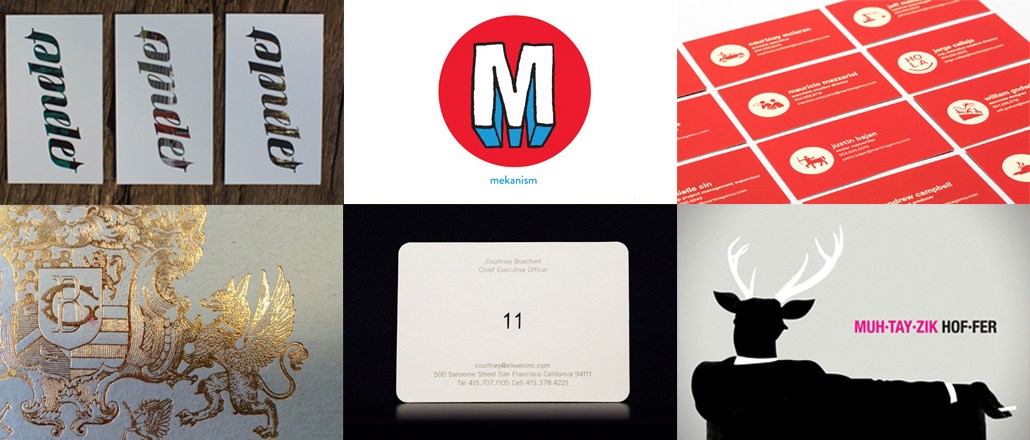
Agencies get as creative with their business cards as they do with their pitch decks. After all, it’s all about making that solid first impression.
While some keep it simple, many are the sum of carefully chosen color palettes and stylistic fonts that evoke an agency’s personality — playful, bold, hip.
We rounded up some of the most creative in the field. Want yours to be included? Tweet it at us.
The Martin Agency

In 2014, the Martin Agency rebranded itself to reflect the diversity that each of its 543 employees brought to the table. Its business cards are at once consistent across the agency and individualized for each employee — every staffer gets an avatar reflective of their personality: a centaur, a biker dude, a guitar.
“It’s as much about their personal identity as their professional identity,” said a spokesperson for the agency.
The avatars were generated once each employee filled out a questionnaire on the agency’s microsite, said Chris Peel, creative director and lead designer of the rebrand. “The Mad Lib-like tool focused on how you spend your time, the things you can’t live without and other personal questions which helped the generator find the perfect design for you, resulting in an individual icon for each of our 500+ employees at the agency.”
Omelet

This Los Angeles-based agency purposefully chose a clean design that allowed its unique ambigram logo to pop, hinting at the agency’s creative versatility. It also paid homage to L.A. in its cards, incorporating different visual elements of the city into the logo instead of going with a standard, solid font color.
“At Omelet, we always prefer to let our personalities and creative capabilities speak for us, and our business cards were designed with that in mind,” said Clemente Bornacelli, Omelet’s associate creative director. “If you know anything about Omelet, you know that we were born and bred in Los Angeles. So we chose to incorporate visual elements of this amazing city.”
Mekanism

Mekanism’s business cards are an extension of its agency logo — an encircled letter M with a superhero feel to it. But the agency truly differentiates itself in opting for a non-standard square-shaped card. Its cards also have its logo debossed and gloss-varnished and are printed on super thick stock to give them more of a superhero feel.
“They also work pretty well as throwing stars,” said Mekanism’s head of creative, Tom Lyons.
Eleven
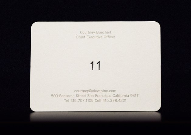
Since the basic information of any card is now so easily shared and transmitted via mobile and digital devices, Eleven envisioned its business cards as anti-digital artifacts. It used the craft of printing to its advantage and to “appeal to human senses.” Its cards use three different and subtle printing techniques, the most prominent being the die-cut 11.
“You only have a few seconds to leverage a hand-to-hand exchange into a momentary, favorable impression,” said Michael Borosky, founder and creative director at Eleven.
Grace Blue
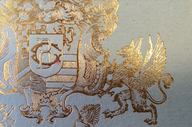
Grace Blue wanted a elegant feel, going with cards that are both visually appealing with an intricate design and satisfyingly tactile. The paper stock, printing method and typography all complement each other.
It is like “a polite hello, a conversation starter and ultimately a keepsake of human interaction,” according to Alex Griffin, the card designer.
Work & Co.
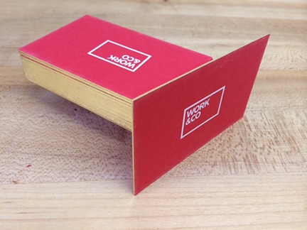
Work & Co. wanted the design of its business cards to be incredibly straightforward, and the quality of the paper and the printing to be the best available. Each of its red cards is letter-pressed on very thick card stock. Because this is an expensive endeavor, the agency only puts people’s departments and not their titles on the cards, so they don’t need new cards when they get promoted. The typography is a mix of Akzidenz Grotesque and Garamond.
“The cards feel heavy and precious and always get noticed,” said Joe Stewart, designer and partner at Work & Co. “The design doesn’t need to be heavy; the object already is.”
Safari Sundays

Safari Sundays’ business cards feature the company’s mascot Steve — a gangly tangle of curves that weaves together the letter “S.” Safari is meant to be a place where employees explore new territories for fresh ideas. The “S” is also engraved in the paper at the back.
DDB Worldwide
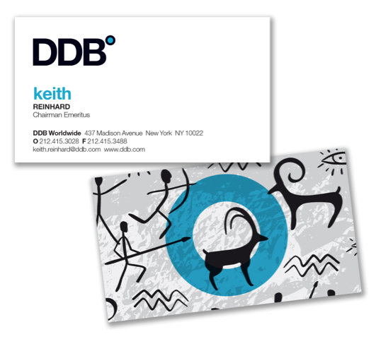
DDB’s business cards are meant to convey the firm’s insight into human nature, respect for the consumer and the power of creativity. One big idea is the power of storytelling, which has always been central to the human experience, hence the cave art-inspired motifs.
“I chose this design to remind myself and others of the power and importance of storytelling and the fact that from the days of the cave persons, we shaped our cultures and our legacies with stories,” said Keith Reinhard, chairman emeritus of DDB Worldwide.
Muhtayzik Hoffer

Muhtayzik Hoffer’s logo is a playful riff on the idea of pedigree. It is also an obvious nod to “Mad Men.” But for co-founders John Matejczyk and Matt Hofherr, more than that, it is a representation of the agency — which is all about inventing what’s next. They wanted to create a consistent look and feel for the agency on their business cards, so the cards are a direct reflection of the agency’s interiors in its San Francisco office. They also incorporate stag horns, part of the agency’s logo.
“We wanted to let the logo have the same freedom we have in developing relevant content for brands,” said John Matejczyk, co-founder and executive creative director at Muhtayzik Hoffer.
Huge

Huge was founded in the belief that great design makes life easier for people, and that the best design is the simplest. In 2014, Huge applied this principle of simplicity to the redesign of its own brand — introducing a refined design system, a new logo and a reengineered website. The elements are all based on a simple grid. The H is the agency’s “flag.” The shape and space of the letter is meant to signify a blank canvas for everyone at Huge to be able to share the work they’ve done while reinforcing its overall brand identity.


More in Marketing

Future of Marketing Briefing: The case for and against the death of the big brand ad
Marketing has a new favorite argument: is it still smarter to talk to a million people at once, or to find the thousand people they already trust?

Lifestyle brand Stanley 1913 uses AI behind the scenes — but execs claim it won’t touch ad creative
Not every brand is racing to let AI anywhere near its ads. Stanley draws the line there on purpose.

TikTok’s Kat Marquez unpacks NBA and WNBA creator deal
TikTok’s latest move to secure its share of the leagues’ growing audiences sees it play gatekeeper between creators and rights holders.